

TABLEMANIA丨创意餐具品牌
TABLEMANIA
品牌定位:饮品品牌
项目内容:视觉策略 /品牌VI设计/ 包装设计
在餐具市场高度风格化的环境中,品牌竞争往往停留在“审美标签”的切换——北欧、复古、极简。但同质化定位不利于品牌长线发展。所以Niice团队认为,本项目的核心命题是:如何超越风格表达,用策略与视觉为品牌建立可持续的核心差异?
In the highly stylized environment of the tableware market, brand competition often stays at the switch of “aesthetic labels” – Nordic, retro, and minimalist. However, homogeneous positioning is not conducive to the long-term development of
the brand. So the Niice team believes that the core proposition of this project is: how to go beyond style expression and establish sustainable core differences for the brand through strategy and vision?
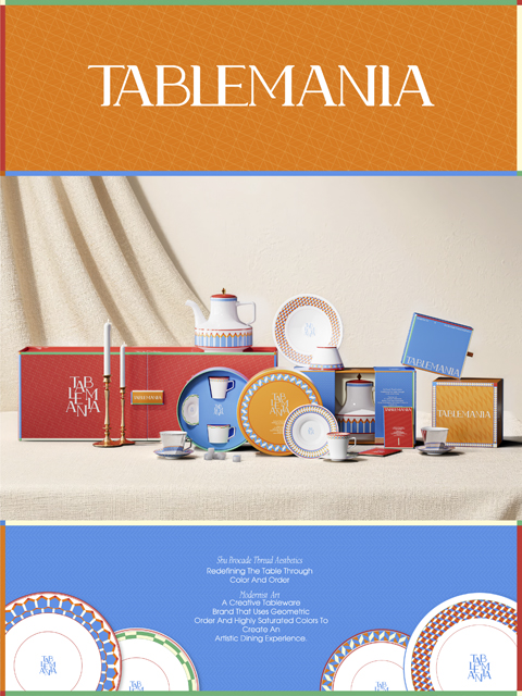
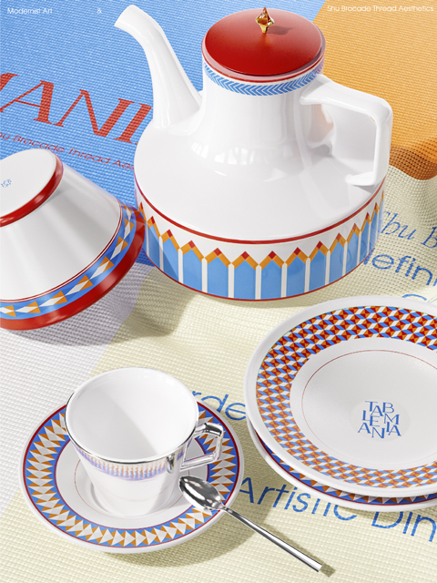
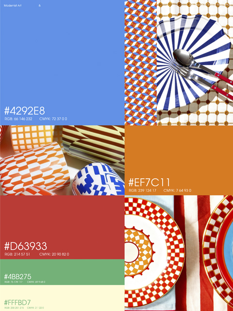
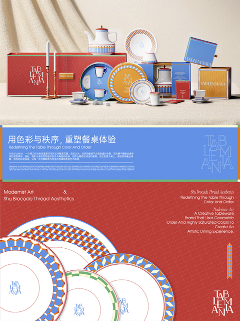
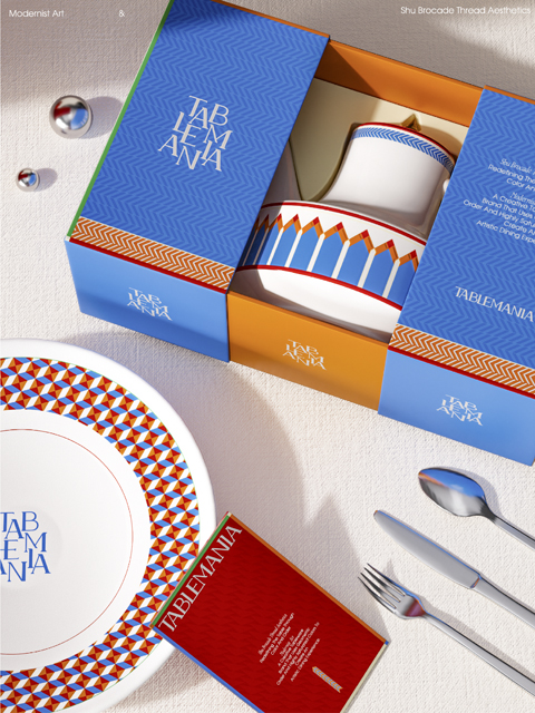
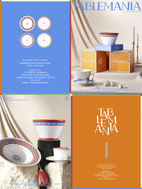
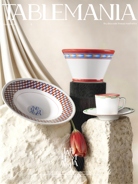
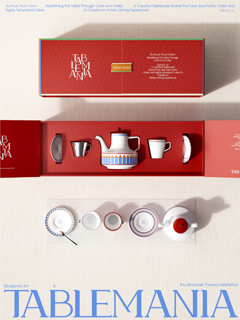
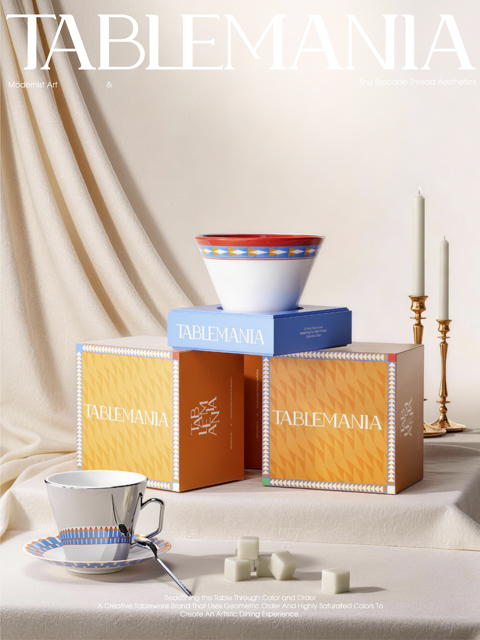
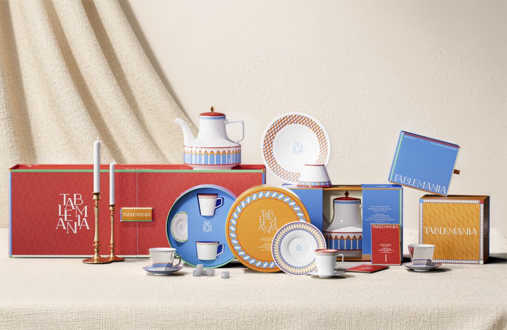
在设计策略上,Niice 以现代艺术构成语言为基础,构建高饱和色彩体系与几何图形秩序系统。橙、蓝、红等高纯度色块形成品牌色彩矩阵,在陈列与传播中具备强识别度。Niice 相信,真正的差异化不来自风格选择,而来自策略导向的视觉系统。TABLEMANIA 通过现代艺术色彩体系与图形秩序系统,将餐具从“功能器物”升级为“日常艺术载体”。用现代艺术色彩体系与图形秩序,重塑餐桌体验。
In terms of design strategy, Niice builds a high saturation color system and geometric order system based on the language of modern art composition. High purity color blocks such as orange, blue, and red form a brand color matrix, which has strong recognition in display and dissemination. Niice believes that true differentiation does not come from style selection, but from a strategy oriented visual system. Tableau has upgraded tableware from a “functional object” to a “daily art carrier” through a modern art color system and graphic order system. Reshaping the dining experience with modern art color systems and graphic order.