

海昌丨美瞳品牌设计
海昌
品牌定位:美瞳品牌
项目内容:视觉策略 /品牌VI设计/ 包装设计
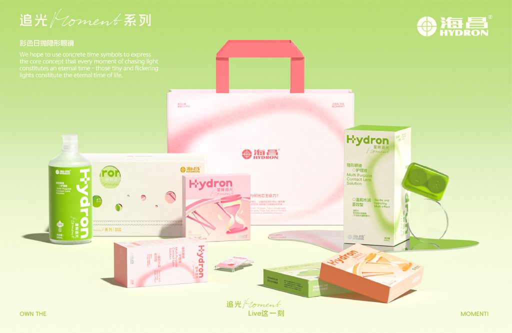
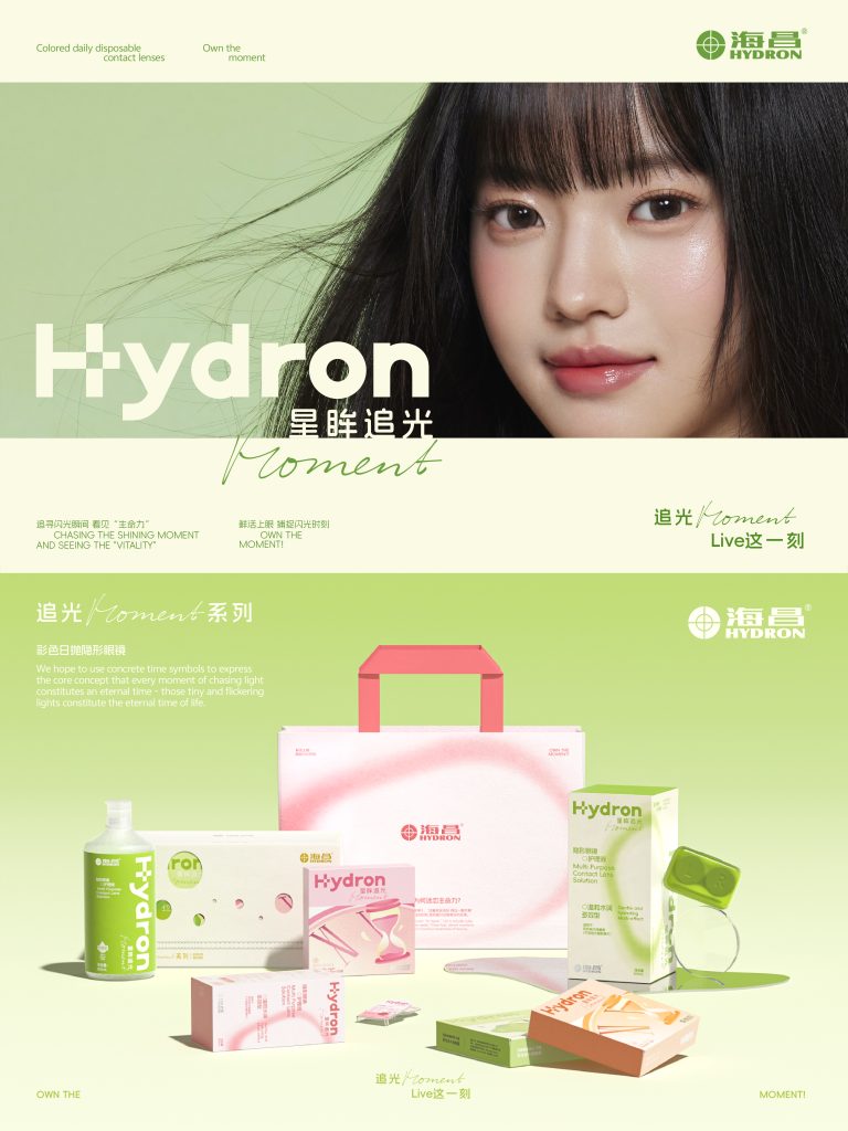
本次海昌「追光 Moment」系列美瞳包装设计,以“永恒的时间”与“生活中的闪光瞬间”为灵感核心。在设计中,我们希望用具象化的时间符号,表达每一个追光瞬间都构成了一段永恒的时间这一核心概念——那些微小而闪烁的光,构成了生活的永恒瞬间。
The packaging design of Haichang’s “Light Chasing Moment” series of contact lenses takes “eternal time” and “the shining moments in life” as the core inspiration. In the design, we hope to use concrete time symbols to express the core concept that every
moment of chasing light constitutes an eternal time – those tiny and flickering lights constitute the eternal moments of life.
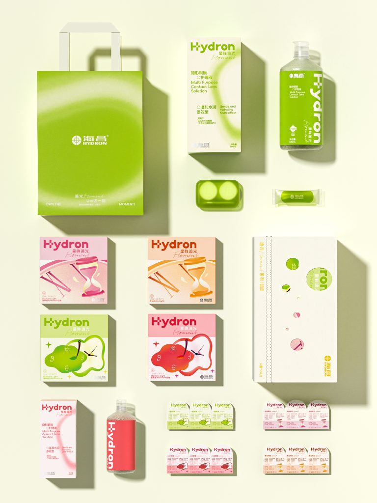
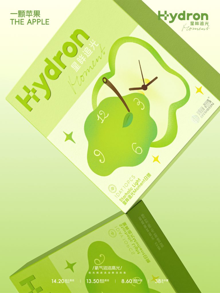
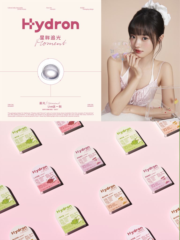
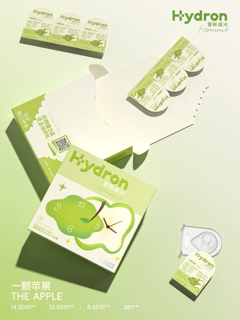
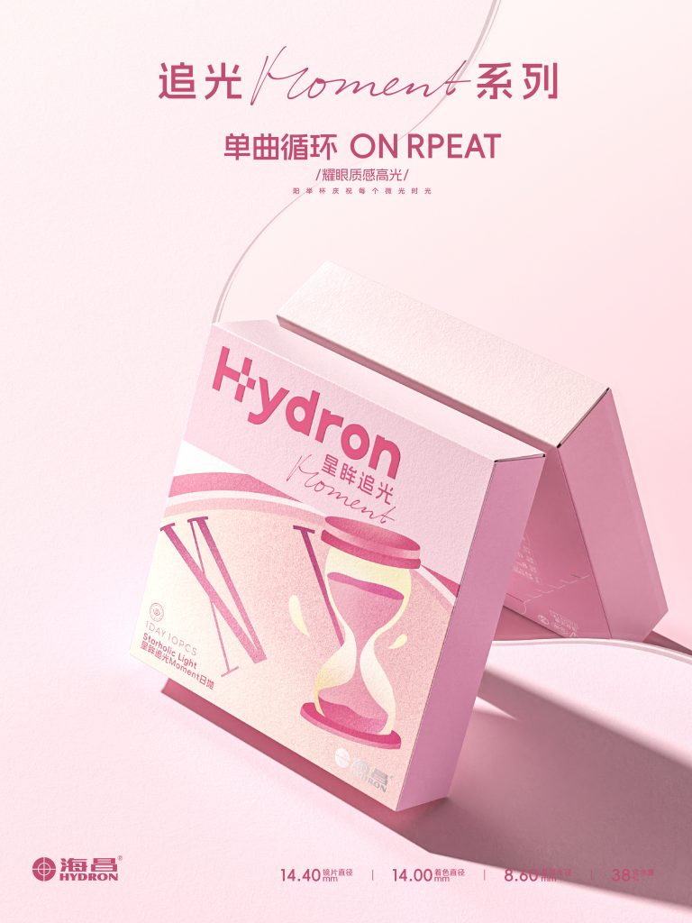
两款包装以不同的时间象征展开叙事,流动苹果 · 时间之面:以流动的苹果形态模拟时钟表面,象征时间的流动与感知的延展。 沙漏 × 莫比乌斯环:沙漏与莫比乌斯环结合,构建出“无尽时间”的视觉符号。粉色柔和而富有生命力,融入“植物萌芽”的意象,象征时间中的循环与新生。整体设计以极简构成与流动光影表现“时间的形态”。两款包装在形式上对比互补:一个代表时间的延展,一个象征时间的回环;共同传递出“追光瞬间构成永恒时间”的态度——让每一个追光 Moment,成为永恒的闪光瞬间。
The two packages use different time symbols to unfold the narrative. Flowing Apple·Face of Time: The flowing apple shape simulates the surface of a clock, symbolizing the flow of time and the extension of perception. Hourglass × Möbius strip: The combination of the hourglass and the Möbius strip creates a visual symbol of “endless time”. The pink color is soft and full of vitality, incorporating the image of “plant sprouts”, symbolizing the cycle and rebirth in time. The overall design uses minimalist composition and flowing light and shadow to express the “shape of time.” The two packages contrast and complement each other in form: one represents the extension of time, and the other symbolizes the loop of time; together they convey the attitude of “chasing light constitutes eternal time” – making every moment of chasing light become an eternal shining moment.