

Pawfect丨宠物食品品牌
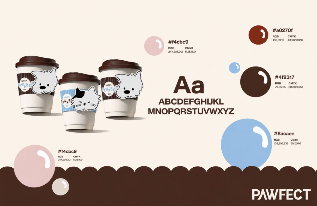
Pawfect
品牌定位:宠物食品品牌
项目内容:视觉策略 /品牌VI设计/ 包装设计
Pawfect是一个关注宠物日常陪伴感的生活方式品牌,名字源自“Paw(爪子)+ Perfect”,意为“结合宠物行业属性和养宠美好期待”。我们希望通过品牌视觉与产品体验,回应当代年轻人对“陪伴、趣味与健康”的养宠期待。
“Pawfect” is a lifestyle brand that focuses on the daily companionship of pets. Its name is derived from “Paw (paw) + Perfect”, which means “combining the attributes of the pet industry and the wonderful expectations of
pet ownership.” We hope to respond to contemporary young people’s pet-raising expectations of “companionship, fun and health” through brand vision and product experience.
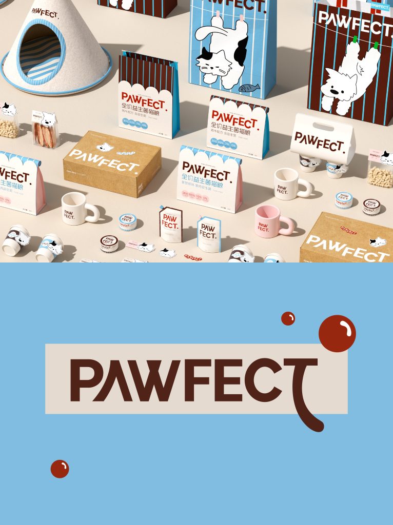
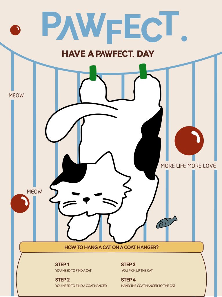
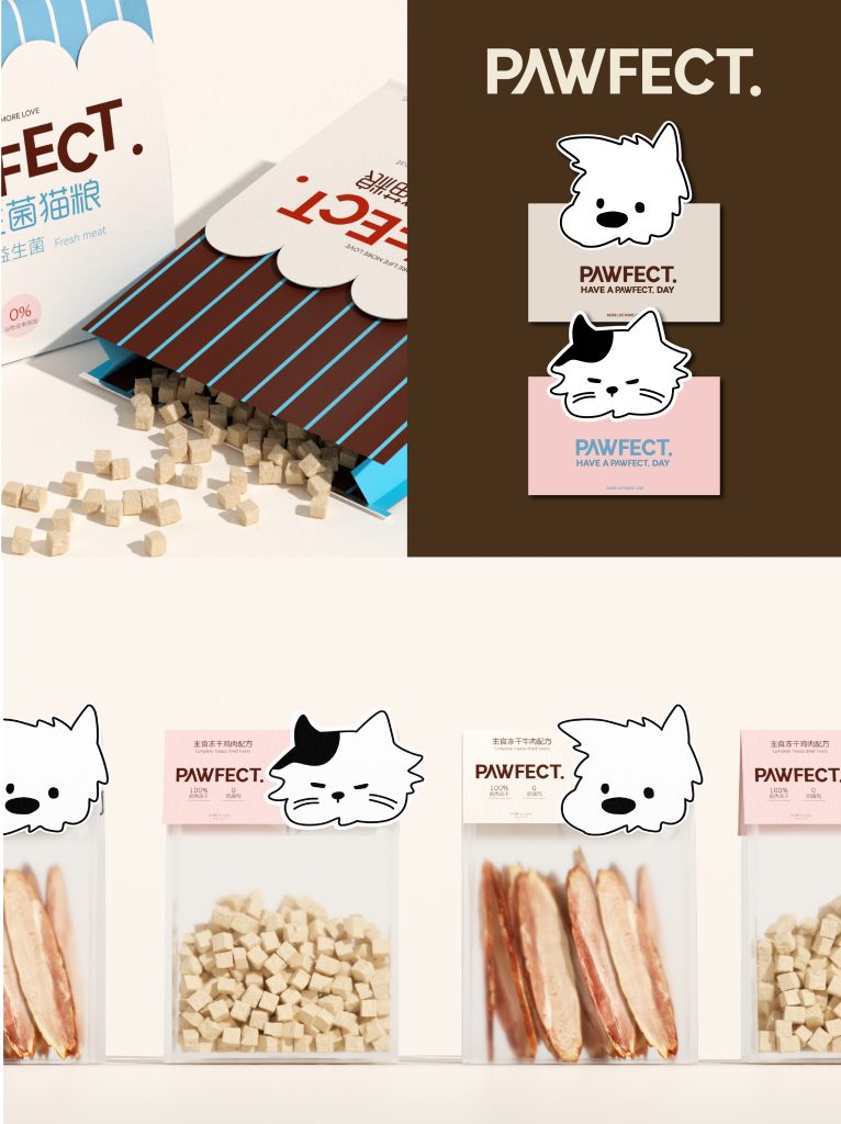
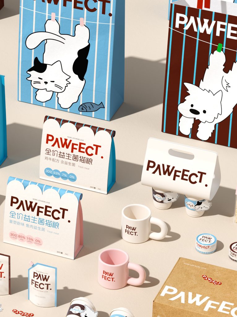
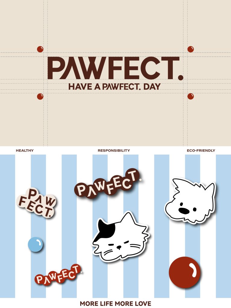
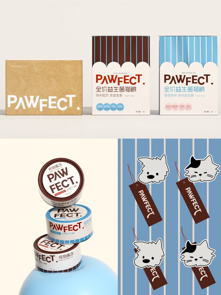
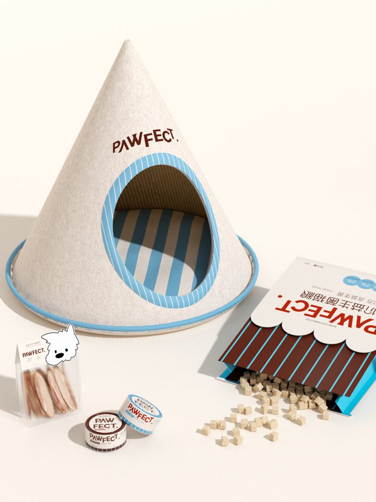
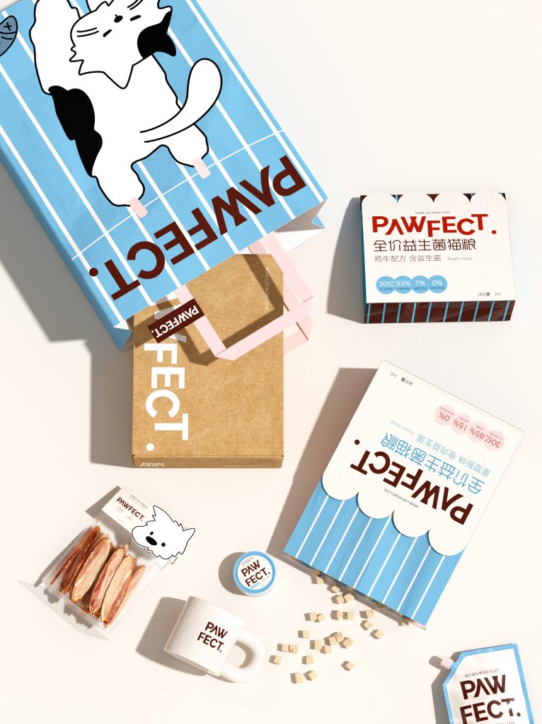
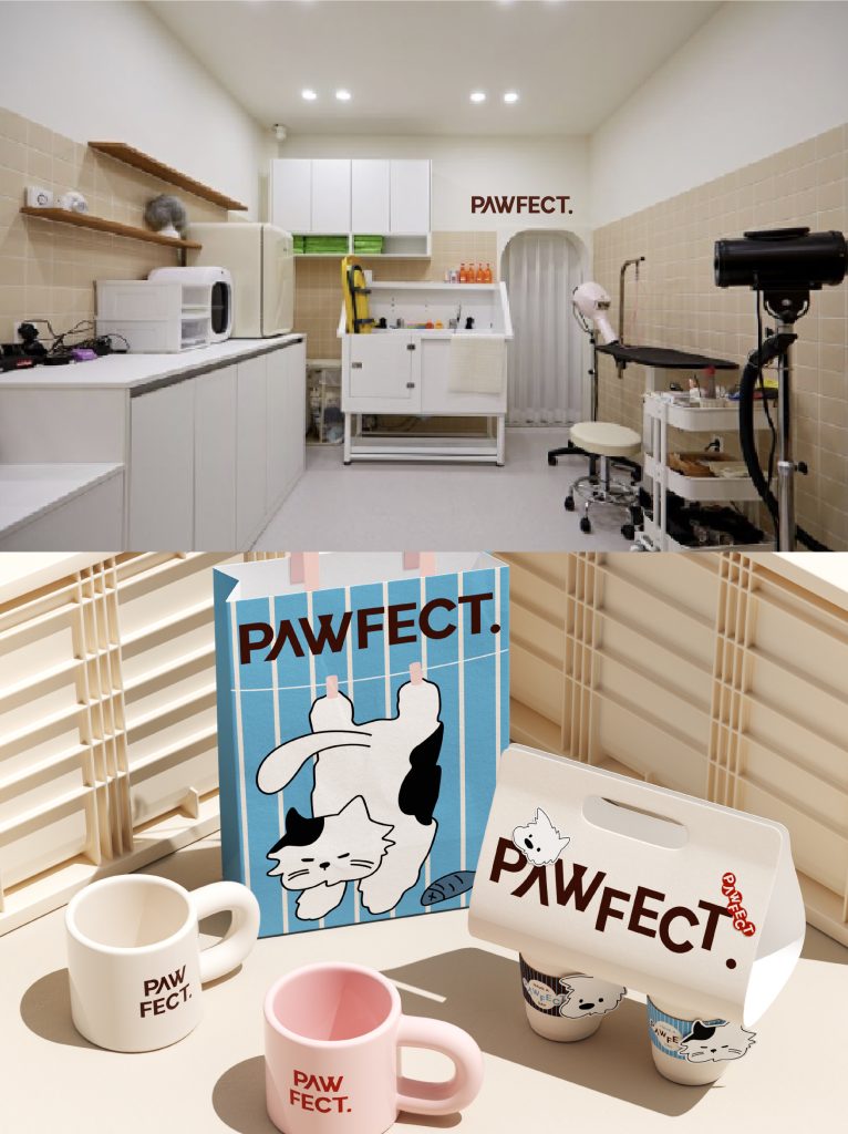
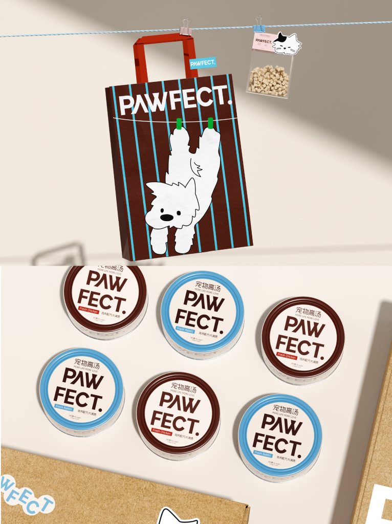
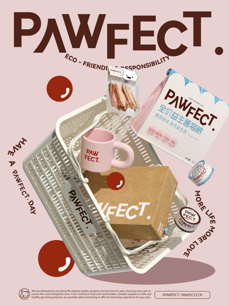
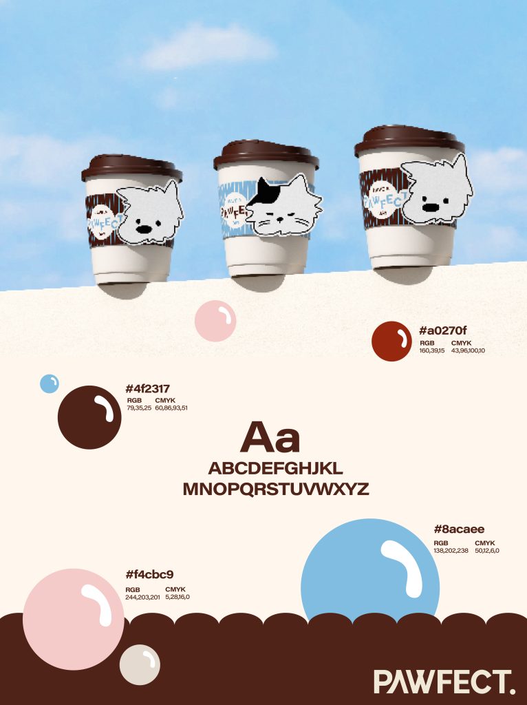
视觉系统以“日常场景中的轻松感”为核心方向,LOGO采用几何感强的无衬线字体,搭配活泼跳跃的“paw”图形符号,整体呈现亲切又简洁的识别风格。品牌主色调选择了可可棕、牛奶白与冰蓝色,柔和不失质感,强化了品牌温度。我们打造了品牌专属IP形象 —— 一组正挂在晾衣绳上的小猫插画角色,借由“洗晒”日常延伸出毛孩子的“家居时光”。这一轻松的场景设定既增强了品牌的亲和力,也为包装增添了强识别性的趣味视觉符号。在包装设计中,我们围绕主粮、零食、冻干、宠物奶等不同产品形态,建立了统一但富有细节差异的系统视觉规范。从插画构图到文字排版,体现产品结构的清晰,同时保留了适度的童趣与生活感。
The visual system takes “relaxation in daily scenes” as its core direction. The LOGO uses a geometric sans-serif font, paired with the lively and jumping “paw” graphic symbol, to present an overall friendly and concise identification style. The main colors of the brand are cocoa brown, milk white and ice blue, which are soft without losing texture and strengthen the brand warmth. We created an exclusive IP image for the brand – a set of illustrations of kittens hanging on the clothesline, which extend the “home time” of furry children through daily “washing and drying”. This relaxed scene setting not only enhances the brand’s affinity, but also adds an interesting visual symbol with strong recognition to the packaging. In packaging design, we have established unified but detailed systematic visual specifications around different product forms such as staple food, snacks, freeze-drying, and pet milk. From illustration composition to text layout, the product structure is clear, while retaining a moderate sense of childlike interest and life.