

family丨宠物咖啡
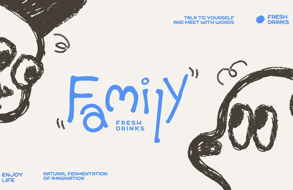
family
品牌定位:宠物咖啡品牌
项目内容:视觉策略 /品牌VI设计/ 包装设计
温馨治愈的品牌形象真的很受大家喜爱,family是一家社区饮品店,想要传递给顾客的是温馨和爱的信息。我们从品牌名字出发,提取出来“家”作为贯穿整体品牌的视觉符号,将品牌内核融于logo中,使用手写不规则排版,打造趣味且有亲和力的品牌视觉表达。
The warm and healing brand image is really popular with everyone. Family is a community beverage store that wants to convey a message of warmth and love to customers. Starting from the brand name, we extracted “home” as a visual symbol that runs through
the entire brand, integrated the brand core into the logo, and used handwritten irregular layout to create an interesting and approachable brand visual expression.
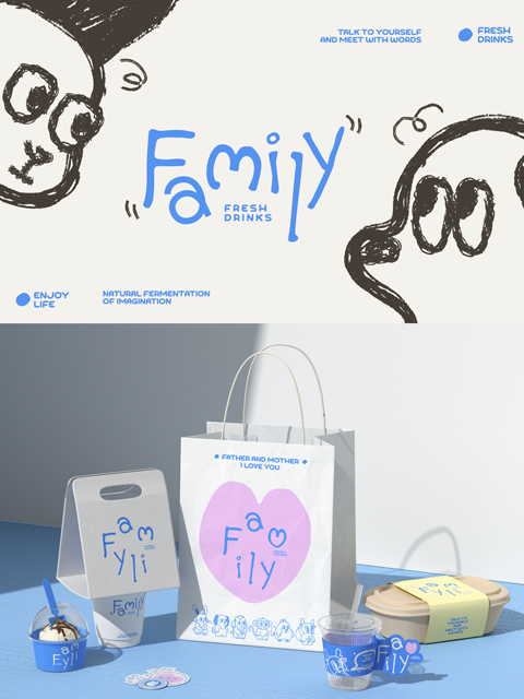
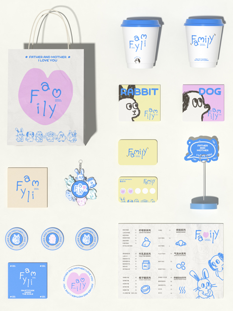
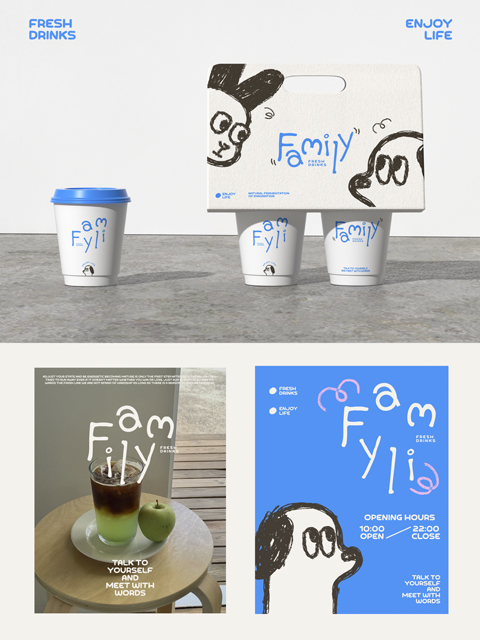
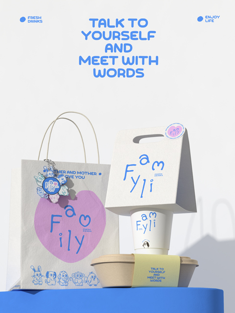
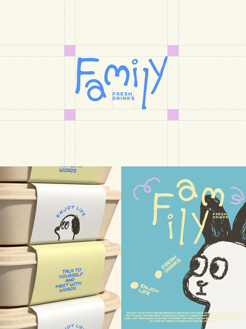
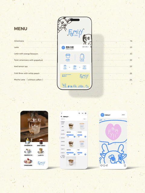
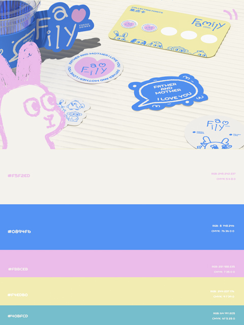
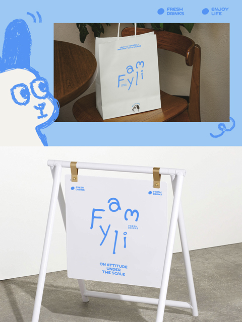
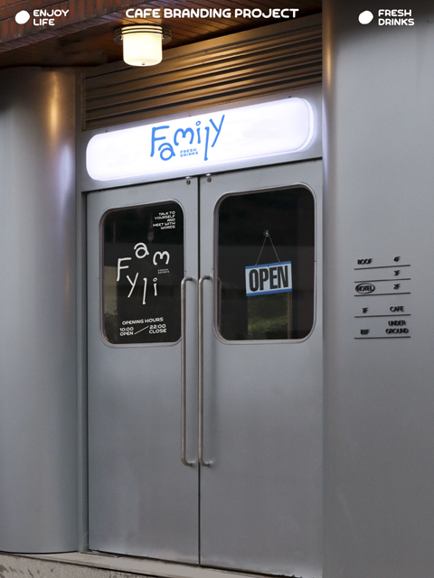
在品牌设计过程中,适当使用一些插画图标作为辅助图形效果会事半功倍。辅助图形一定是和“家”主题相关的,对主理人家人的生肖进行简化绘制的图案赋予了family独特有趣的属性。现在的做品牌的年轻人越来越多,年轻化的品牌也随之变多,在体现品牌个性化的同时,如何能吸引年轻人的目光,才是现在一个好的设计应该思考的。
In the brand design process, the appropriate use of some illustration icons as auxiliary graphic effects will get twice the result with half the effort. The auxiliary graphics must be related to the theme of “home”. The simplified drawing of the zodiac signs of the host’s family gives the family unique and interesting attributes. Nowadays, there are more and more young people making brands, and there are also more and more youthful brands. While reflecting the personalization of the brand, how to attract the attention of young people is what a good design should think about now.