

无相之地丨文旅品牌设计
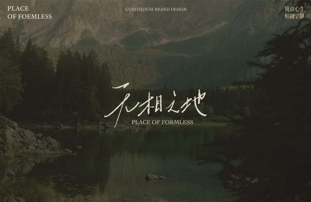
康养新模式
品牌定位:文旅品牌
项目内容:视觉策略 /品牌VI设计/ 包装设计
康养旅游是休闲度假的核心产业,未来发展一定是医、养、游、居、憩融合发展。无相之地位于缙云山,依托于当地优越的气候条件、高负氧离子浓度、良好的空气质量和丰富的森林覆盖率为市场切入点,向自然寻求健康解法,从身体上的医养、食养,到身心上的健养,再到精神上的颐养,是谓养老养生养心,正悄然引领着一场关于健康与美好生活的深度探索。
Wellness tourism is the core industry of leisure and vacation, and its future development must be the integrated development of medicine, health care, tourism, residence and recreation. Wuxiang Land is located in Jinyun Mountain. Relying on the local superior climate conditions, high negative oxygen ion concentration, good air quality and rich forest coverage as the market entry point, it seeks healthy solutions from nature, from physical medical care and food care, to physical and mental health care, and then to spiritual care. It is called elderly care and health care, and it is quietly leading an in-depth exploration of health and a better life.
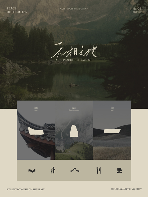
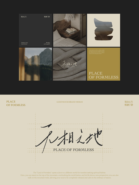
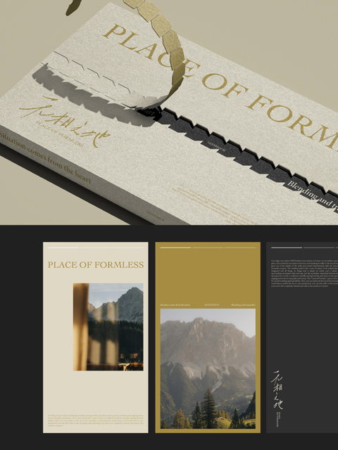
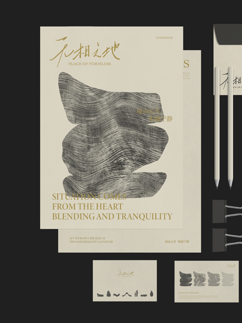
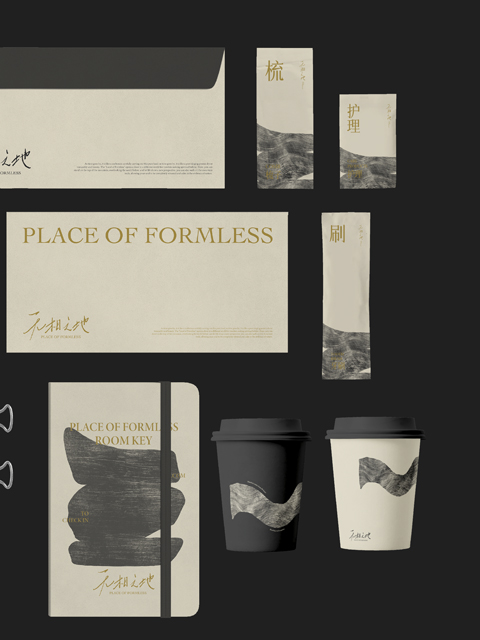
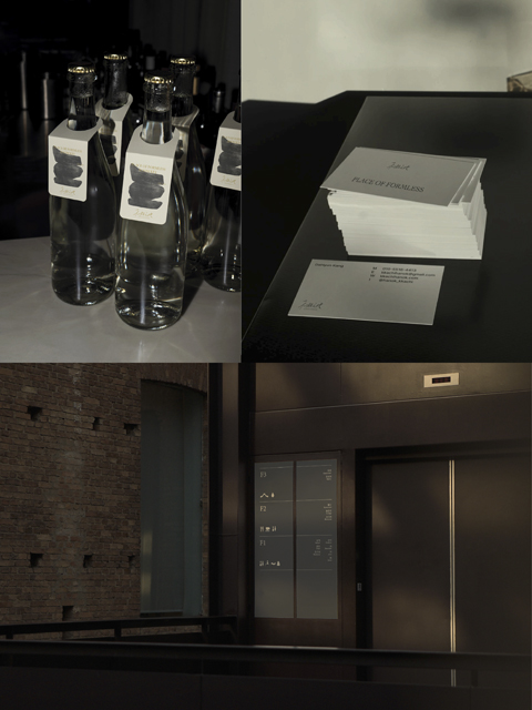
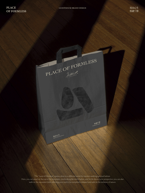
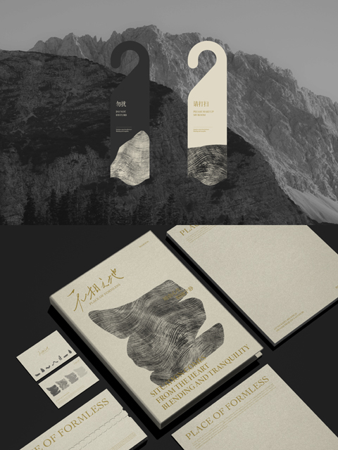
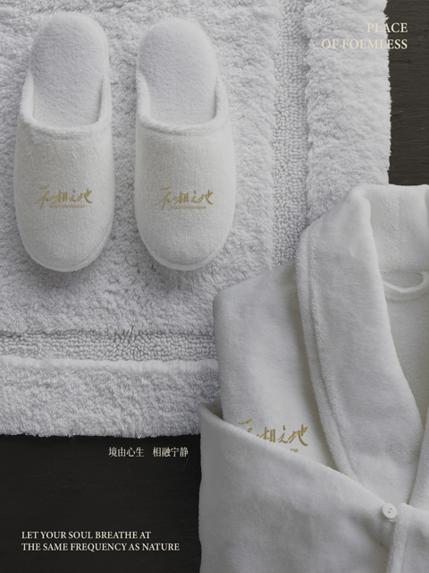
设计逻辑上,我们摒弃浮于表面的自然符号堆砌,选择深植于在地文化基因。通过新中式美学的当代表达,我们织就了一张无形的疗愈之网:它轻柔承托人们对健康的本质渴望,含蓄呼应着对山野的天然眷恋,让疗愈如呼吸般自然发生,悄然褪去传统康养的沉重感。这不仅是空间营造,更是价值沉淀与生命连接的体验设计。标志设计正是这一理念的凝练。取意“归隐自然”之境——山形轮廓勾勒出栖居半山的悠然意象,木质肌理的温暖棕调传递质朴美感。整体造型极简而富有呼吸感,摒弃冗余,以高度的识别性与高级质感,精准呼应品牌“文化为魂、自然为体、体验为桥”的核心定位。它不仅是视觉符号,更是通往“无相之地”那份宁静与自得的无言邀请。
In terms of design logic, we abandon the accumulation of superficial natural symbols and choose to be deeply rooted in local cultural genes. Through the contemporary expression of new Chinese aesthetics, we weave an invisible healing network: it gently supports people’s essential desire for health, implicitly echoes the natural attachment to the mountains and wilderness, allowing healing to occur naturally like breathing, quietly fading away the heaviness of traditional health care. This is not only space creation, but also an experience design that connects value and life. The logo design is the epitome of this idea. Taking the idea of ”retreating to nature” – the mountain-shaped outline outlines the leisurely image of living in the middle of the mountain, and the warm brown tone of the wooden texture conveys a simple beauty. The overall shape is minimalist and breathable, eliminating redundancy and accurately echoing the brand’s core positioning of “culture as the soul, nature as the body, and experience as the bridge” with a high degree of recognition and high-end texture. It is not only a visual symbol, but also a silent invitation to the tranquility and contentment of the “formless land”.