

照物丨眼镜品牌设计
照物
品牌定位:眼镜品牌
项目内容:视觉策略 /品牌VI设计/ 包装设计
Crestar照物,致力于探索新生活方式下的用户体验,以每一幅眼镜为载体,创造第三生活艺术空间,与消费者一同看见更美的生活。照物主理人坚持消费者本位,关注眼镜的实际佩戴需求和应用场景,通过专业化的定制服务,为消费者提供不惧时光的实用美学。
Crestar is committed to exploring user experience in new lifestyles, using each pair of glasses as a carrier to create a third living art space, and see a more beautiful life with consumers. Photography managers adhere to the consumer orientation, pay attention to
the actual wearing needs and application scenarios of glasses, and provide consumers with practical aesthetics that are not afraid of time through professional customized services.
_画板-1.jpg)
-04.jpg)
-03-1.jpg)
-02.jpg)
-05.jpg)
-06.jpg)
-07.jpg)
-08.jpg)
-10.jpg)
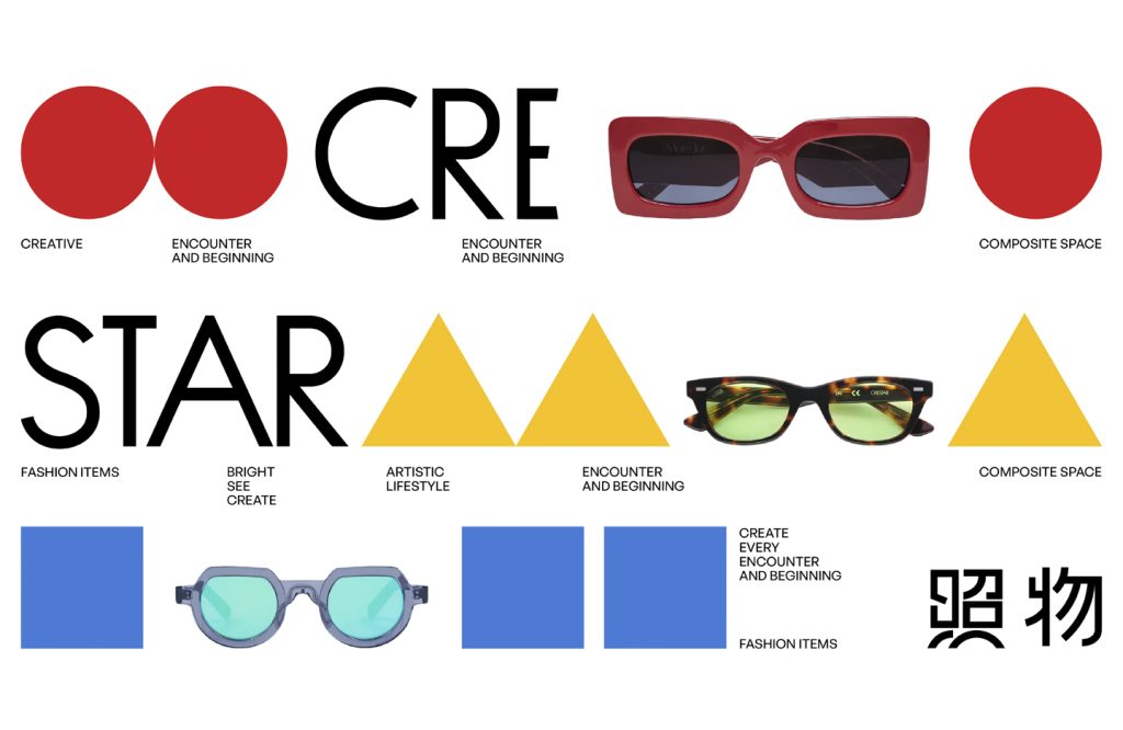
我们对市场情况进行深度考察后,发现传统眼镜重视技术工艺,而忽视了与消费者的情感链接,所以我们将品牌定位为“EYESWEAR生活艺术方式品牌”,不仅强调实用性,更强调一种充满艺术氛围的生活方式,建设能与消费者共创文化的空间。视觉设计板块,我们将策略主张一以贯之——融入包豪斯设计理念、蒙德里安艺术色彩,通过简明、有趣的视觉语言,烘托时尚、精工感、现代主义的品牌调性,做到“功能致上,艺术与技术统一”。
品牌图形围绕“圆、正方形、三角形”展开,演变出抽象几何组合;色彩以原木色、白色为主,并辅以活泼的红、黄、蓝色;文字方面,取义品牌产品“眼镜框与镜腿的大小对比”,以极简的黑体字为基础,对字形做粗细对比处理。整体视觉呈现以“极简、时尚、有趣”的形式呈现,与品牌试图表达的“根据不同的场景需求来选择产品”之观点不谋而合。“每一刻 都值得被看见”,Crestar照物从生活灵感中诞生,坚持长期主义,而我们则用细节表达诗意,用艺术传递思想。
After conducting an in-depth investigation of the market situation, we found that traditional glasses focus on technical craftsmanship and ignore the emotional connection with consumers. Therefore, we positioned the brand as “EYESWEAR Lifestyle Art Brand”, emphasizing not only practicality, but also a lifestyle full of artistic atmosphere, and building a space that can create culture with consumers. In the visual design section, we have been consistent in our strategic propositions – integrating Bauhaus design concepts and Mondrian artistic colors, using concise and interesting visual language to highlight the brand tone of fashion, precision and modernism, so as to achieve “functionality first, art and technology unified”.
The brand graphics revolve around “circles, squares, and triangles”, evolving into abstract geometric combinations; the colors are mainly wood and white, supplemented by lively red, yellow, and blue; in terms of text, the meaning of the brand product is “the size comparison between the glasses frame and the temples”, and is based on minimalist black fonts to contrast the thickness of the fonts. The overall visual presentation is presented in a “minimalist, fashionable and interesting” form, which coincides with the brand’s view of “choosing products according to the needs of different scenarios” that the brand tries to express. “Every moment is worth seeing.” Crestar photos are born from inspiration in life and adhere to long-termism. We use details to express poetry and art to convey ideas.