

Berrytint丨指甲油品牌设计
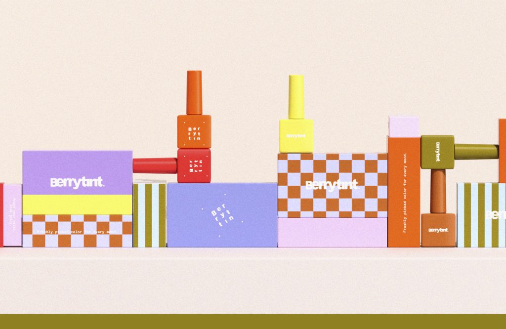
Berrytint
品牌定位:指甲油品牌
项目内容:视觉策略 /品牌VI设计/ 包装设计
美甲在北美和东南亚已经不是”女生做指甲”这件事了。OPI、Sally Hansen 之外,新一批 indie nail brand 正在 TikTok、Instagram 上疯狂收割 Z 世代——她们买的不是颜色,是身份认同。干净成分 + 强烈美学 + 情绪共鸣,三者缺一,记不住你。其实我们可以发现美甲这个品类:从功能品转向了文化品。
Nail art is no longer just a matter of “girls getting their nails done” in North America and Southeast Asia. In addition to OPI and Sally Hansen, a new batch of indie nail brands are wildly harvesting Generation Z on TikTok and Instagram – what they buy is not color, but identity. Clean ingredients + strong aesthetics + emotional resonance, if one of the three is missing, I won’t be able to remember you. In fact, we can find that the category of nail art has shifted from functional products to cultural products.
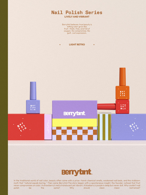
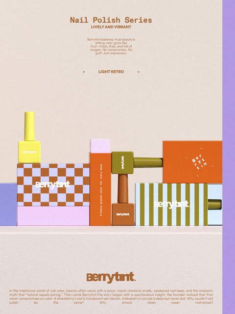
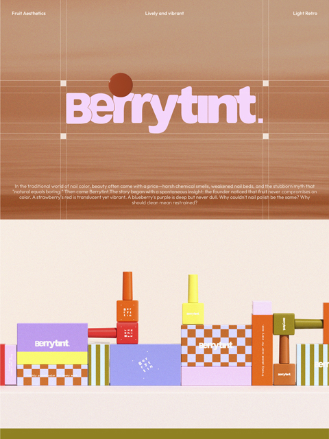
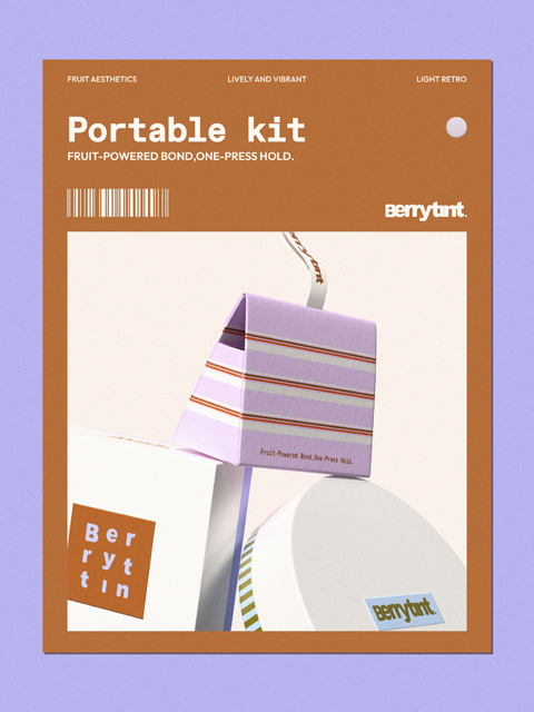
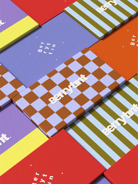
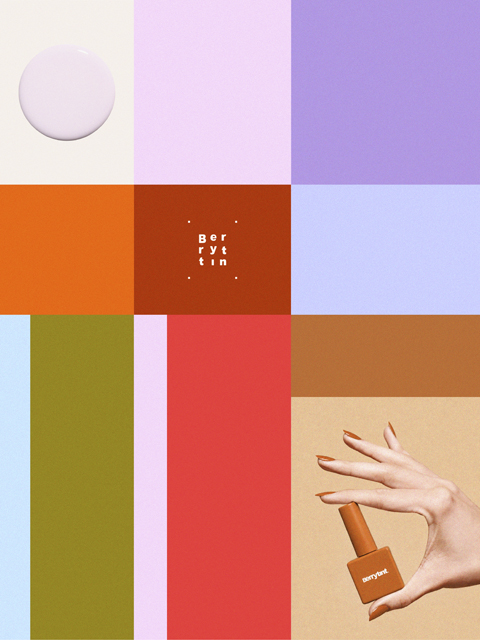
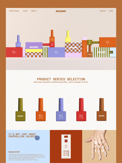
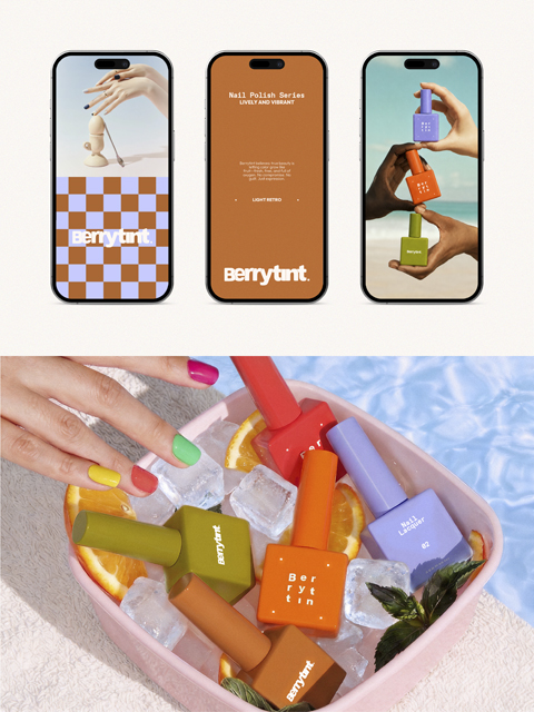
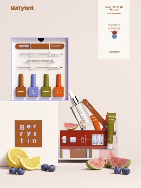
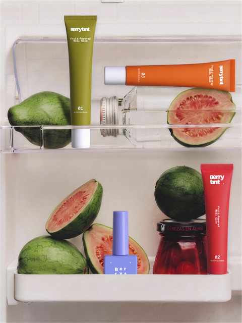
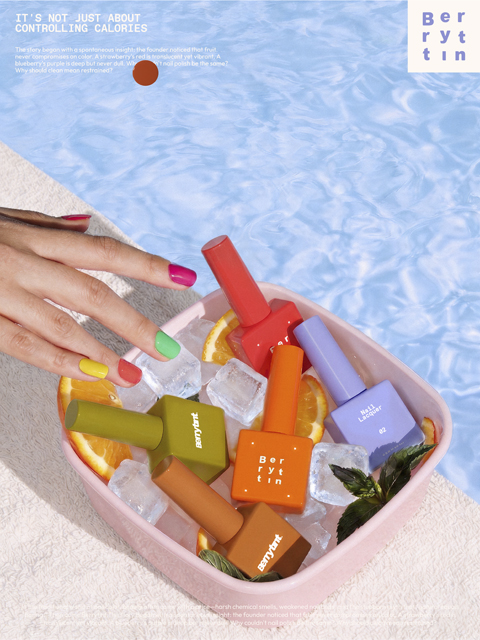
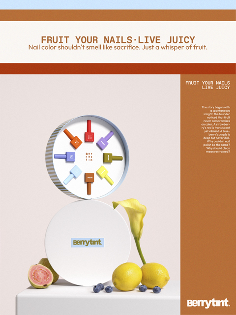
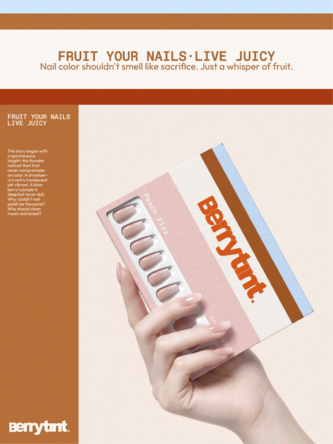
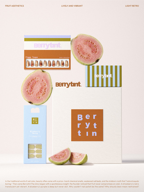
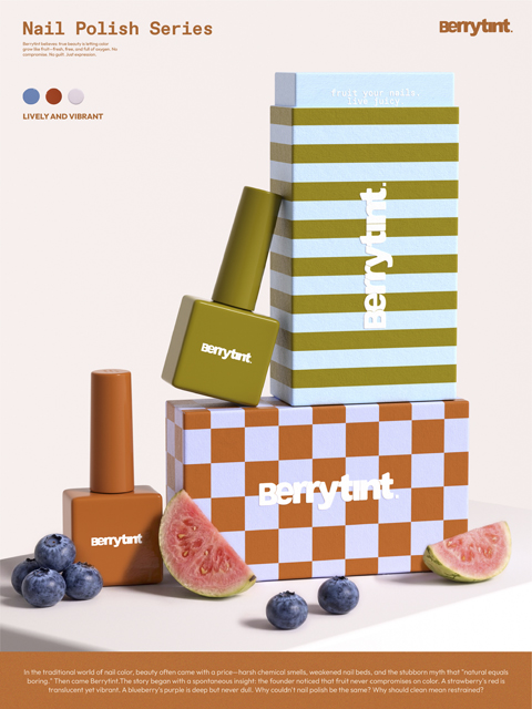
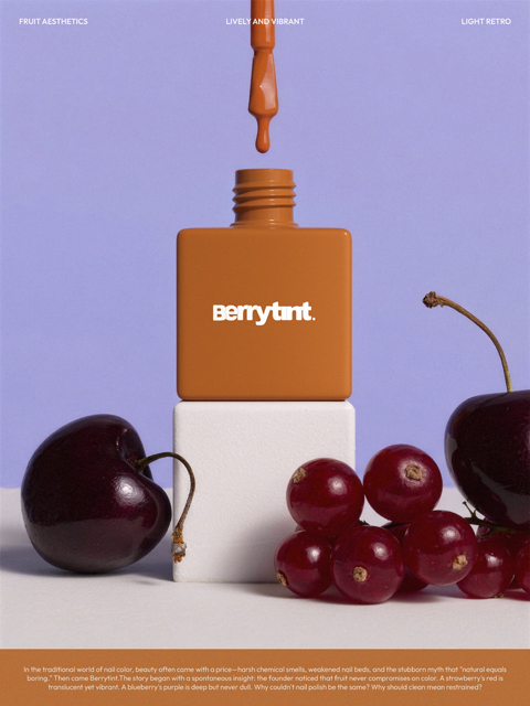
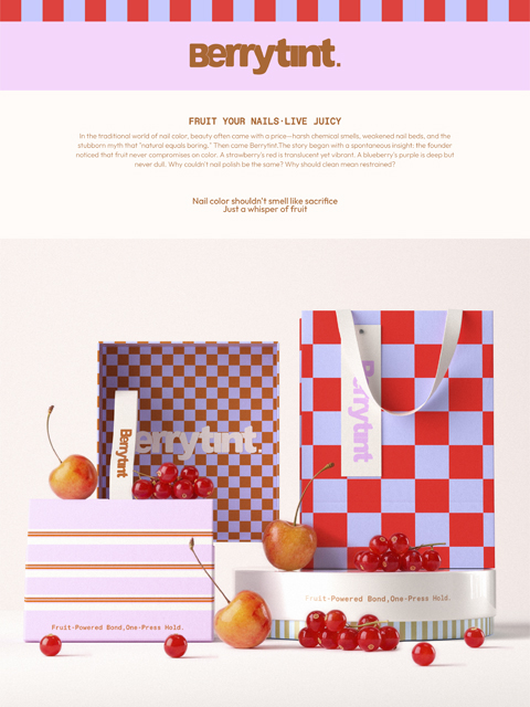
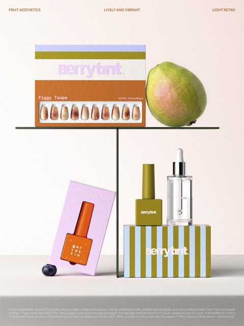
我们接到「Berrytint」这个项目的时候,创始人给了我们一句话——”我不想做另一个粉粉嫩嫩的美甲品牌。”这句话定了整个项目的方向。她的用户是住在多伦多、洛杉矶新加坡的 22-35 岁女性,阅读成分表、追求 Clean Beauty,同时拒绝”天然就该寡淡”这件事。我们给这个品牌建了一个世界观:指尖果园。 颜色不从化学色号里来,从水果里来。设计上我们做了三个核心决策:字标用堆叠换行排列,像果实截面一样层叠,圆润但有力。配色完全抛弃裸粉系,橘棕、樱桃红、蓝莓紫——每一个色都有水果原型。图形语言用棋格 / 条纹 / 圆点三套抽象果肉纹理,可以随 SKU 自由换色,好看又好用。一个好品牌,在用户拿起来的一秒,就应该告诉她:你为什么选我。如果你也在做新消费品牌,想清楚这个市场的竞争已经不在产品层了——在视觉层就已经开始了。
Strategy When we received the “Berrytint” project, the founder gave us a sentence – “I don’t want to be another pink and tender nail brand.” This sentence set the direction of the entire project. Her users are 22-35-year-old women living in Toronto, Los Angeles, and Singapore. They read ingredient lists, pursue Clean Beauty, and reject the idea that “naturalness should be bland.” We built a world view for this brand: Fingertip Orchard. The color does not come from chemical color numbers, it comes from fruits.We made three core decisions: The word mark is arranged in stacks and new lines, stacked like a fruit cross-section, rounded but powerful. The color matching completely abandons the nude pink series, with orange brown, cherry red, and blueberry purple—each color has a fruit prototype. The graphic language uses three sets of abstract pulp textures: checkers/stripes/polka dots. The color can be changed freely according to the SKU, which is beautiful and easy to use. A good brand should tell users the moment they pick it up: Why did you choose me? If you are also building a new consumer brand, think clearly that the competition in this market is no longer at the product level – it has already begun at the visual level.