

NiceDesign x 「超级莓莓 SUPERBERRY 」超级水果品牌全案设计
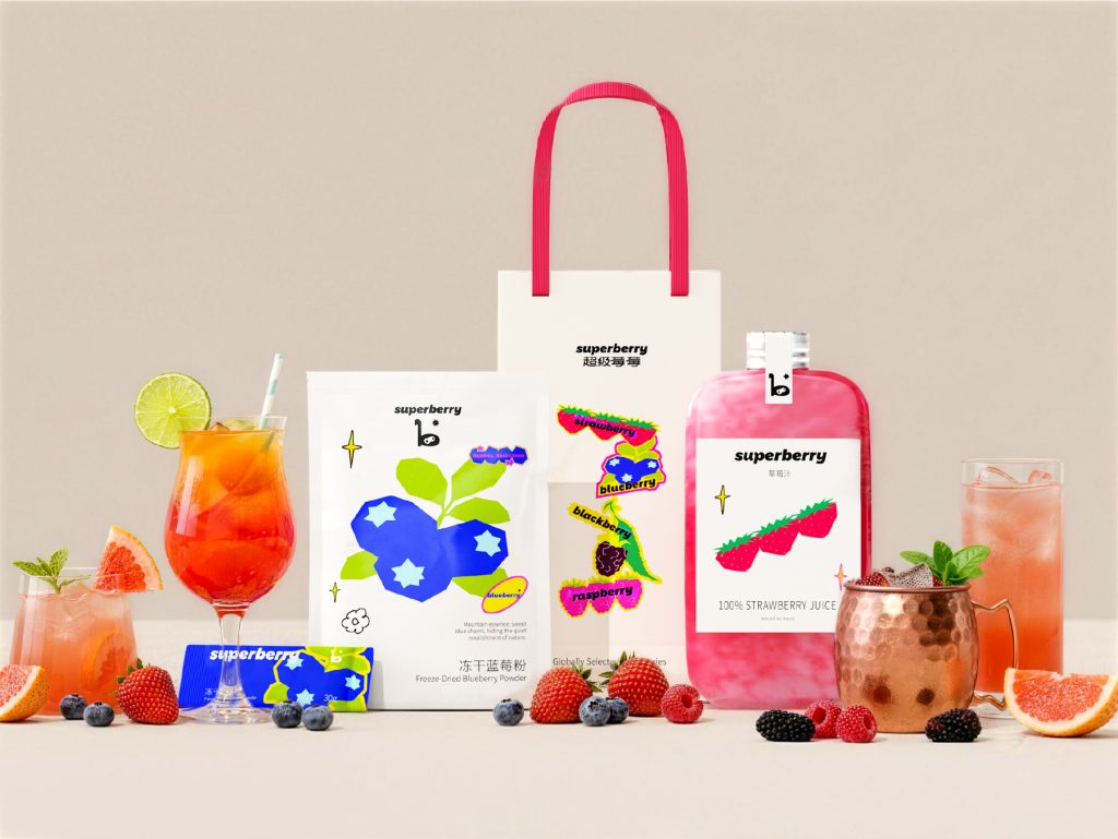
精品水果赛道的消费延伸
在精品水果赛道,当下的消费者决策正在发生转变。购买水果的标准,不再局限于单一的产地或品种优势,而是逐渐延伸到产品背后的消费场景与审美体验。消费者不仅关注“它来自哪里”,也开始在意“它呈现出来的状态”。当水果从农副产品走向日常消费生活时,品牌需要的不仅仅是印上一个产地标签,更需要一套能承载“自然感”与“品质感”的完整视觉系统,去回应这种消费诉求的升级。
In the premium fruit market, consumer decision-making is undergoing a transformation. The standard for purchasing fruits is no longer limited to a single origin or variety advantage, but gradually extends to the consumption scenarios and aesthetic experiences behind the product. Consumers are not only concerned about ‘where it comes from’, but also about ‘the state it presents’. When fruits move from agricultural and sideline products to daily consumer life, brands not only need to print a place of origin label, but also need a complete visual system that can carry the “sense of nature” and “sense of quality” to respond to the upgrading of this consumer demand.
品牌策略:从“水果供应商”到“自然策展品牌”
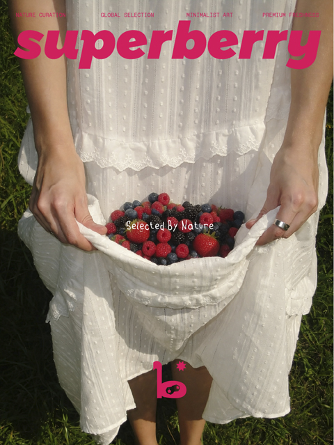
SUPERBERRY 的品牌理念定位于「全球甄选 + 自然策展」。我们将这一理念转化为具体的品牌策略:不将目光局限于产地背书,而是把品牌身份从单纯的水果供应商,提升为“自然策展品牌(Nature Curator)”。我们提出「莓好,源于自然,Selected By Nature.」的品牌主张。在品牌看来,真正能形成差异化的,不是某一个产地,而是“把水果从农产品升级为一种关于自然、审美与生活方式的表达”。我们希望每一次产品亮相,都能传递出自然馈赠的态度,让每一颗莓果都成为连接自然与生活的媒介。
SUPERBERRY’s brand philosophy is positioned as “global selection+natural curation”. We will translate this concept into specific brand strategies:Don’t limit your focus to endorsement of the place of origin, but elevate your brand identity from a mere fruit supplier to a ‘Nature Curator’.We propose the brand proposition of ‘Berry Good, Originating from Nature, Selected By Nature.’.In the eyes of brands, what truly creates differentiation is not a specific place of origin, but rather ‘upgrading fruits from agricultural products to an expression of nature, aesthetics, and lifestyle’.
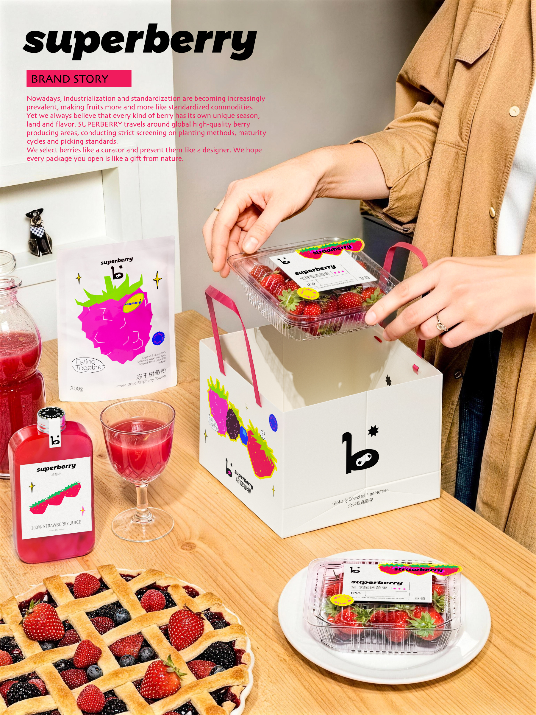
视觉系统构建:高级撞色与莓果图鉴秩序
基于“自然策展”的理念,我们在视觉上采用了高级撞色与现代极简结合的风格,打造兼具品质感与艺术感的高端视觉体系。
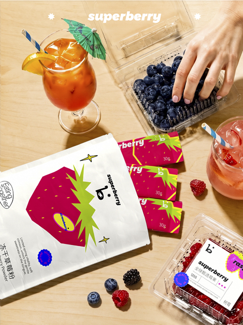
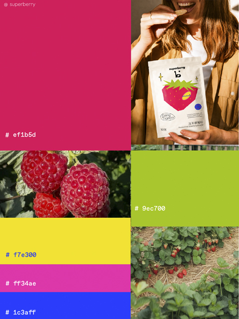
色彩与符号:以高饱和的莓果色系为品牌底色,通过对色彩的精准选用,形成独特的辨识度。我们将各类莓果的自然形态与色彩提炼为「莓果图鉴」视觉核心,建立清晰、可延展的视觉秩序。
Based on the concept of “natural curation”, we have adopted a visual style that combines advanced contrasting colors with modern minimalism, creating a high-end visual system that combines quality and artistic sense.Color and symbol: Using a highly saturated berry color scheme as the brand base, through precise selection of colors, a unique recognition is formed.We extract the natural forms and colors of various types of berries into the visual core of the ‘Berry Catalog’, establishing a clear and extensible visual order.

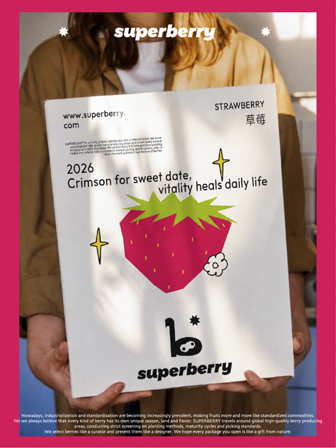
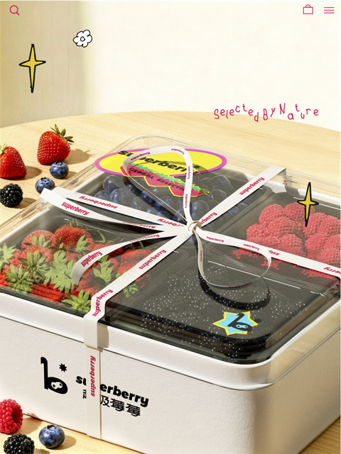
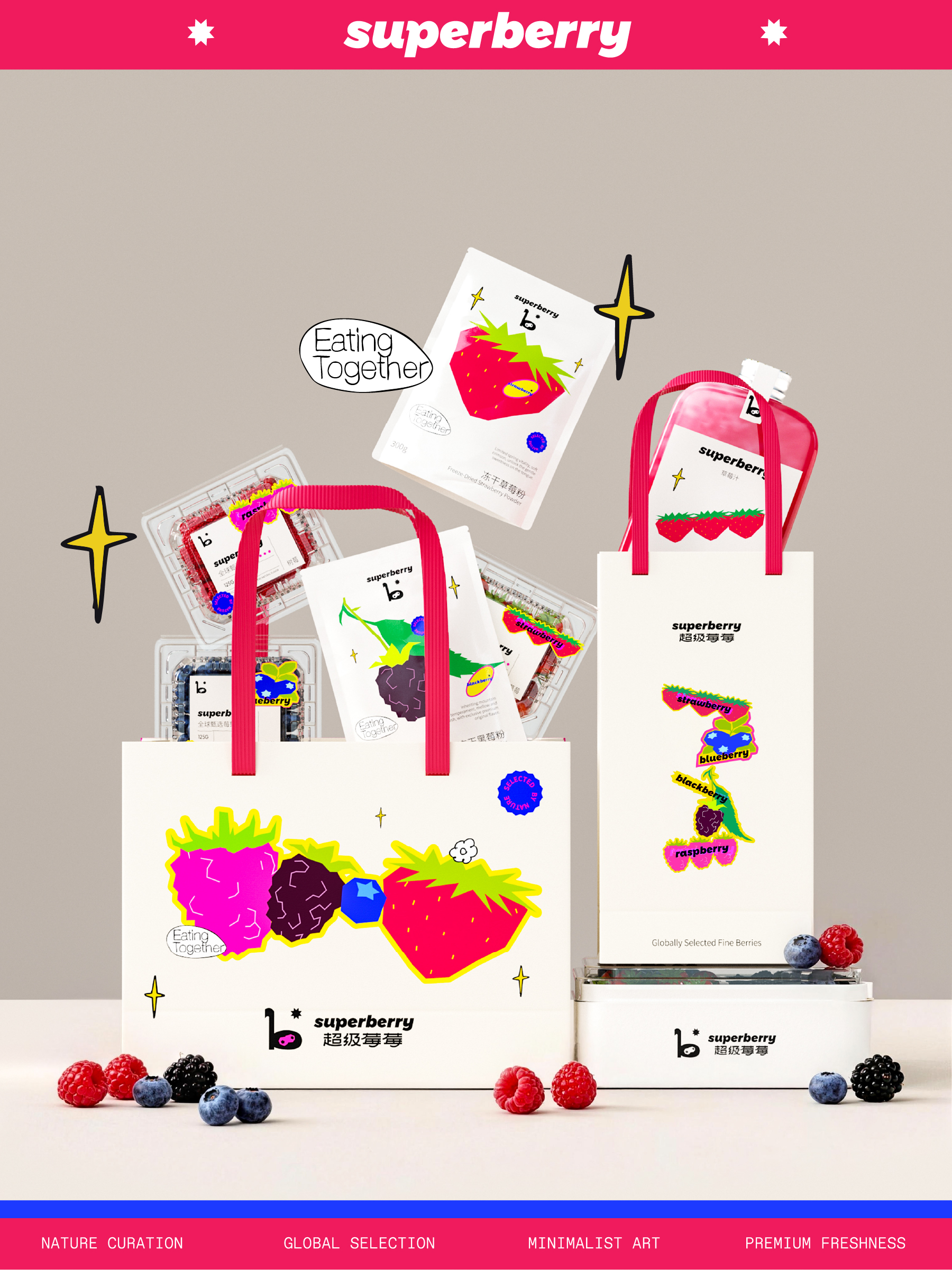
产品线视觉规划:为了让产品线更具层次,我们在包装上建立了三个维度——Daily Line 日常小规格家庭装、Gift Line 礼赠系列礼盒包装、以及Reserve Line 产地限定系列。以统一的图形视觉系统为基础,通过包装形态与使用场景的区分,构建出完整且有序的品牌体验。物料与载体:从产品内袋、外包装到礼盒、礼品袋,我们将这套视觉语言系统化地延展至不同载体。在消费者接触产品的每一个触点中,保持品牌高度统一的质感与秩序。
Product line visual planning: In order to make the product line more layered, we have established three dimensions in packaging – Daily Line daily small size family packaging, Gift Line gift box packaging, and Reserve Line origin limited edition series. Based on a unified graphic visual system, a complete and orderly brand experience is constructed by distinguishing packaging forms and usage scenarios. Materials and carriers: From product inner bags and outer packaging to gift boxes and gift bags, we systematically extend this visual language to different carriers. Maintain a highly unified texture and order of the brand at every touchpoint where consumers come into contact with the product.
iceDesign x 「 SUPERBERRY 」
“莓好,源于自然,Selected By Nature.”