

NiiceDesign x 「见茶日报」|创意养生茶品牌视觉设计
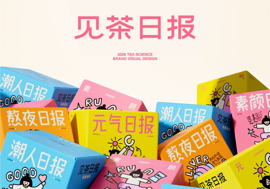
见茶日报|养生茶赛道的年轻化突围
中国养生茶饮市场规模已突破300亿元,其中18-35岁年轻消费者占比超过六成。但一个尴尬的现实是:市面上大多数养生茶品牌仍在沿用“传统草本”“古法配方”等话语体系,包装上堆满枸杞、红枣、菊花,表达上充斥着“清肝明目”“补气养血”等功能性词汇。对于年轻人而言,养生不是不需要,而是不想要“被说教”。他们熬夜后想补救,但不想喝一杯像中药一样的茶;他们需要的是——在正确的场景里,喝一杯刚刚好的茶,顺便完成一次轻量级的自我照顾。这正是「见茶日报」切入市场的机会:不以功效命名,而以生活状态命名。将养生茶从“功能性饮品”重新定义为“年轻人的每日情绪日报”——每一天,每一种状态,都有一杯对应的茶。
The market size of Chinese health tea drinks has exceeded 30 billion yuan, with young consumers aged 18-35 accounting for over 60%. But an awkward reality is that most health tea brands on the market still use discourse systems such as “traditional herbal” and “ancient formula”, with packaging filled with goji berries, red dates, chrysanthemums, and functional vocabulary such as “clearing the liver and improving vision” and “nourishing qi and blood”. For young people, health preservation is not unnecessary, but they do not want to be “lectured”. They want to make up for it after staying up late, but they don’t want to drink a cup of tea like traditional Chinese medicine; What they need is – to have a just right cup of tea in the right setting and also complete a lightweight self-care session. This is precisely the opportunity for “Jian Cha Daily” to enter the market: not named after efficacy, but named after lifestyle status.
见茶日报|从“功效列表”到“生活日报”的品牌升维
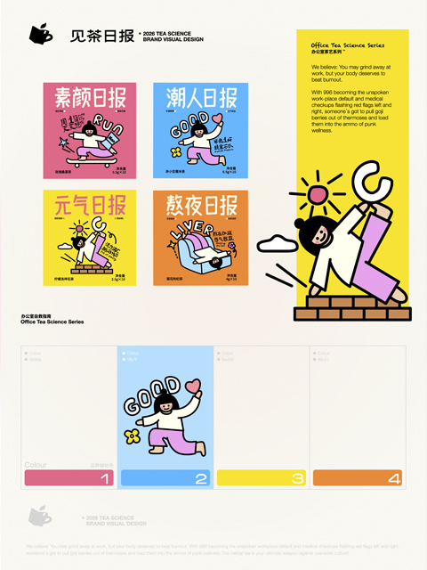
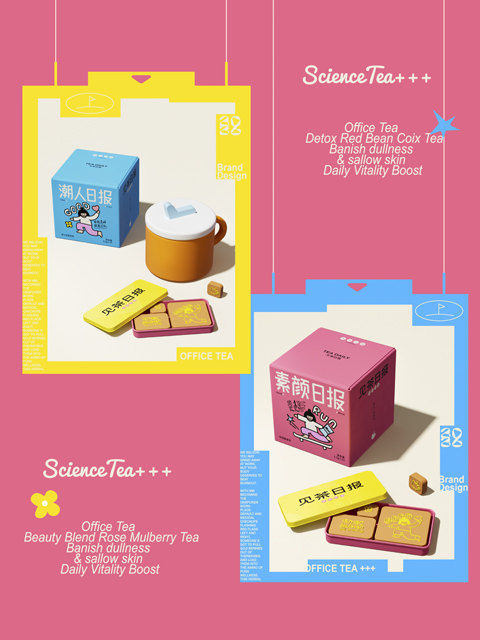
真正的突破,在于将养生茶从“药食同源的容器”转变为“年轻人日常状态的表达媒介”。品牌不做“全能养生”,而是将年轻人的高频生活场景提炼为四大系列:素颜日报、潮人日报、熬夜日报、元气日报。品牌定位:一个以“生活场景日报”为核心概念的创意养生茶品牌。
产品载体:四大主题系列茶包,匹配不同生活状态下的养生需求。核心价值:以“生活日报”创意概念作为核心,让产品价值与年轻人的生活场景产生连接。消费场景:早起洗漱后、上班路上、午后犯困、熬夜加班、周末出街……覆盖年轻人一天中需要“微养生”的所有瞬间。品牌主张:见茶日报,每日见茶。希望通过“日报”这一概念,让喝茶成为一种轻松、有仪式感且可期待的日常习惯。
The real breakthrough lies in transforming health tea from a “container for medicine and food” to a “medium for expressing the daily state of young people”. The brand does not focus on “all-around health preservation”, but instead extracts high-frequency life scenes of young people into four major series: Plain Face Daily, Trendy People Daily, Stay Up Late Daily, and Vitality Daily. Brand positioning: A creative health tea brand with the core concept of “daily life scene report”. Product carrier: Four themed series of tea bags, matching the health needs of different living conditions. Core value: With the creative concept of “Life Daily” as the core, connect product value with the life scenarios of young people. Consumer scenarios include waking up early to wash up, commuting to work, feeling sleepy in the afternoon, staying up late and working overtime, and going out on weekends… covering all the moments when young people need “micro health” throughout the day. Brand proposition: See Tea Daily, see tea every day. I hope to use the concept of “daily newspaper” to make drinking tea a relaxed, ceremonial, and anticipated daily habit.
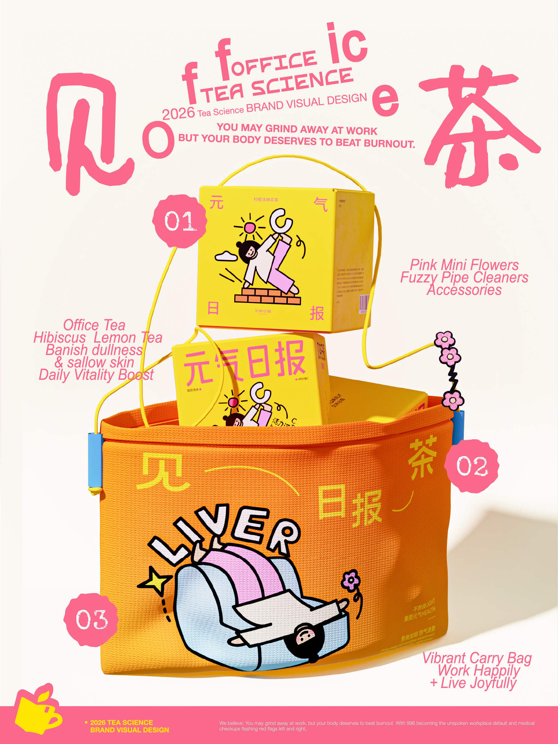
色彩被看见,插画被记住:一套轻巧明亮的创意视觉系统
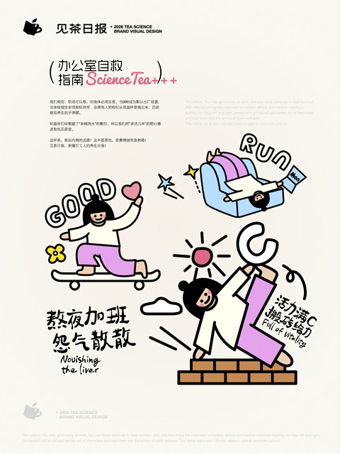
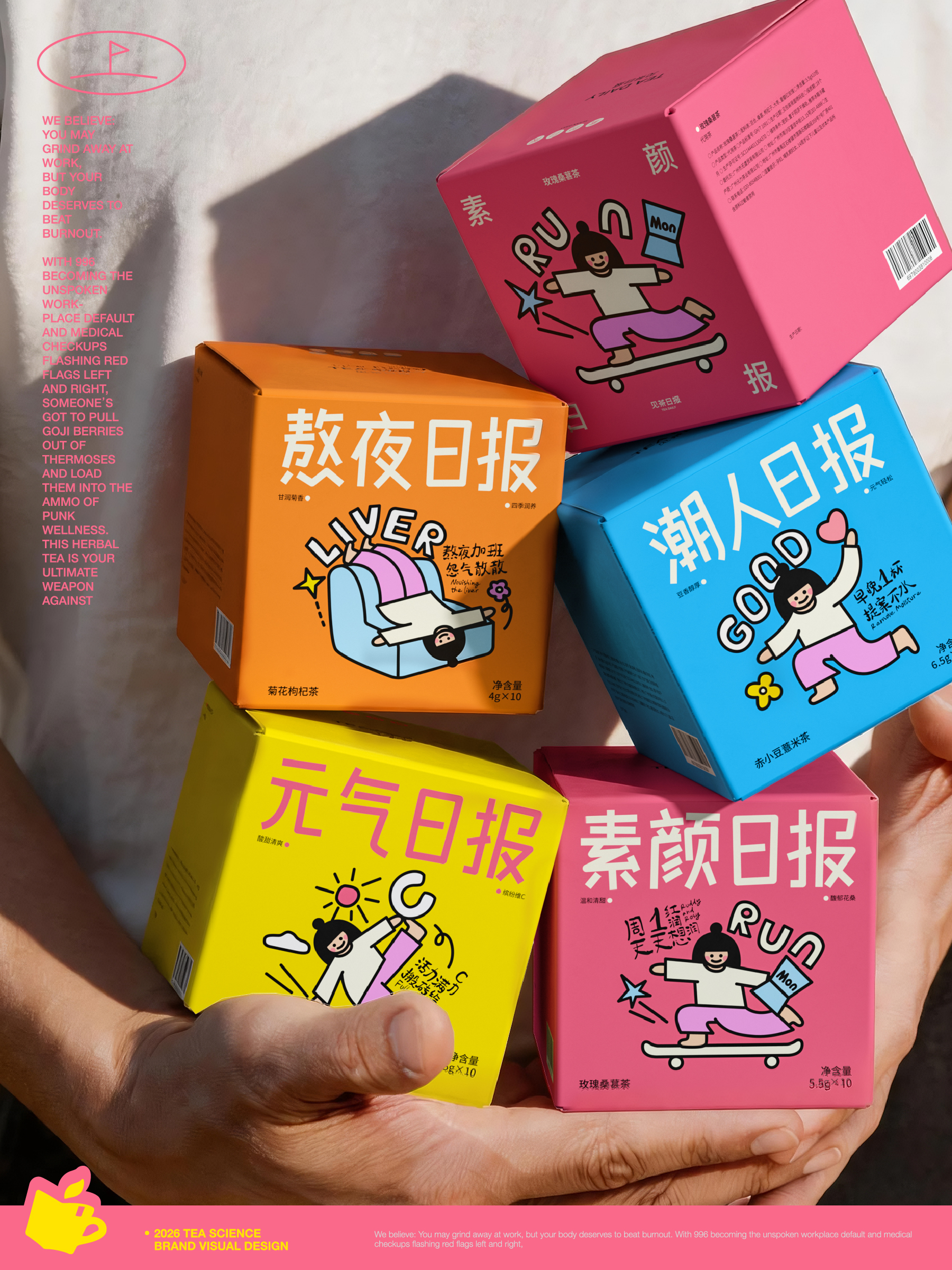
与创意概念呼应,我们选择以色彩和主题插画建立品牌识别。色彩负责被看见,插画负责被记住。品牌色彩 | 高饱和×强识别,每个系列都有自己的“日报色”高饱和度的色彩体系,让产品在货架上极具视觉冲击力,也便于消费者“看色识茶”,降低选择成本。插画系统 | 让功效变成可感知的场景画面我们没有在包装上罗列枸杞、菊花、人参,而是围绕每一个“日报”对应的生活场景,创作了高度风格化的主题插画
In line with the creative concept, we have chosen to establish our brand identity through color and themed illustrations. Colors are responsible for being seen, illustrations are responsible for being remembered. Brand color | high saturation x strong recognition, each series has its own “daily color” high saturation color system, making the product visually impactful on the shelf and easy for consumers to “identify tea by color”, reducing selection costs. Illustration System | Turning Effects into Perceived Scene Images We did not list goji berries, chrysanthemums, and ginseng on the packaging, but created highly stylized themed illustrations around the corresponding life scenes of each “daily newspaper”
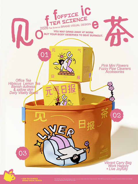
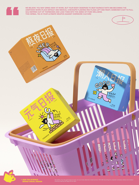
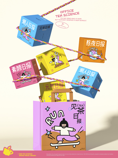
品牌LOGO | 轻松、拙趣、不端着LOGO采用简洁的无衬线字体,字形圆润、结构松弛,并在笔画末端融入适度的“拙趣感”细节——比如轻微的不规则收笔、略带手工感的弧度。这让品牌在保持干净现代的同时,多了一份轻松与亲和力,减少传统养生品牌的“距离感”。包装系统 | 像一份真正的“日报”以“日报”标题式的字体排版及插画展示,每次拿起产品,都像在翻阅一份属于自己的“今日日报”。当视觉成为品牌资产,产品不再只是功能的承载,而成为消费者认识品牌、记住品牌的重要入口。
Trendy IP image: The powerful 3D climber IP has become a symbol of the brand spirit. Visually conveying the concept of “continuous upward movement” through jumping, climbing, and breakthrough postures. The vivid colors of the IP image run through all visual materials with a lively posture. Life oriented peripheral carrier: The peripheral carrier is designed with a dual extension of visual and functional clues. The canvas bag uses real climbing ropes as handles, translating the symbol “pivot point” into a directly perceptible daily contact point; In addition, the matching dopamine colored sports socks, coffee paper cups, rock point shaped refrigerator stickers, and employee hanging ropes cover multi-dimensional scenarios such as commuting, office, and home, building a highly recognizable brand application matrix.
NiceDesign x 见茶日报
“见茶日报,每日见茶”