

NiiceDesign x GULULU COFFEE丨人宠生活方式品牌全案设计
从“宠物友好”到“人宠共处”:咖啡场景的情绪延展
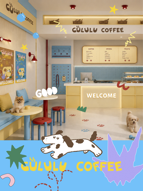
宠物消费正在从基础用品购买,进入更完整的生活方式场景。年轻宠物主关注的不只是产品功能,也在意品牌是否能进入他们的日常审美、社交分享和情绪关系中。咖啡也不再只是饮品,而是城市生活里高频出现的停留场景。当宠物消费与咖啡场景发生交集,“宠物友好”就不只是允许宠物进入空间,而是人与宠物能否在同一个场景中自然停留、互动和放松。因此在设计 GULULU COFFEE 时,我们并没有把它理解成一个“宠物可以进入”的咖啡空间,而是从人和宠物共同停留的日常片刻出发,去建立一个更轻松、更明亮、更容易被带入生活的品牌场景。从咖啡饮品到宠物零食、玩具、护理用品,再到品牌周边与线下空间,包装和视觉系统需要承载的,不只是产品信息,而是一种人宠共处下的松弛体验。
Pet consumption is shifting from the purchase of basic supplies to encompassing more comprehensive lifestyle scenarios. Young pet owners care not only about product functionality but also whether brands can integrate into their daily aesthetics, social sharing, and emotional connections. Coffee has evolved beyond being merely a beverage, becoming a frequent stopping point in urban life. When pet consumption intersects with coffee scenarios, “pet-friendly” no longer simply means allowing pets into a space but rather enabling people and pets to naturally linger, interact, and relax together. Thus, in designing GULULU COFFEE, we did not interpret it as a “pet-accessible” coffee space but rather started from the shared moments of daily presence between people and pets, aiming to create a brand scene that is more relaxed, brighter, and easier to bring into everyday life. From coffee beverages to pet snacks, toys, care products, and extending to branded merchandise and offline spaces, the packaging and visual system must convey more than just product information—it should embody a sense of ease in human-pet coexistence.
GULULU COFFEE|从“场景友好”到“轻松陪伴”的品牌升维
GULULU 这个名字,本身就带着声音和画面感。它像咖啡倒入杯中时的流动声,也像冰块与杯壁轻轻碰撞的细响。放在人宠关系里,它又像宠物靠近人时自然发出的亲密回应,轻微、连续、不打扰,却很有陪伴感。所以在品牌设计中,我们将“咕噜感”作为包装视觉的情绪起点。
品牌定位:一个以“人宠共处”为核心价值的生活方式咖啡品牌。产品载体:围绕咖啡饮品、宠物零食、宠物玩具、护理用品、品牌周边与线下空间展开,通过包装系统建立不同品类之间的视觉关联。价值主张:咕噜咕噜,轻松一下。Ease into the moment。消费场景:覆盖遛宠休息、咖啡外带、宠物社交、日常补给和轻松分享等年轻宠物主的高频生活场景。在紧凑的城市节奏里,为人和宠物提供一个可以短暂停下、自然靠近、轻松回血的日常片刻。
“咕噜咕噜,轻松一下”,也成为我们在包装与视觉表达中持续回应的品牌情绪。
The name “GULULU” carries its own sense of sound and imagery. It evokes the flow of coffee pouring into a cup, as well as the soft clink of ice against the rim. In the context of human-pet relationships, it resembles the natural, affectionate purr of a pet approaching its owner—gentle, continuous, and unobtrusive yet deeply companionable. Thus, in brand design, we adopted the “purr feel” as the emotional starting point for packaging visuals. Brand Positioning: A lifestyle coffee brand centered around the core value of “human-pet coexistence.” Product Offerings: Focused on coffee beverages, pet snacks, toys, care products, branded merchandise, and offline spaces, the packaging system establishes visual connections across different product categories. Value Proposition: Gulp, gulp, relax a moment. Ease into the moment. Consumer Scenarios: Covers high-frequency daily moments for young pet owners, such as pet walking breaks, coffee takeout, pet socializing, routine supplies, and casual sharing. In the fast-paced urban rhythm, it offers people and pets a brief pause—a moment to naturally connect and recharge with ease.
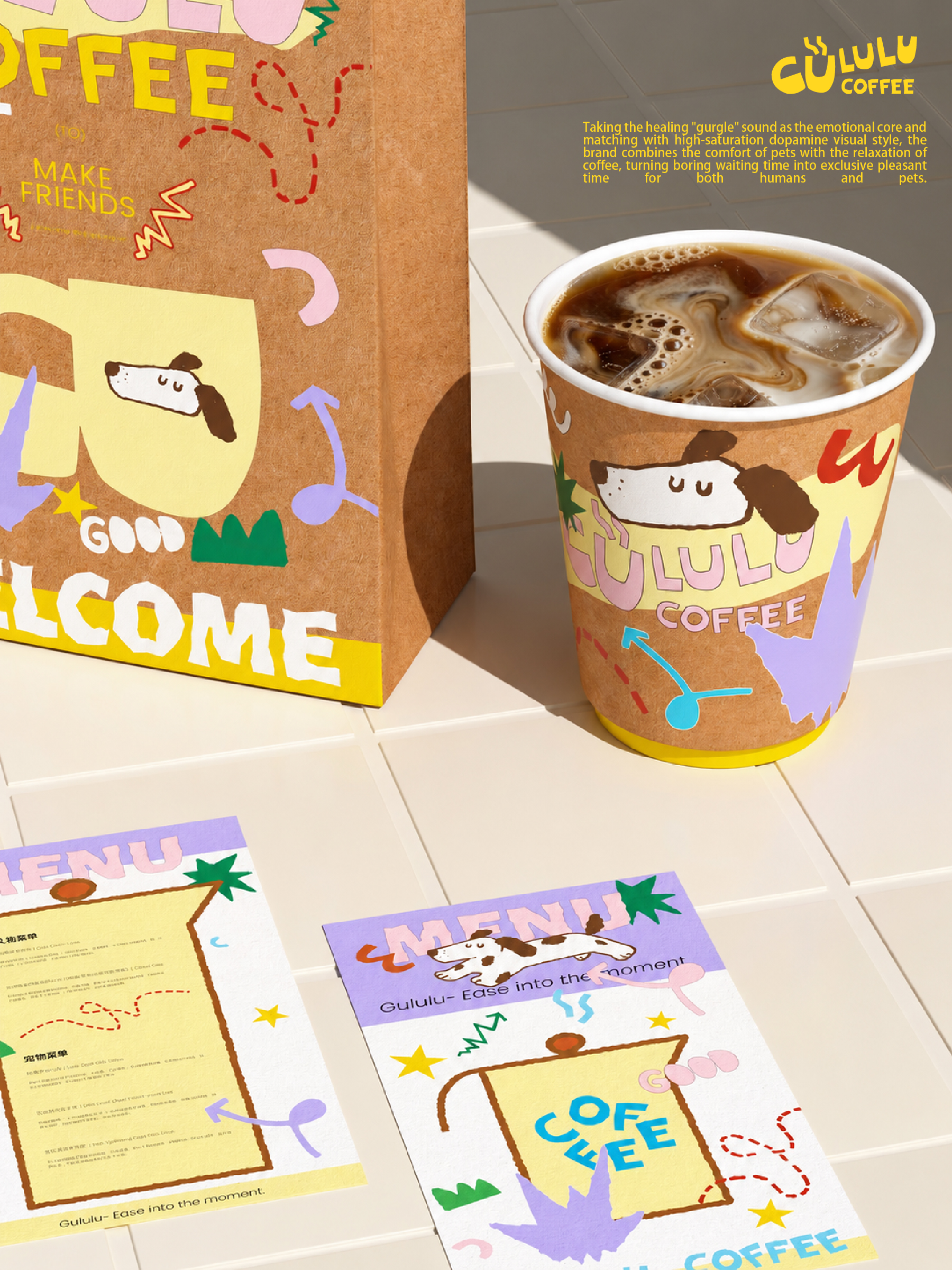
声音感 × 陪伴感 × 松弛感:一套自由明亮的视觉系统
这次包装设计围绕「声音感、陪伴感、松弛感」展开。我们没有采用传统咖啡包装常见的深色、成熟、安静路线,也没有走宠物产品中过度软萌的表达。GULULU COFFEE 更适合一种年轻、开放、轻松但不幼稚的视觉状态。
This packaging design revolves around the themes of “sensory sound, companionship, and relaxation.” We did not follow the conventional dark, mature, and quiet aesthetic typical of traditional coffee packaging, nor did we adopt the overly cute and soft expressions common in pet product designs. GULULU COFFEE is better suited for a youthful, open, and relaxed yet not childish visual style.
品牌视觉
品牌LOGO|拉近品牌距离,延续声音节奏
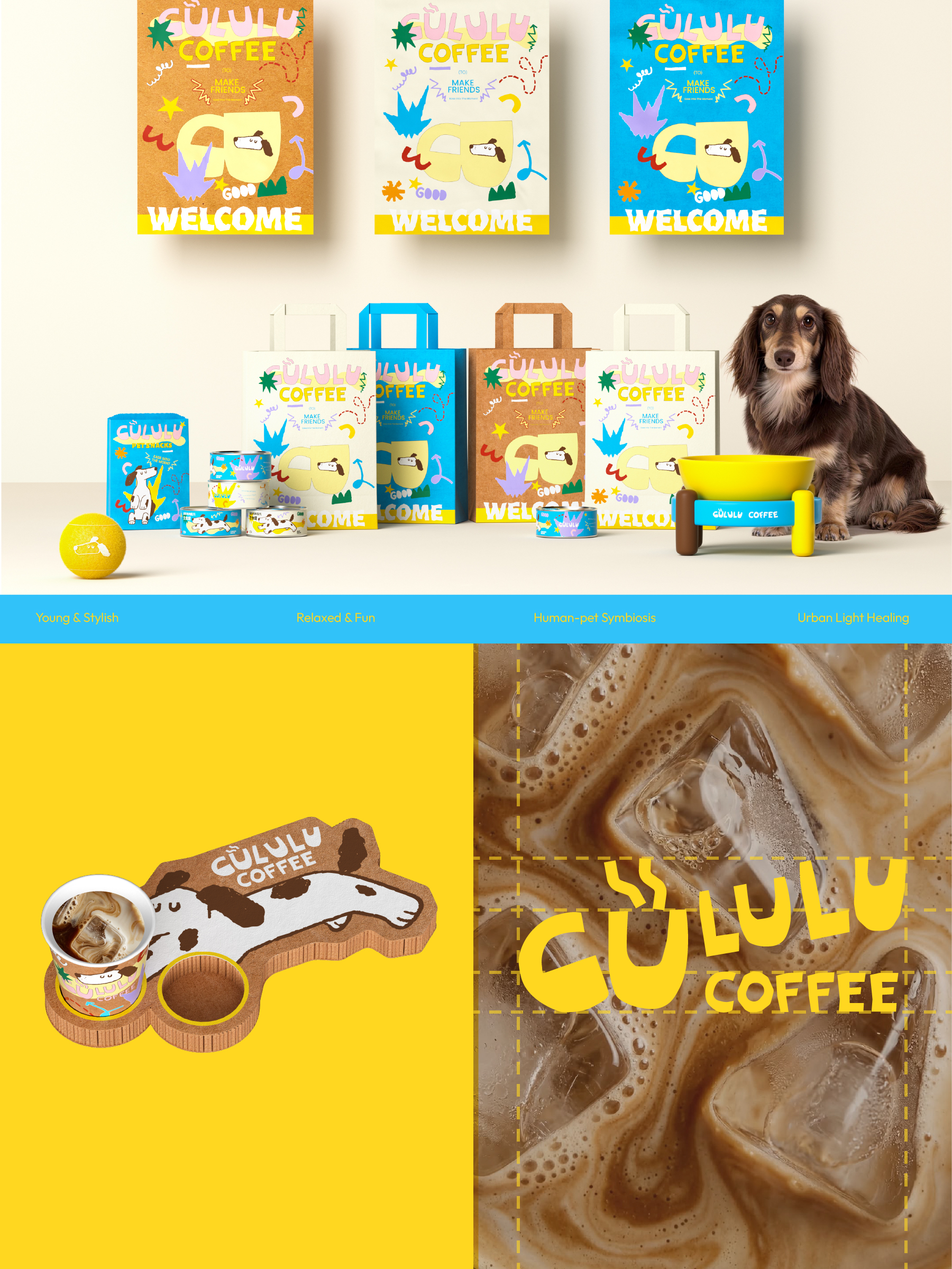
Logo 采用圆润、饱满且略带不规则的字体结构,让包装正面的品牌识别更轻快,也减少传统咖啡视觉中的距离感。字形节奏呼应 GULULU 本身的声音联想,让品牌在不同包装规格中都能保持记忆点。
品牌色彩|营造明亮轻松的人宠氛围
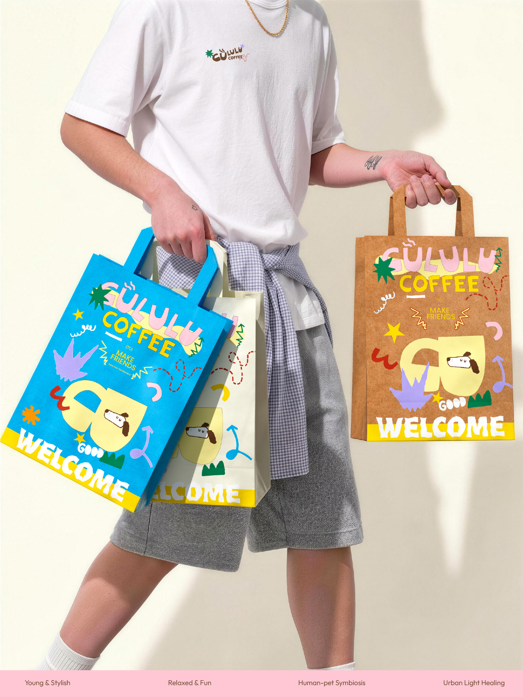
包装色彩由黄色、蓝色、粉色、紫色、绿色与牛皮纸色共同组成。高饱和色彩带来年轻、自由和愉悦的感受,牛皮纸色则连接咖啡外带与日常消费场景,让整体在活力与自然之间形成平衡。
Brand LOGO | Bring the brand closer and continue the rhythm of sound. The logo adopts a rounded, full, and slightly irregular font structure, making the brand recognition on the front of the packaging lighter and reducing the distance in traditional coffee visuals. The rhythm of the characters echoes GULULU’s own sound association, allowing the brand to maintain its memory points in different packaging specifications. Brand Color | Create a bright and relaxed pet atmosphere. The packaging color is composed of yellow, blue, pink, purple, green, and kraft paper color. High saturation colors bring a feeling of youthfulness, freedom, and pleasure, while kraft paper color connects coffee takeaway with daily consumption scenes, creating a balance between vitality and nature as a whole.
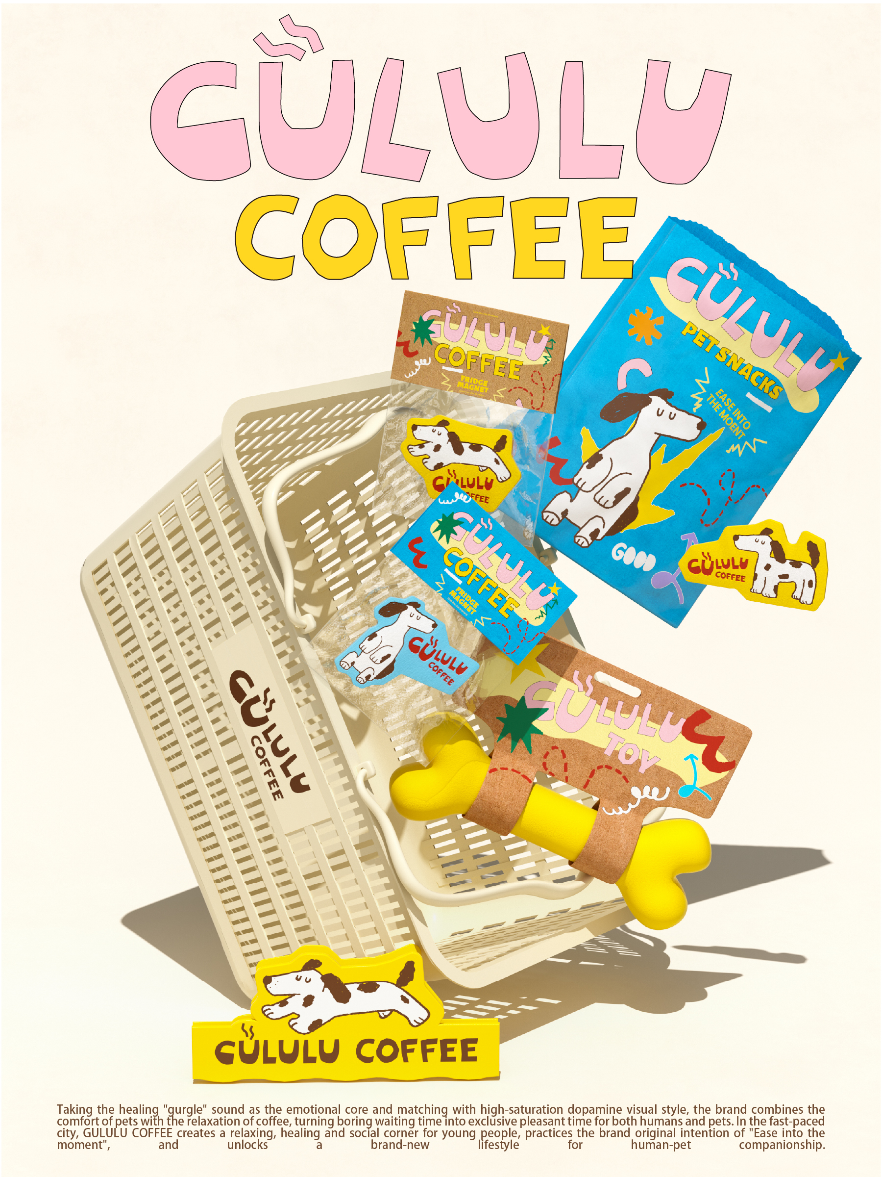
插画系统|让宠物成为画面里的自然陪伴
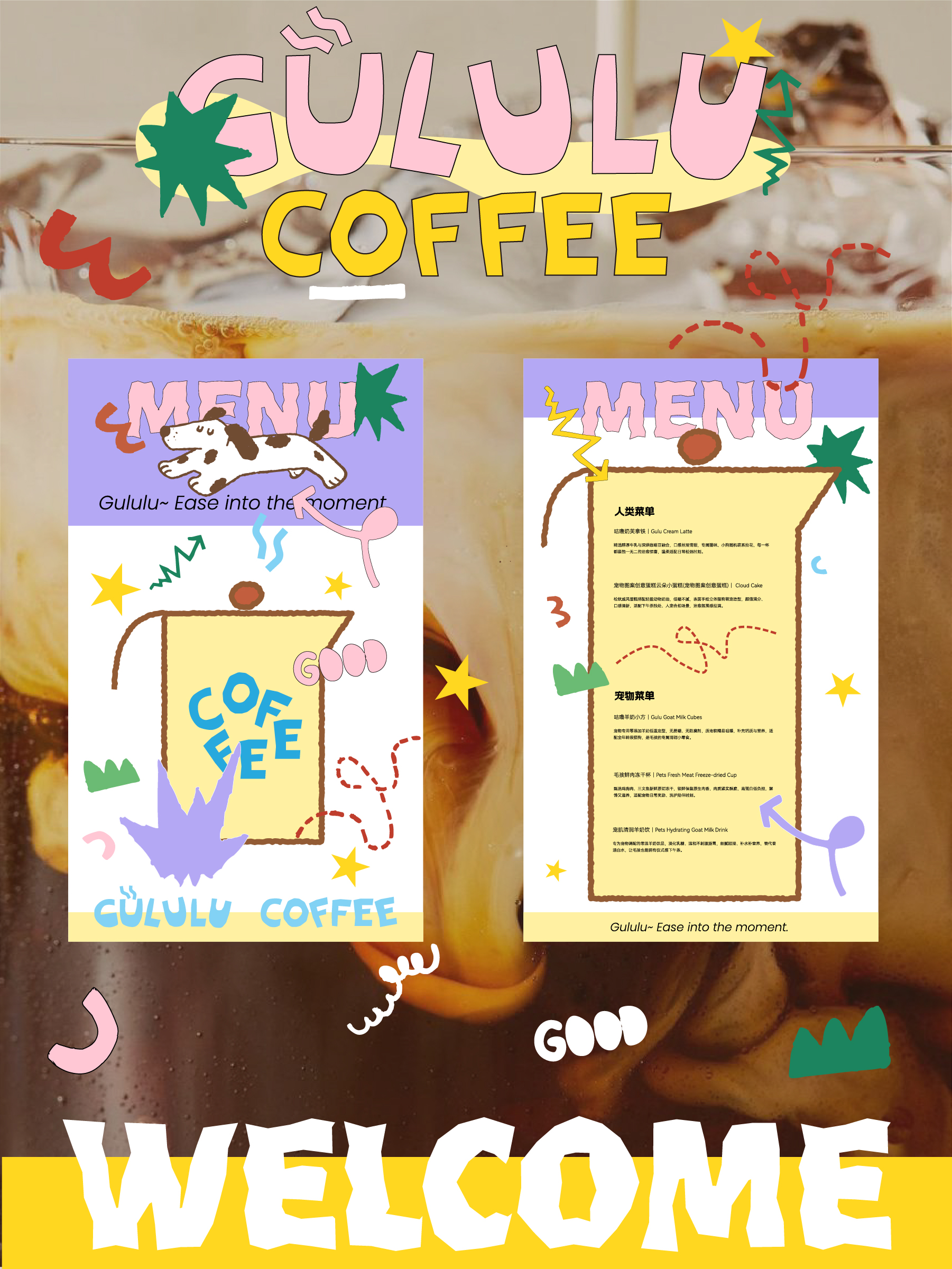
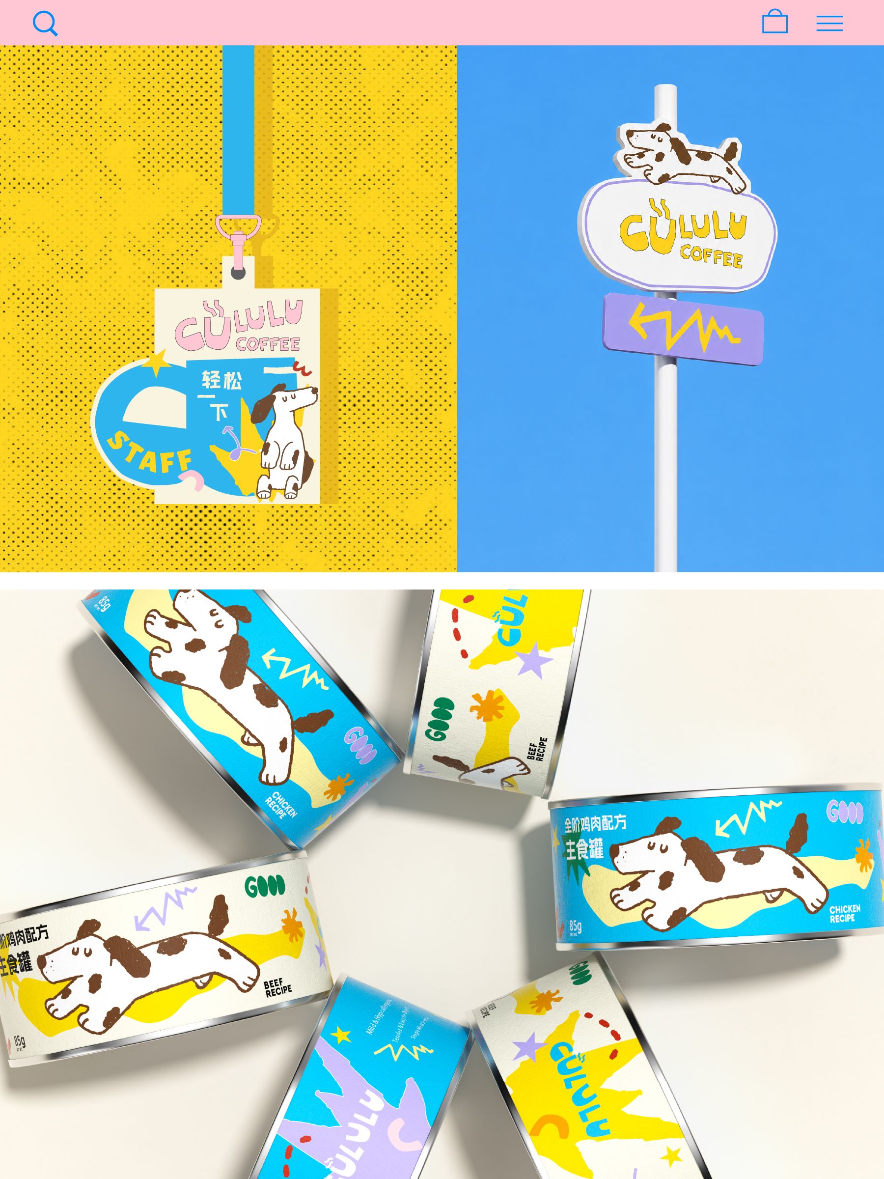
狗狗插画作为包装中的核心视觉符号,以趴着、跳跃、停留等自然状态出现。它不是被过度拟人化的吉祥物,而更像是生活场景中自然出现的伙伴。星星、箭头、波浪线、骨头、爪印等图形元素共同组成品牌视觉资产,让包装系统更有趣,也更易延展。
包装系统|在统一识别中完成多品类延展
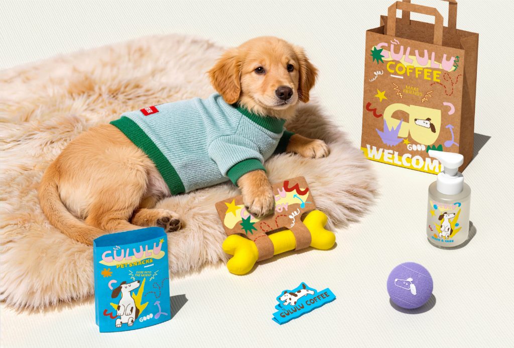
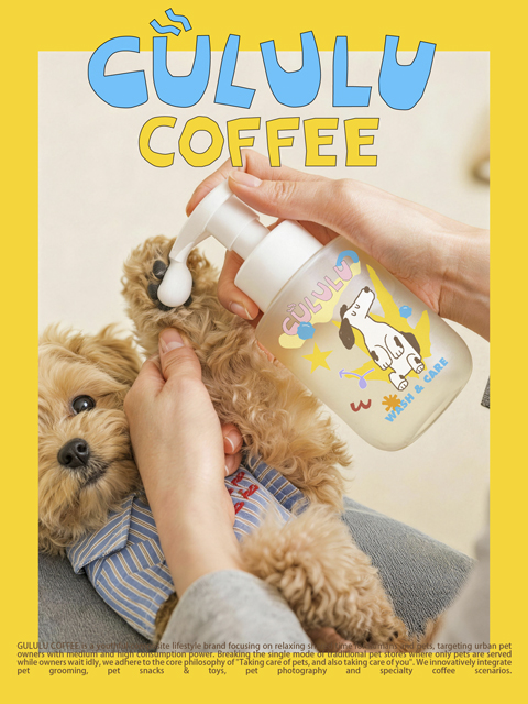
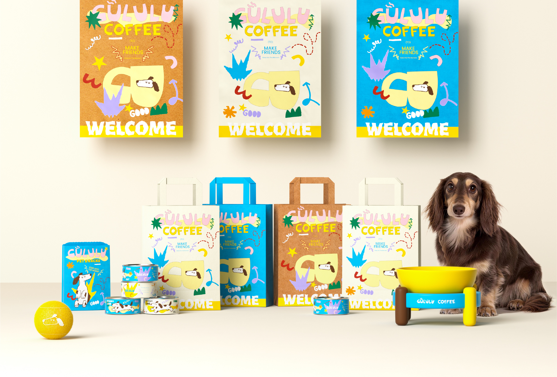
咖啡杯、手提袋、宠物零食、罐头、玩具、护理用品等不同品类,通过统一的 Logo、插画、色彩和图形规则形成关联。不同产品并不机械重复同一画面,而是在一致的视觉逻辑下保持变化,让包装既有整体识别,也能适应不同消费场景。
Illustration System | Making Pets Natural Companions in Pictures As the core visual symbol in packaging, dog illustrations appear in natural states such as lying down, jumping, and stopping. It is not an overly anthropomorphic mascot, but rather a natural companion that appears in everyday life scenes. The visual assets of the brand are composed of graphic elements such as stars, arrows, wavy lines, bones, and paw prints, making the packaging system more interesting and easily extensible. Packaging System | Achieving Multi Category Extension in Unified Identification Different categories such as coffee cups, handbags, pet snacks, canned goods, toys, and care products are associated through unified logos, illustrations, colors, and graphic rules. Different products do not mechanically repeat the same image, but maintain changes under a consistent visual logic, allowing packaging to have both overall recognition and adapt to different consumer scenarios.
NiiceDesign x GULULU COFFEE
“咕噜咕噜,轻松一下”