

NiiceDesign x 「MOSAÏQUE 」|艺术香氛品牌视觉设计
香氛赛道的审美同质化困境
近年来,国内香氛市场迅速扩张,各类主打植物香气、生活方式与极简美学的品牌层出不穷。然而,在香调叙事趋同、植物元素包装高度同质化的行业背景下,大多数香氛品牌的视觉表达陷入了“看起来都很像”的困境。对于追求独特审美的年轻消费者而言,香氛产品正逐渐从“功能性气味商品”向“个人审美与态度表达”转变。品牌能否通过视觉语言传递出超越产品本身的独特气质,成为能否在赛道上被消费者记住的关键所在。
In recent years, the domestic fragrance market has rapidly expanded, and various brands that focus on plant fragrance, lifestyle, and minimalist aesthetics have emerged one after another. However, in the context of the convergence of fragrance narrative and high homogenization of plant element packaging, the visual expression of most fragrance brands has fallen into the dilemma of “looking very similar”. For young consumers who pursue unique aesthetics, fragrance products are gradually shifting from “functional scent products” to “personal aesthetic and attitude expression”. Whether a brand can convey a unique temperament beyond the product itself through visual language becomes the key to being remembered by consumers on the track.
策略定位:捕捉植物生长的内在反差
品牌定位:一个以“人宠共处”为核心价值的生活方式咖啡品牌。产品载体:围绕咖啡饮品、宠物零食、宠物玩具、护理用品、品牌周边与线下空间展开,通过包装系统建立不同品类之间的视觉关联。价值主张:咕噜咕噜,轻松一下。Ease into the moment。消费场景:覆盖遛宠休息、咖啡外带、宠物社交、日常补给和轻松分享等年轻宠物主的高频生活场景。在紧凑的城市节奏里,为人和宠物提供一个可以短暂停下、自然靠近、轻松回血的日常片刻。
Brand positioning: A lifestyle coffee brand with “coexistence of people and pets” as its core value. Product carrier: Centered around coffee drinks, pet snacks, pet toys, care products, brand peripherals, and offline spaces, establish visual connections between different categories through packaging systems. Value proposition: Gulu Gulu, relax a bit. Ease into the moment。 Consumer scenarios: covering high-frequency life scenarios for young pet owners, such as taking pets for rest, taking out coffee, socializing with pets, daily supplies, and easy sharing. In the tight city rhythm, provide a brief moment of daily life for people and pets to pause, naturally approach, and easily replenish blood.
视觉系统构建:外部克制与内部张扬的统一
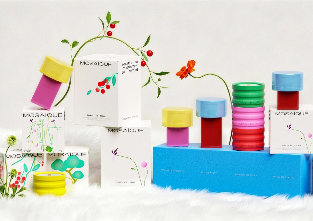
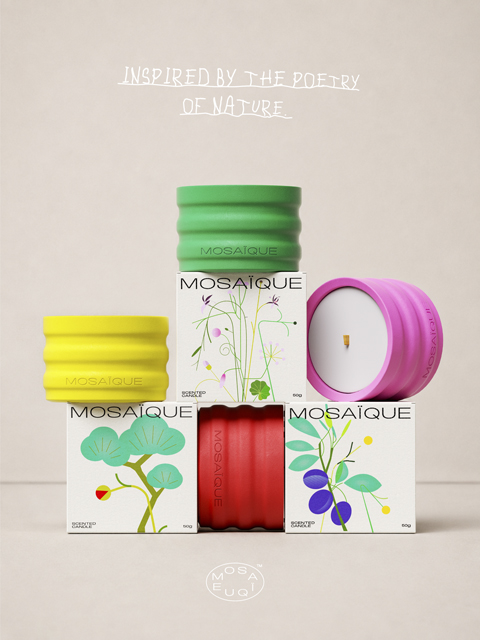
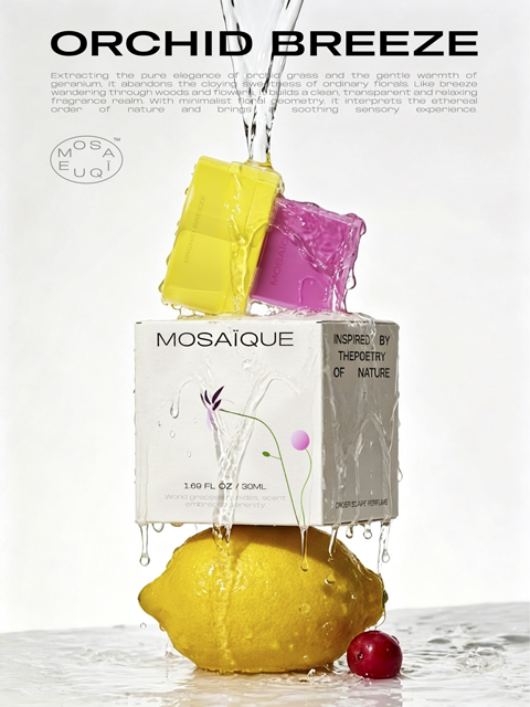
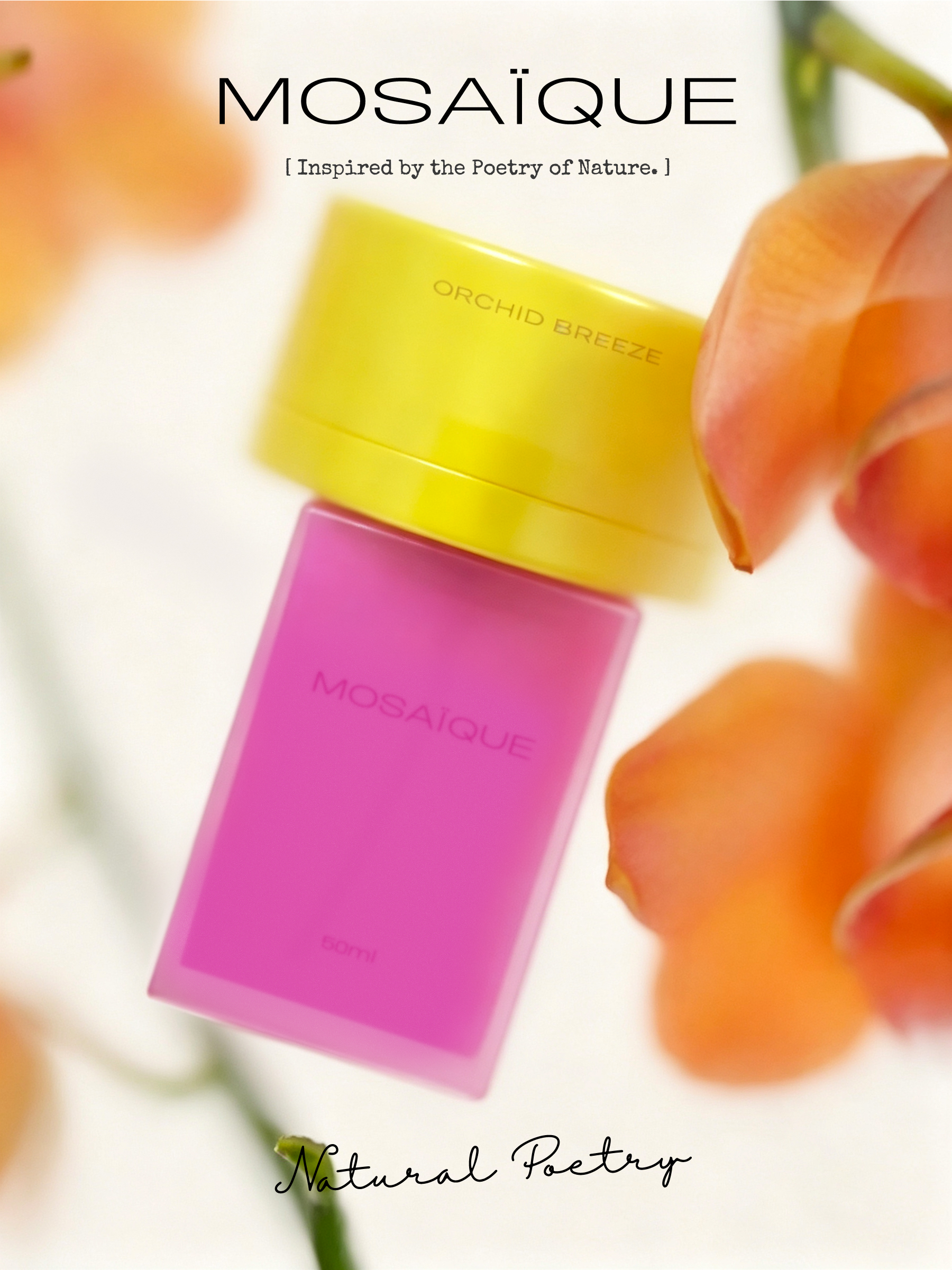
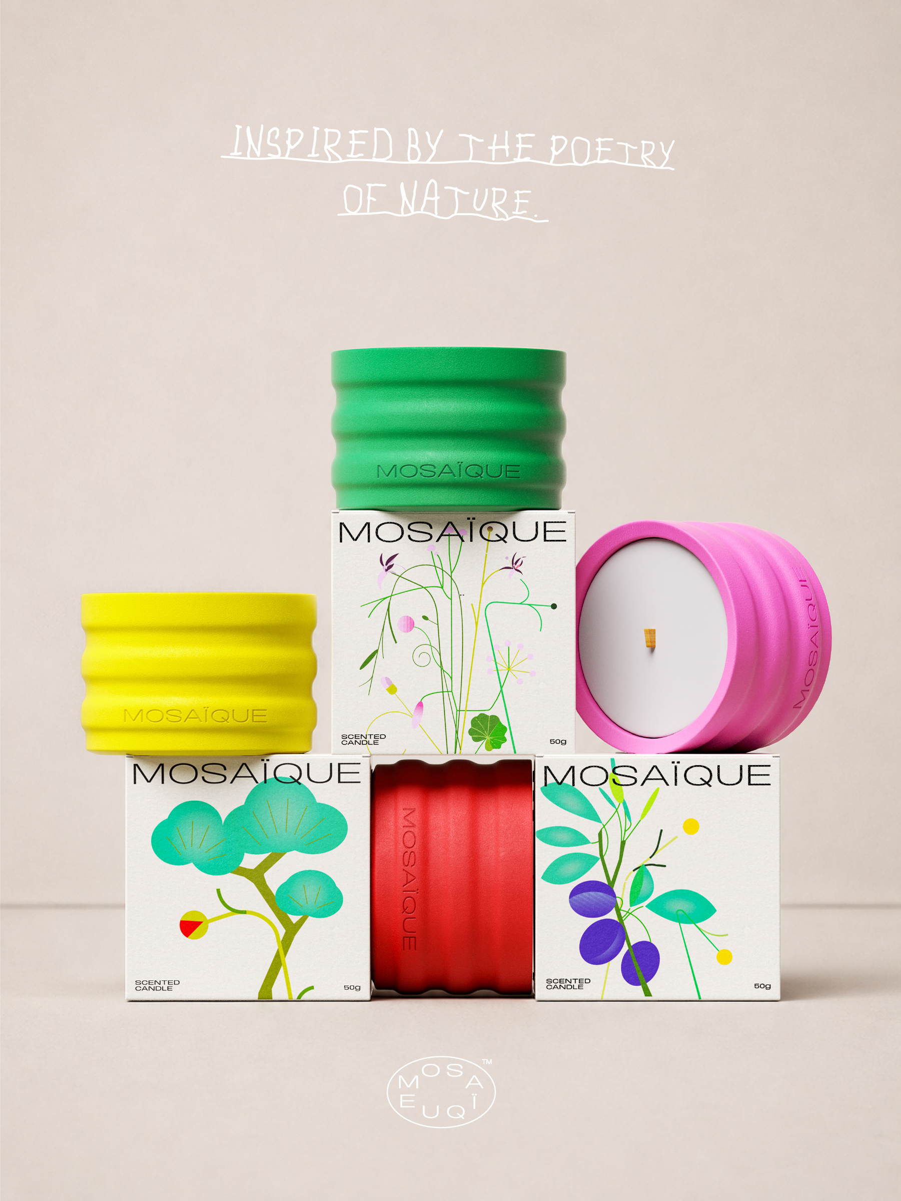
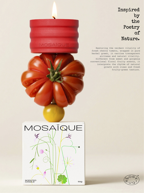
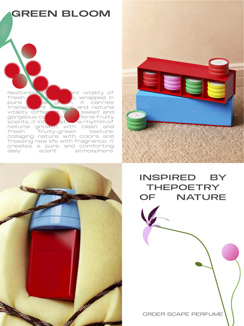
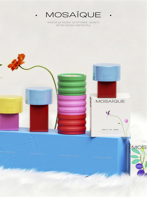
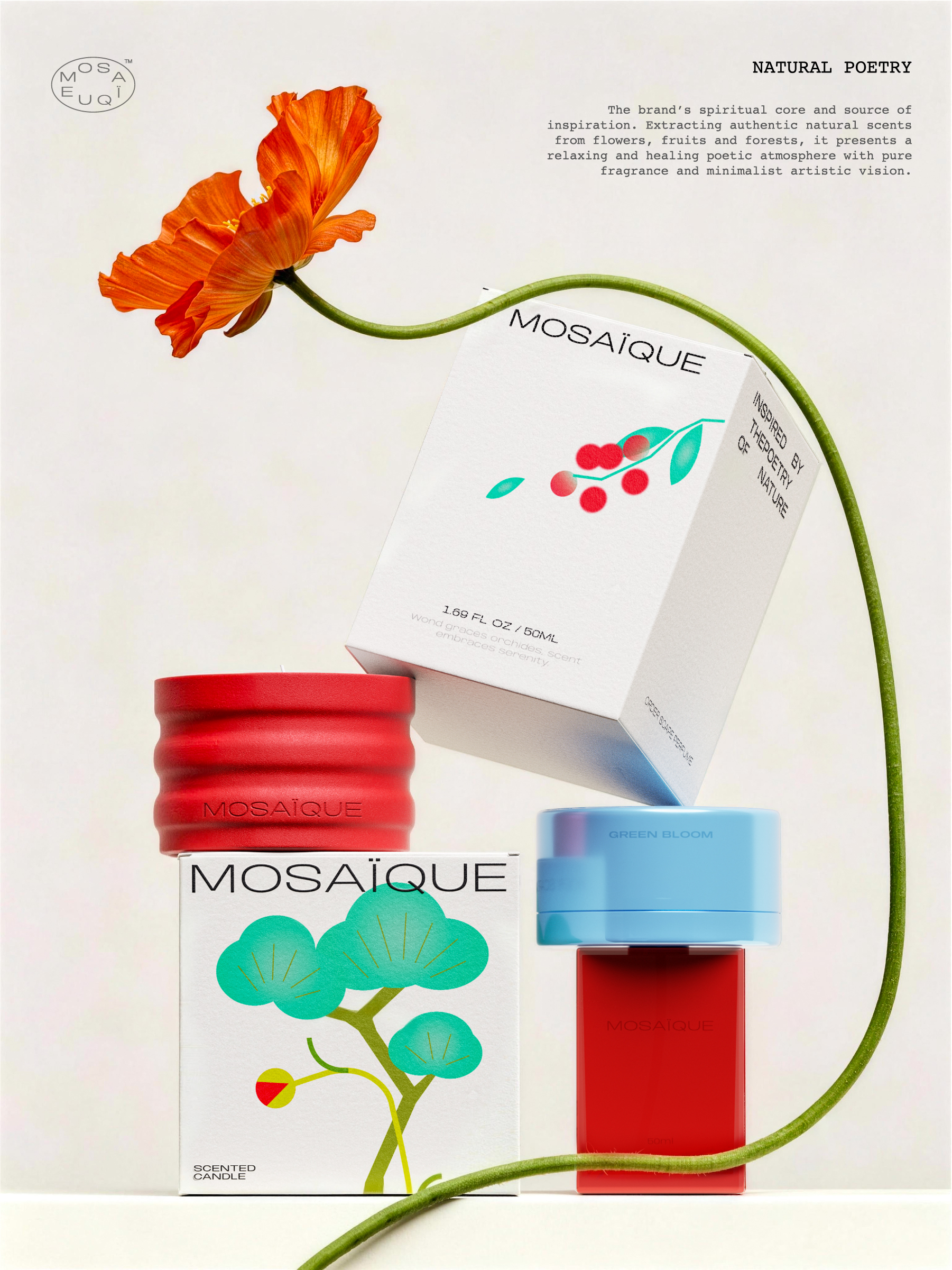
在视觉表达上,我们围绕“外在安静克制,香气内里热烈生长”的对比,构建了一套具有视觉层次的品牌识别系统。外包装视觉(克制与诗意):外包装采用大面积留白,以克制、轻盈的视觉语言为主。藤蔓与花卉图形如同自然生长般自由舒展,传达出自然的呼吸感与品牌静谧的诗意底色。瓶身设计(张扬与现代):与外部留白形成鲜明对比,内部瓶身采用高饱和色彩与撞色搭配。在统一的结构体系下,每一款香型都具有独立且鲜明的色彩印记,强化品牌现代艺术的定位与高识别度。系统延展:该套视觉体系贯穿品牌包装、瓶身与终端物料,在同一品牌框架下,呈现“外在安静克制,香气内里热烈生长”的视觉反差,建立起独特的品牌美学。
In terms of visual expression, we have constructed a brand identity system with visual hierarchy around the contrast of “external quietness and restraint, while fragrance grows vigorously inside”. Outer packaging visual (restraint and poetry): The outer packaging uses large areas of white space, with a visual language of restraint and lightness as the main focus. The vines and floral patterns stretch freely like natural growth, conveying a natural sense of breathing and the poetic background of the brand’s tranquility. Bottle body design (bold and modern): In sharp contrast to the external white space, the internal bottle body adopts high saturation colors and contrasting colors. Under a unified structural system, each fragrance has an independent and distinct color imprint, strengthening the brand’s modern art positioning and high recognition. System extension: This visual system runs through the brand packaging, bottle body, and terminal materials, presenting a visual contrast of “external quietness and restraint, aroma growing vigorously inside” within the same brand framework, establishing a unique brand aesthetic.
NiceDesign x MOSAÏQUE
“Inspired by the Poetry of Nature 灵感源于自然诗意”