

敖叶堂丨中医养生推拿馆
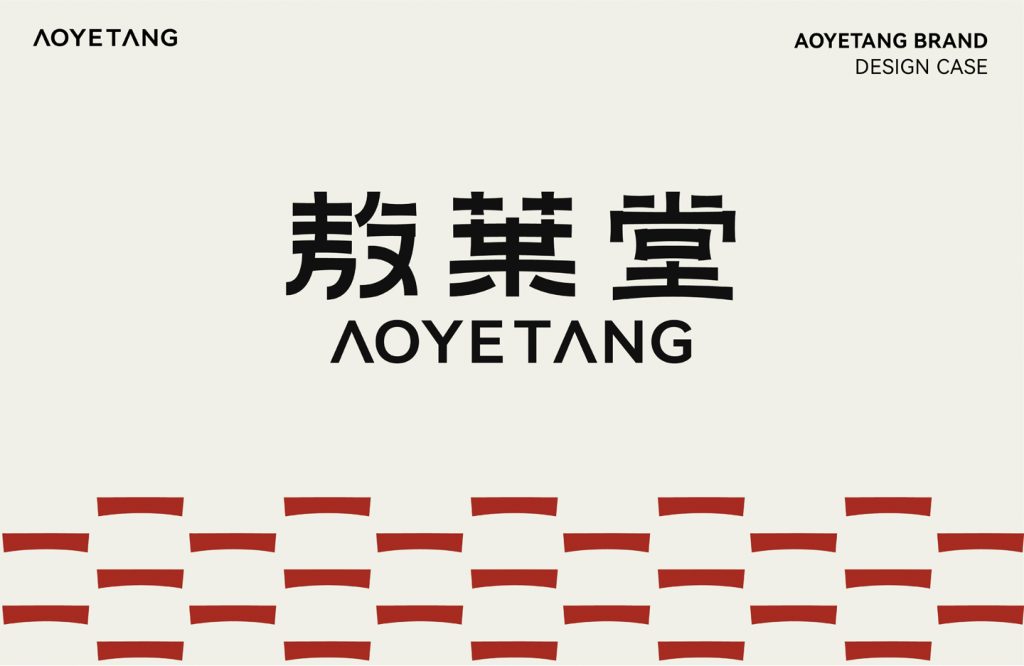
敖叶堂
品牌定位:中医养生推拿馆
项目内容:视觉策略 /品牌VI设计/ 包装设计
敖叶堂是面对当代年轻人集推拿休闲于一体的新中式推拿馆。以“内外同调,药食同源”为宗旨,找寻中药文化中所蕴藏的养生智慧。运用“按、沉、点、振、擦”深层激活身体能量,缓解久坐疲劳。
Aoyetang is a new Chinese massage parlor that integrates massage and leisure for contemporary young people.With the purpose of “harmony between inside and outside, medicine and food
come from the same source”, we look for the health wisdom contained in the traditional Chinese medicine culture. Use “press, sink, point, vibrate and rub” to deeply activate body energy and relieve fatigue from prolonged sitting.
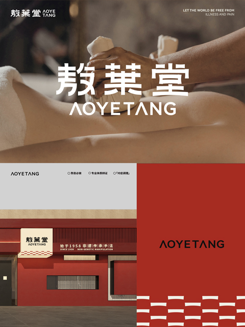
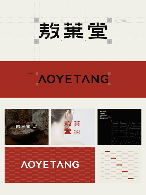
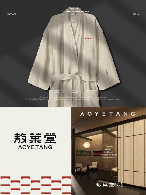
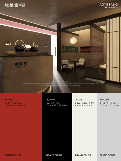
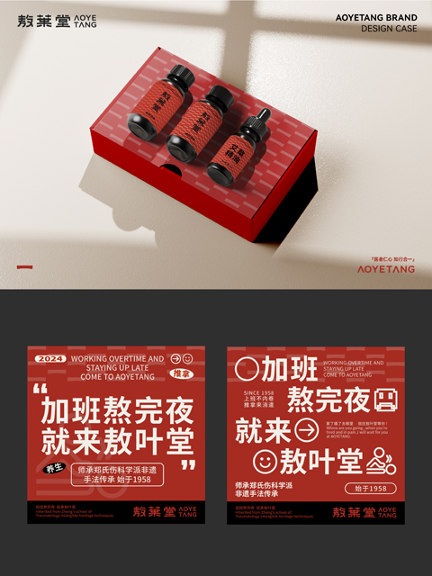
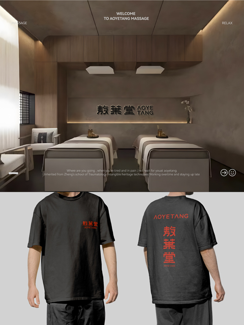
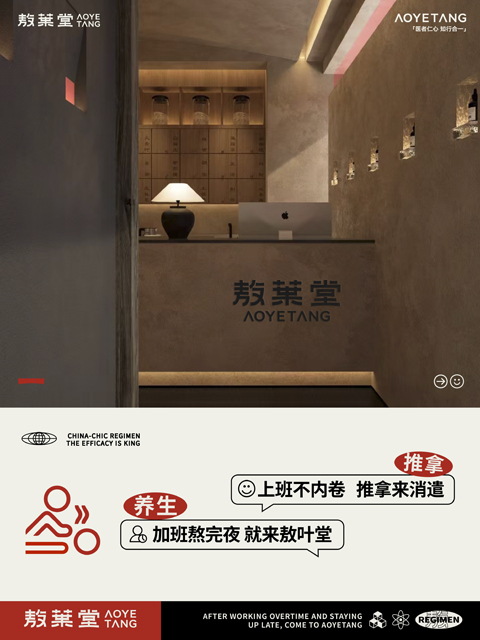
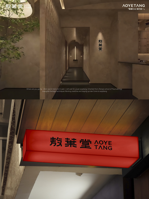
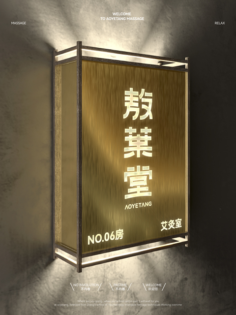
logo设计选择隶书作为参考,隶书体承载了中华五千年的美学传承,再从品牌空间风格中,提取出瓦的结构,进行艺术化的创作处理。使字体的结构和细节传承了中式美学。提炼红白双色渐变成为主题色调,暖而倾心,中式又新古典,搭配中式建筑中“瓦”元素底纹营造新中式简而不繁的品牌感。
The logo design uses official script as a reference. The official script carries China’s five thousand years of aesthetic heritage. From the brand space style, the tile structure is extracted and artistically created. The structure and details of the font inherit Chinese aesthetics.The red and white
two-color gradient is refined into the theme color, which is warm and charming, Chinese style and neo-classical. It is combined with the “tile” element shading in Chinese-style architecture to create a new Chinese-style simple but not complicated brand feel.