

CRUSH HUB丨烘焙品牌VI设计
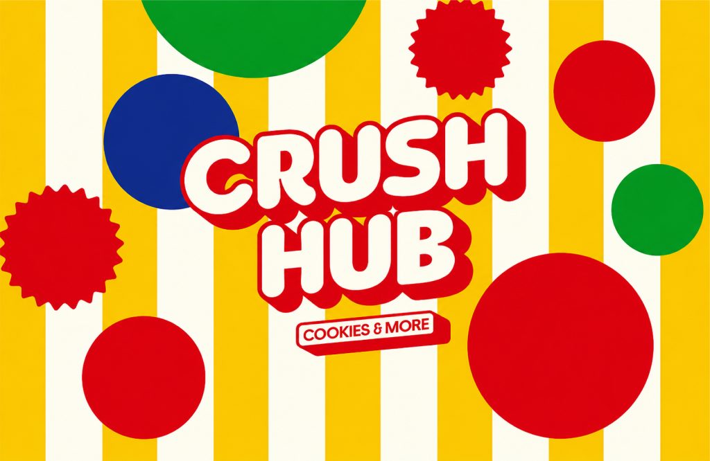
CRUSH HUB
品牌定位:烘焙品牌
项目内容:视觉策略/品牌VI设计/包装设计
CRUSH HUB是一个以Fun为根基的,融合风格烘焙甜点店,主打产品软曲奇,主张Bake FUN goods for good.保持对世间的一腔热情,给大家来好玩、有趣、有爱的风味曲奇
CRUSH HUB is a fusion style bakery and dessert shop based on Fun. It specializes in soft cookies and advocates Bake FUN goods for good. It maintains its passion for the world
and provides everyone with fun, interesting and loving flavored cookies.
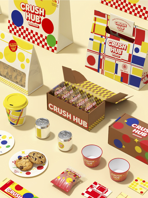
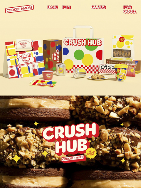
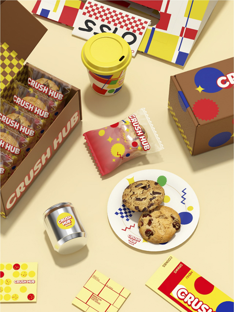
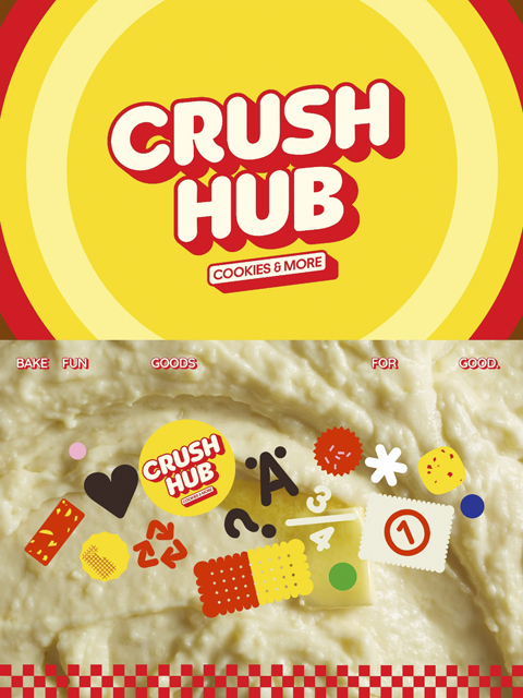
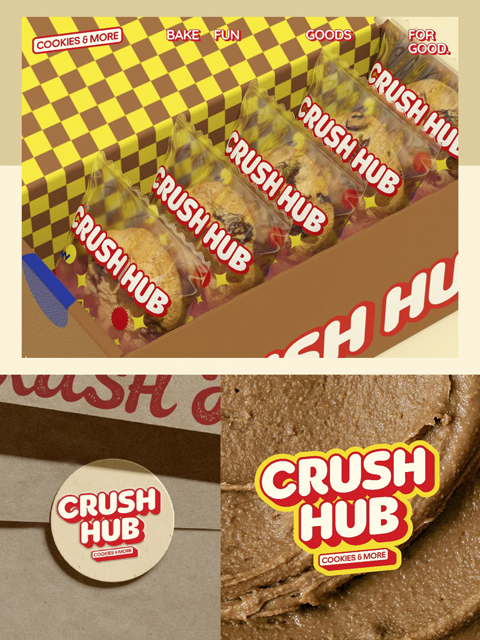
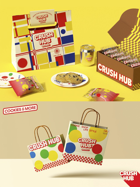
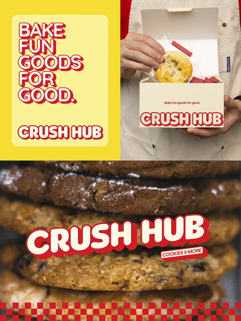
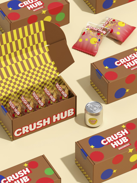
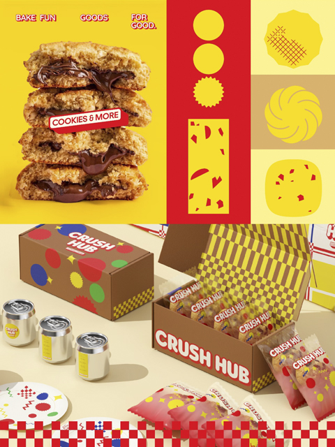
在品牌标识设计以连贯的笔画表现出温暖的质感与温和的个性,品牌名中’CRUSH’配合油印风格而产生的噪点,在表现了手作亲和力的同时,也赋予了品牌独特的记忆点。基于孟菲斯风格的核心视觉,我们将曲奇上的巧克力豆–波点元素进行重组拼贴,创造出趣味、独特的咖啡品牌视觉。就像Crush Hub的名字一样,是寓意任何Crush 或Crushed 时刻,我们都可以用食物和大家连结,陪大家一直走下去。
The brand logo design uses coherent strokes to express a warm texture and gentle personality. The noise generated by the ‘CRUSH’ in the brand name combined with the mimeograph style not only expresses the affinity of handcrafting, but also gives the brand a unique memory point. Based on the core vision of Memphis style, we reorganized and collaged the chocolate beans-polka dot elements on the cookies to create an interesting and unique coffee brand vision. Just like the name of Crush Hub, it means that at any Crush or Crushed moment, we can use food to connect with everyone and keep going with everyone.