

锦城造物丨城市伴手礼品牌
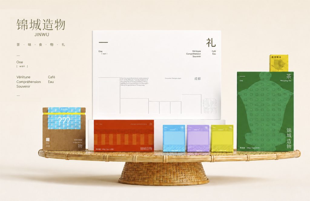
锦城造物
品牌定位:城市伴手礼
项目内容:视觉策略 /品牌VI设计/ 包装设计
一座城市真正让人想念的,从来不是某一个景点,而是某一种生活的质感。
What truly makes a city memorable is never a single landmark, but the unique texture of life it offers.
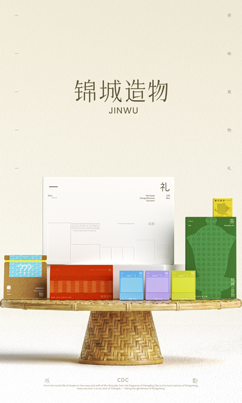
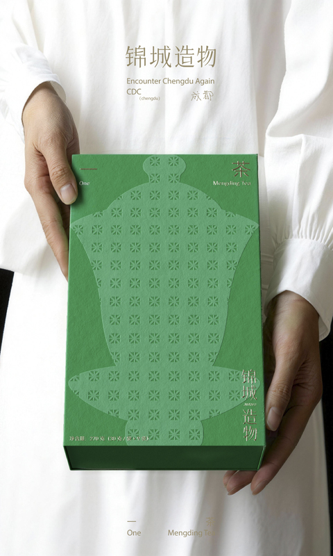
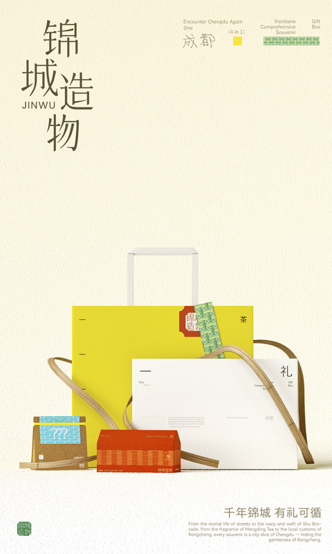
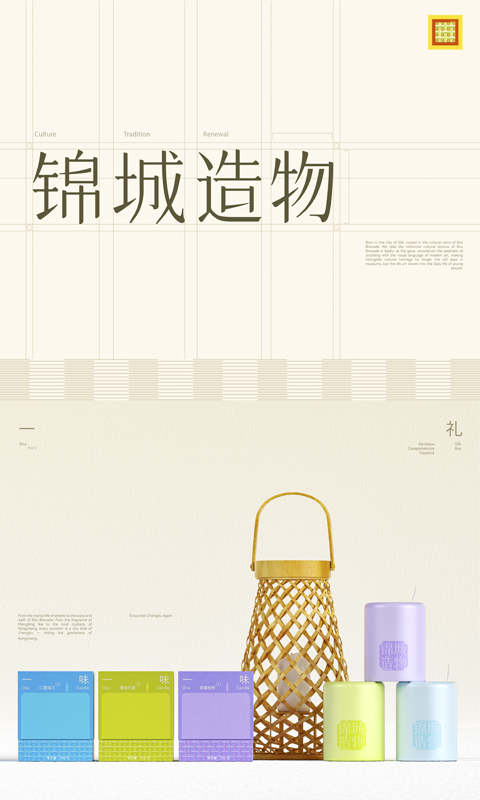
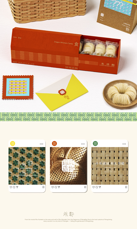
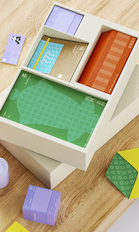
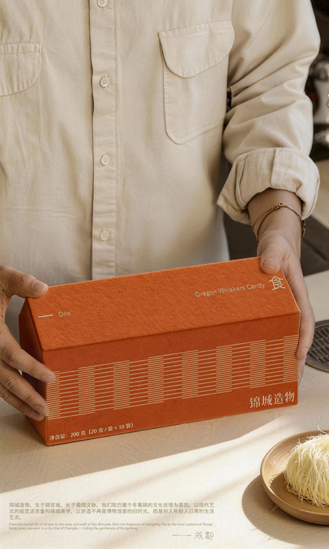
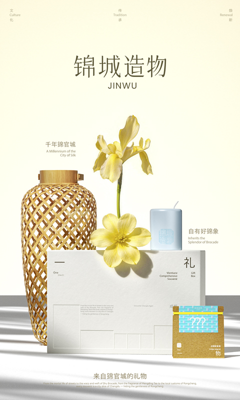
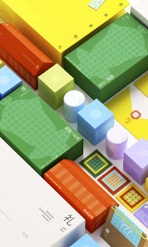
我们以“锦官城”的千年文化为底色,选择蜀锦作为品牌文化,将其“经纬秩序”转译为可延展的视觉DNA;并融合竹编肌理与盖碗茶等城市生活方式意象,用更克制、更年轻的当代表达,重构“来自锦官城的伴手礼”。在品类结构上,以“茶礼/食礼/香礼/蜀锦文创/锦城手册”搭建城市伴手礼矩阵,覆盖自用与礼赠多场景,让“何以一礼代表成都”有迹可循。品牌以竹绿与暖金定调气质,以高纯度色块区分系列,用统一规则串联全系,呈现“松弛但有秩序”的成都。
We take the millennium culture of “Jinguan City” as the background, choose Shu brocade as the brand culture, and translate its “latitude and longitude order” into an extensible visual DNA; And integrate the texture of bamboo weaving with urban lifestyle imagery such as tea bowls, using a more restrained and youthful contemporary expression to reconstruct the “souvenir from Jinguan City”. In terms of category structure, a matrix of urban souvenirs will be built with “Tea Gifts/Food Gifts/Incense Gifts/Shu Brocade Cultural and Creative/Jincheng Handbook”, covering multiple scenarios of self use and gift giving, so that the question of “how one gift represents Chengdu” can be traced.