

缦作丨养生花茶包装设计
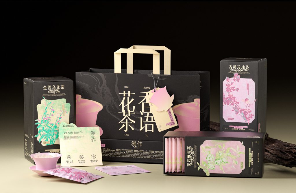
缦作
品牌定位:茶叶包品牌
项目内容:视觉策略 /品牌VI设计/ 包装设计
缦作,一家致力于为Z世代带来既有仪式感又便携的轻养生茶饮品牌。品牌从《本草纲目》汲取灵感,以天然花卉为原料,现代工艺精心调配,保留了古法花卉养生哲学的同时,又以新中式美学为消费者带来独特的体验。
Manzuo is a brand dedicated to bringing a ceremonial and portable light health tea brand to Generation Z. The brand draws inspiration from the “Compendium of Materia Medica”, uses natural flowers as raw materials
and carefully blends them with modern technology. While retaining the ancient flower health philosophy, it also brings a unique experience to consumers with new Chinese aesthetics.
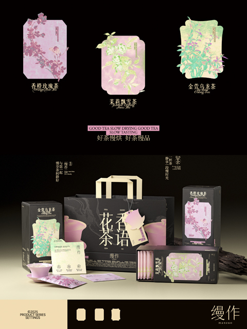
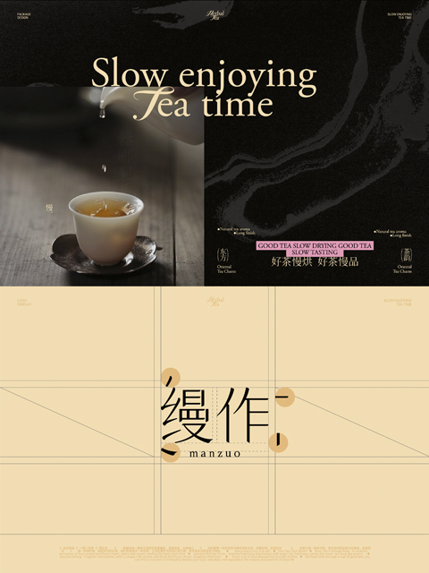
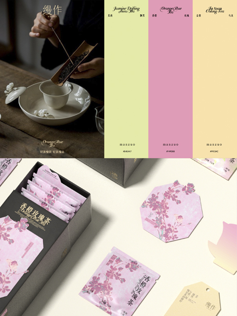
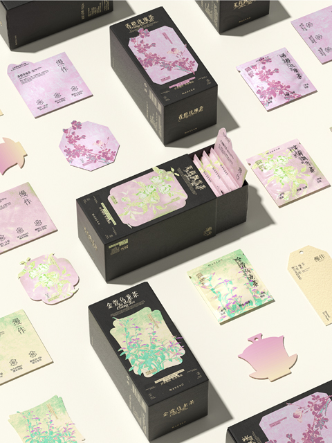
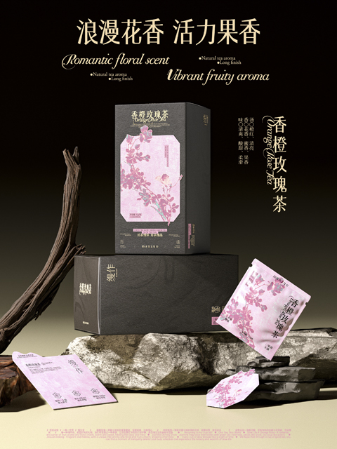
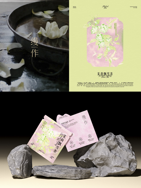
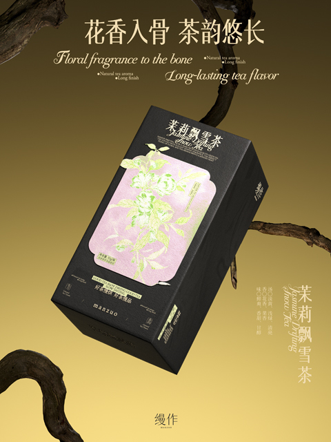
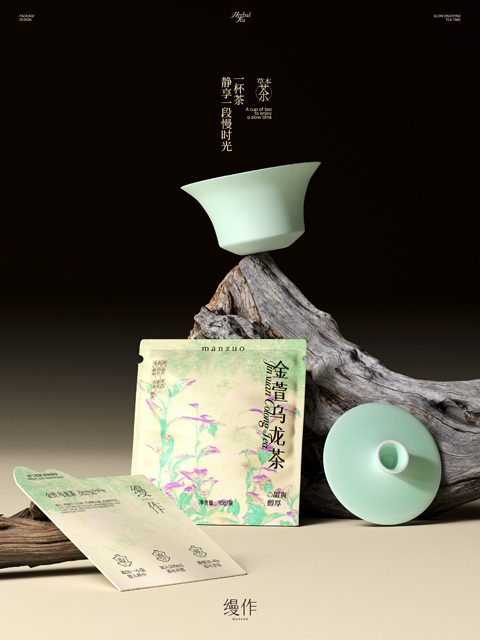
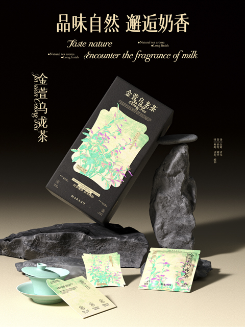
我们基于对市场规模现状、消费者群体变化等深度调研,发现为了规避“同质化”问题,养生花茶品牌越来越重视文化调性的塑造、包装的设计升级——融合传统与现代美学、提升便携性成为主要趋势。设计过程中,我们用当代设计手法去呈现中式韵味。不同于传统的中式品牌常用的莫兰迪色系,我们选用黑色与高饱和度的色系碰撞搭配,融入笔触细腻的花卉插画,在穿插以宋体变形的文字设计,所有设计元素构成了梦幻绮丽的画面,既有保留传统东方韵味,又能找到当代亚文化的影子。
Based on in-depth research on the current market size and changes in consumer groups, we found that in order to avoid the “homogenization” problem, health-preserving scented tea brands are paying more and more attention to the shaping of cultural tone and packaging design upgrades – integrating traditional and modern aesthetics and improving portability have become the main trends. During the design process, we used contemporary design techniques to present Chinese charm. Different from the Morandi color system commonly used by traditional Chinese brands, we chose the collision and matching of black and high-saturation colors, integrated floral illustrations with delicate brushstrokes, and interspersed text designs with deformed Song fonts. All design elements constitute a dreamy and beautiful picture, which not only retains the traditional oriental charm, but also finds the shadow of contemporary subculture.