

Nex丨旅行箱品牌
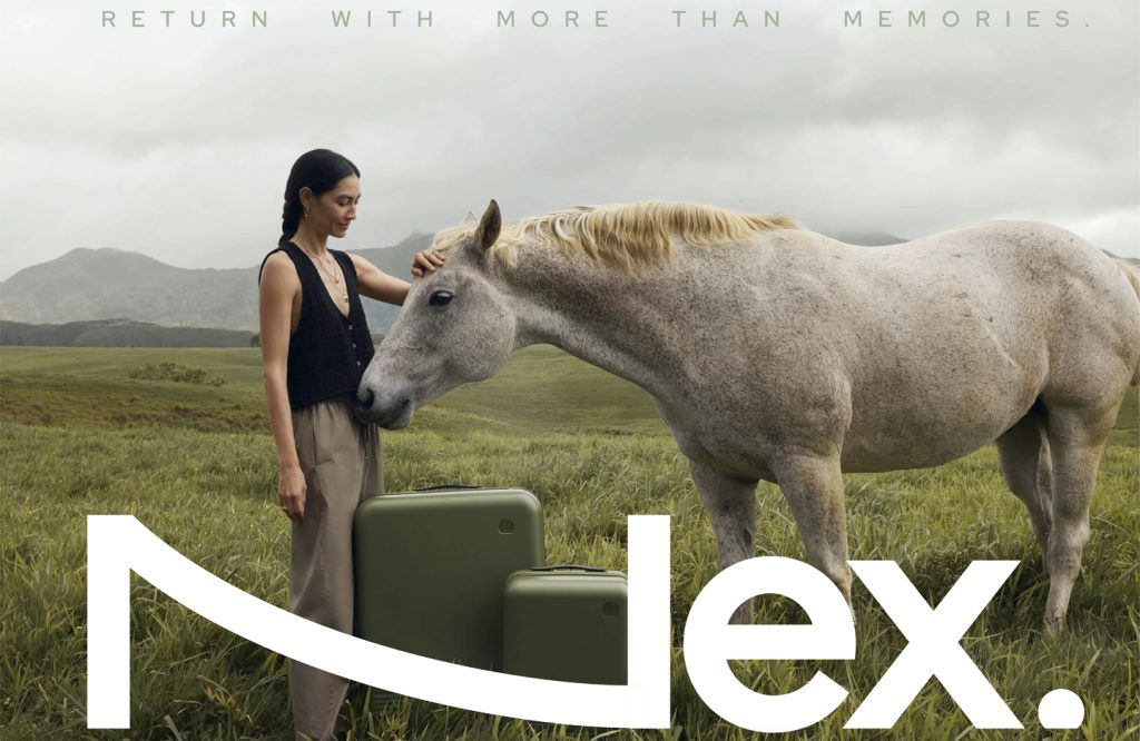
Nex
品牌定位:旅行箱品牌
项目内容:视觉策略 /品牌VI设计/ 包装设计
在为NEX品牌塑造的核心部分的策略板块中,我们完成了对于品牌定位的梳理、产品策略的梳理、品牌故事和精神的撰写等;在设计板块中,我们重新设计了品牌的字型标识、构建了全新的视觉识别系统和包装系统、搭建品牌的色彩体系、并也正在设计电商的内容逻辑和视觉规范、全新的品牌官网体验等等。
In the strategy section, which is the core part of the NEX brand building, we have completed the sorting out of brand positioning, product strategy, brand story and spirit writing, etc.; in the design section, we have redesigned the brand’s font logo, built a new visual identity system and packaging system, established the brand’s color system, and are also designing the content logic and visual specifications of e-commerce, a new brand official website experience, etc.
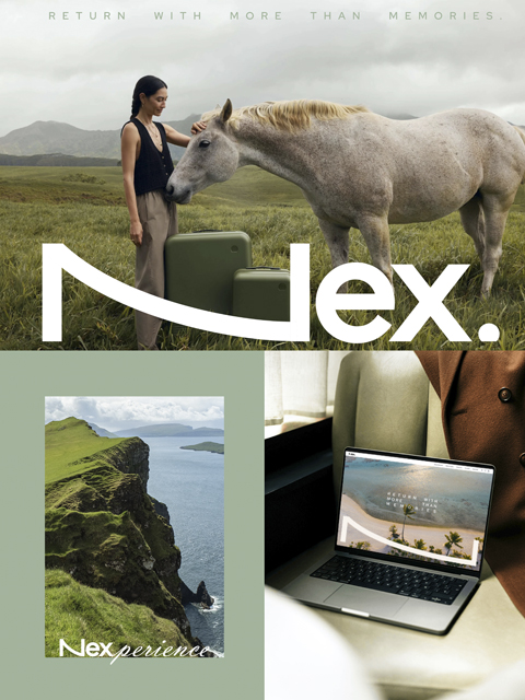
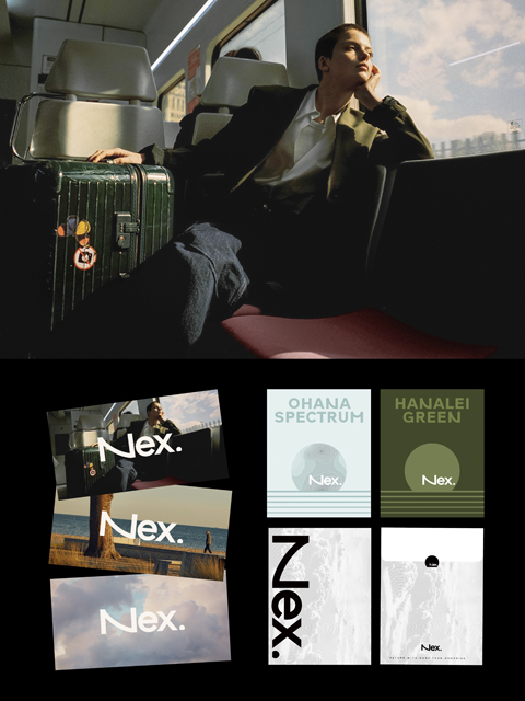
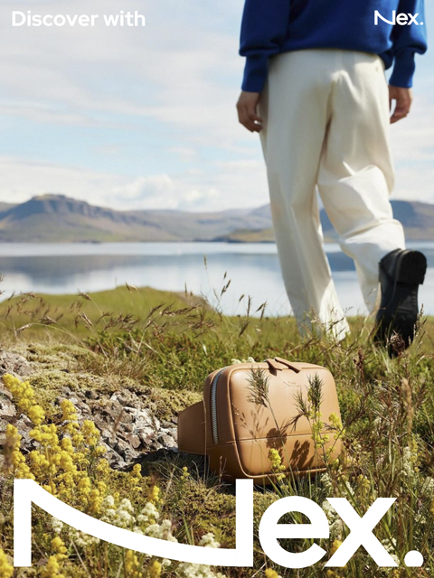
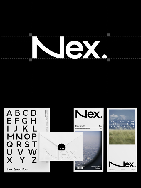
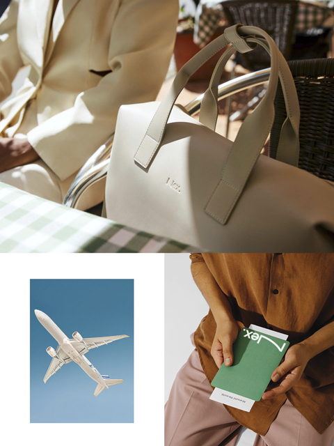
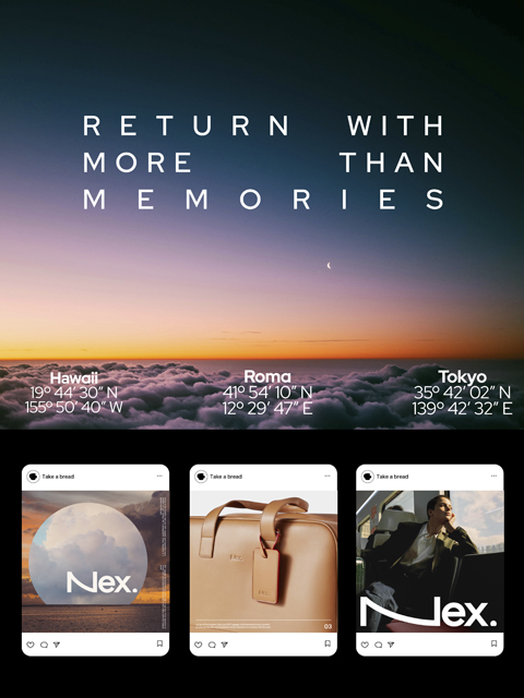
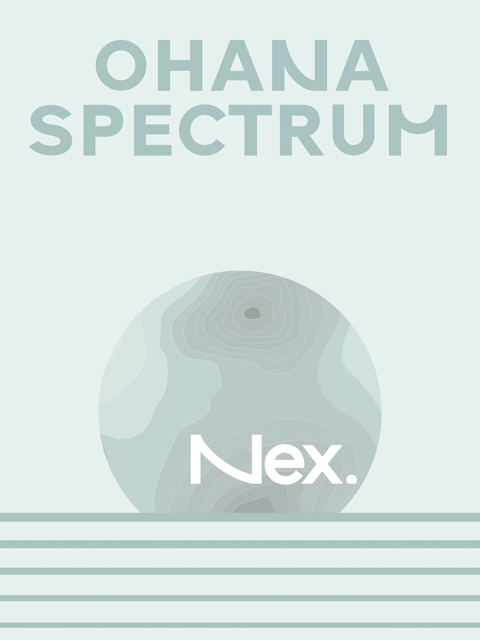
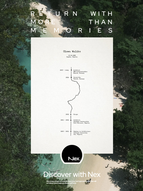
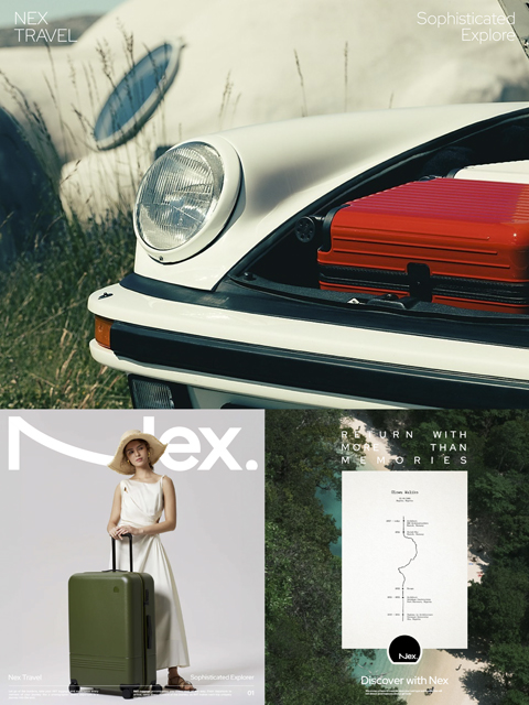
Nex品牌的设计在功能性和装饰性之间取得了完美的平衡,旨在打造一个既美观又实用的产品。行李箱整洁的线条突显了每件产品的质感工艺和对细节的关注。品牌名称后缀的点状符号是对飞机舷窗外地平线景色的隐喻,这一小小的细节象征着每一位旅行者所面对的无限可能和冒险。品牌字体设计简洁现代,体现了品牌对简约与优雅的追求。标志中的字母“N”特别具有变化性,可以根据不同的情境进行拉长或调整,传达了无限的潜力和适应性。设计灵感源自于自然景象,如蔚蓝的天空、蜿蜒的海岸线以及旅途中朦胧的回忆,将每一件产品都注入了探索和旅行的情感。
The design of the Nex brand strikes a perfect balance between functionality and decoration, aiming to create a product that is both beautiful and practical. The clean lines of the luggage highlight the textured craftsmanship and attention to detail that go into each product. The dotted symbol at the suffix of the brand name is a metaphor for the horizon view outside the airplane window. This small detail symbolizes the infinite possibilities and adventures that every traveler faces. The brand font design is simple and modern, reflecting the brand’s pursuit of simplicity and elegance. The letter “N” in the logo is particularly changeable and can be lengthened or adjusted according to different situations, conveying unlimited potential and adaptability.