

PALO丨灯具品牌
PALO
品牌定位:灯具品牌
项目内容:视觉策略 /品牌VI设计/ 包装设计
在这个万物皆可被定义的时代,灯具正在从“单一照明”向“空间情绪媒介”悄然演进。作为设计师,我们观察到当代都市人对家的期待,早已超越了功能,转而追求一种“设计即日常”的智性生活。基于此,我们为品牌 PALO 策划了全套视觉体系。
In this era where everything can be defined, lamps are quietly evolving from “single lighting” to “space emotional media”. As designers, we have observed that contemporary urbanites’ expectations for their homes have long gone beyond
function, and instead are pursuing an intellectual life where “design is daily life”. Based on this, we planned a complete visual system for the brand PALO.
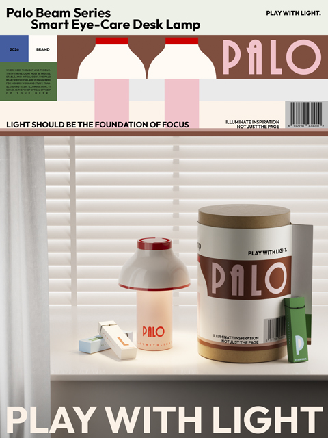
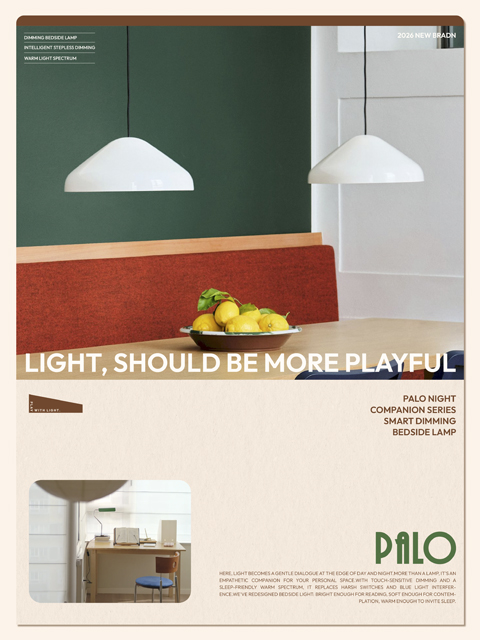
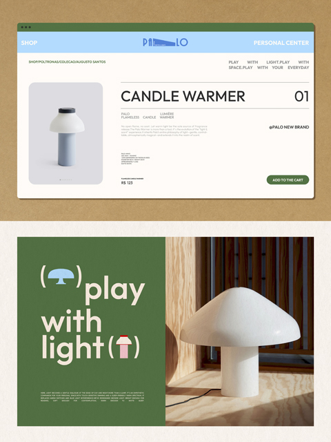
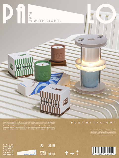
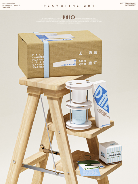
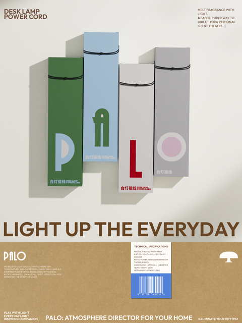
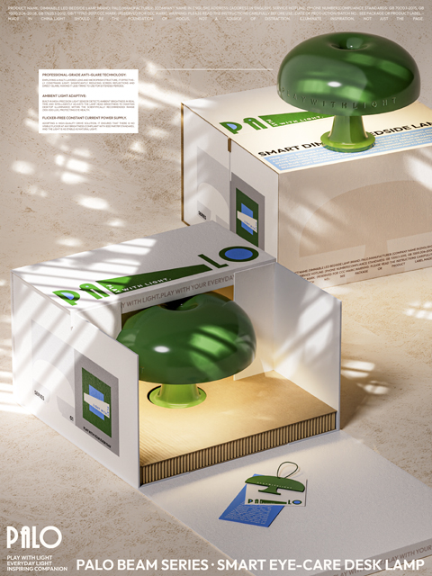
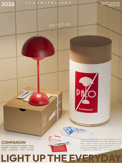
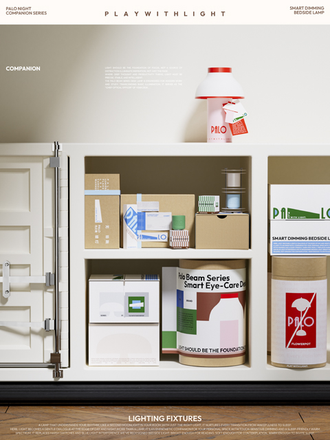
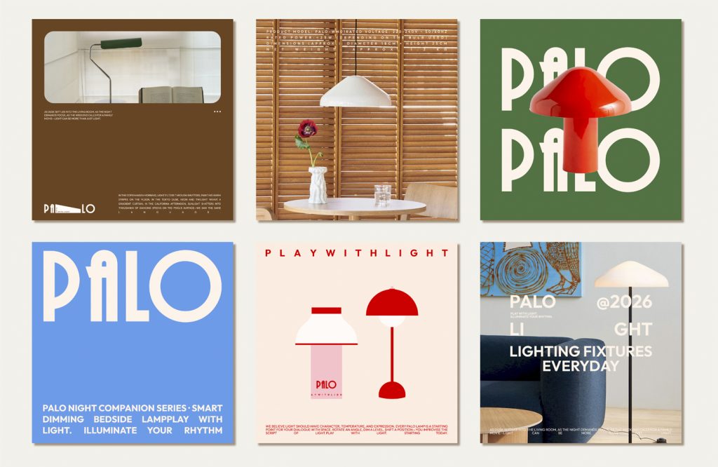
我们将核心定位于“日常光景的氛围导演”。Slogan「Play with light.」并非口号,而是一种生活范式——将光从被动的物理工具,转化为主动的创造性伴侣。设计灵感根植于经典的斯堪的纳维亚精神,试图在克制的秩序感中,加入一丝灵动的玩味。设计方面:Logo 运用国际主义几何构筑,将“光束”负形藏于字母之中,体现极致的纯粹。色彩,选取松林绿、冰川蓝与暖沙色,冷暖交织出自然律动,打破工业品的冰冷。包装, 采用模块化网格系统,将技术规格直接作为视觉元素,外挂极简束绳,让拆箱如同开启一份关于光的礼物。
We position our core as “atmosphere director of everyday scenes”. The slogan “Play with light.” is not a slogan, but a life paradigm – transforming light from a passive physical tool into an active creative partner. The design inspiration is rooted in the classic Scandinavian spirit, trying to add a touch of smart playfulness to the restrained sense of order. In terms of design: the logo uses internationalist geometric construction and hides the negative “beam” shape in the letters, reflecting the ultimate purity. The colors are pine forest green, glacier blue and warm sand. Cold and warm interweave natural rhythms, breaking the coldness of industrial products.