

NiiceDesign x 「PIVOT ROCK」|城市攀岩品牌全案设计
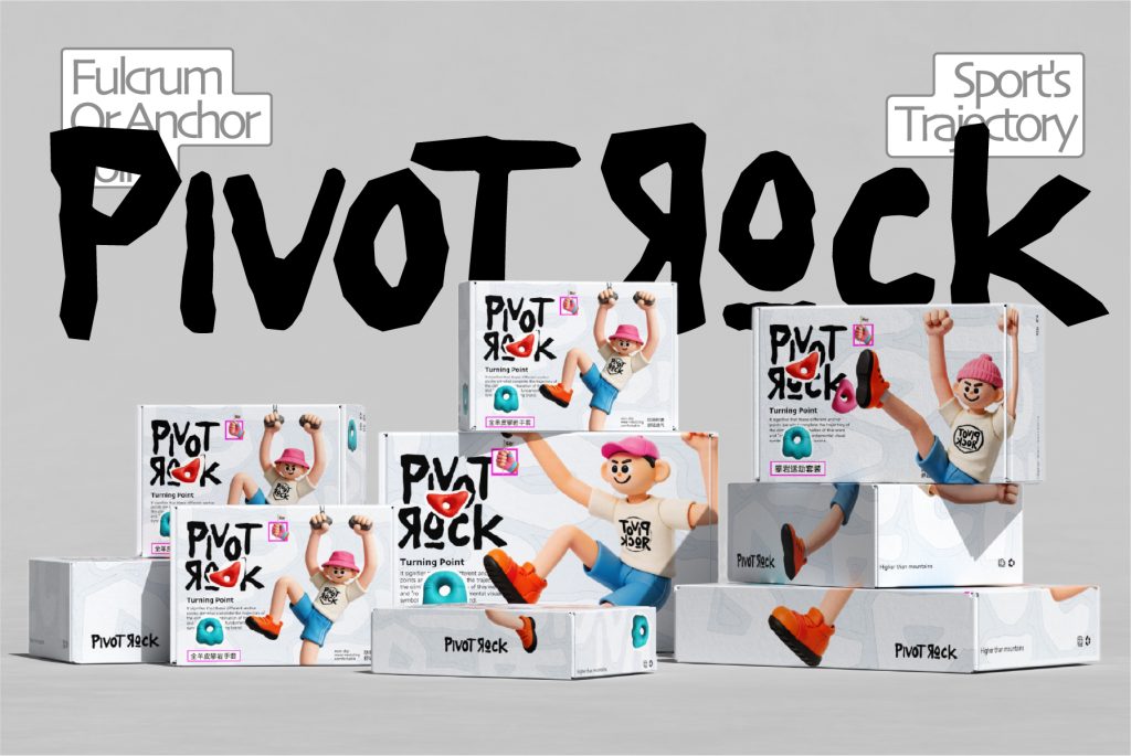
从运动标签到城市生活方式:攀岩赛道的破局契机
数据显示,当下超过60%的年轻都市消费者,将运动不仅是视作身体锻炼,更是一种“社交货币”与精神充电。传统的攀岩馆往往给人留下“硬核”、“门槛高”、“只属于专业圈子”的刻板印象,体验与日常消费生活之间隔着一层玻璃。在运动品牌竞争日益激烈的当下,我们发现消费者真正渴望的,不再仅仅是单一的攀岩运动体验,而是一个能将运动精神与日常休闲、社交、生活方式融合的复合空间。他们需要的不只是一面岩壁,而是一处能安放爱好、获得情绪支撑的“第三空间”。
Data shows that over 60% of young urban consumers view exercise not only as physical exercise, but also as a form of “social currency” and spiritual recharge.Traditional climbing gyms often leave a stereotype of being “hardcore”, “high threshold”, and “only belonging to professional circles”, with a layer of glass separating the experience from daily consumer life.In the increasingly fierce competition among sports brands, we have found that what consumers truly desire is no longer just a single climbing experience, but a composite space that can integrate the spirit of sports with daily leisure, socializing, and lifestyle. What they need is not just a rock wall, but a ‘third space’ where they can place their hobbies and gain emotional support.
“找到支点,持续向上”的策略定位
基于此洞察,NiiceDesign为「PIVOT ROCK」品牌构建了一个核心定义:城市攀岩生活方式品牌。这是一个融合运动、社交与城市生活的攀岩体验空间品牌。品牌主张:在攀岩中,“Pivot”代表发力与转换的关键支点。我们将这一物理概念升维为品牌精神,提出品牌主张:“找到支点,持续向上”。这不仅是运动轨迹的描述,更是年轻人面对生活时的态度。
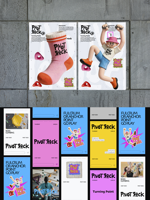
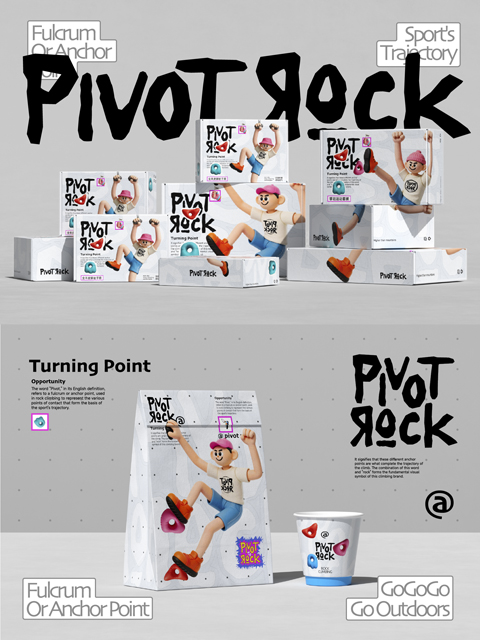
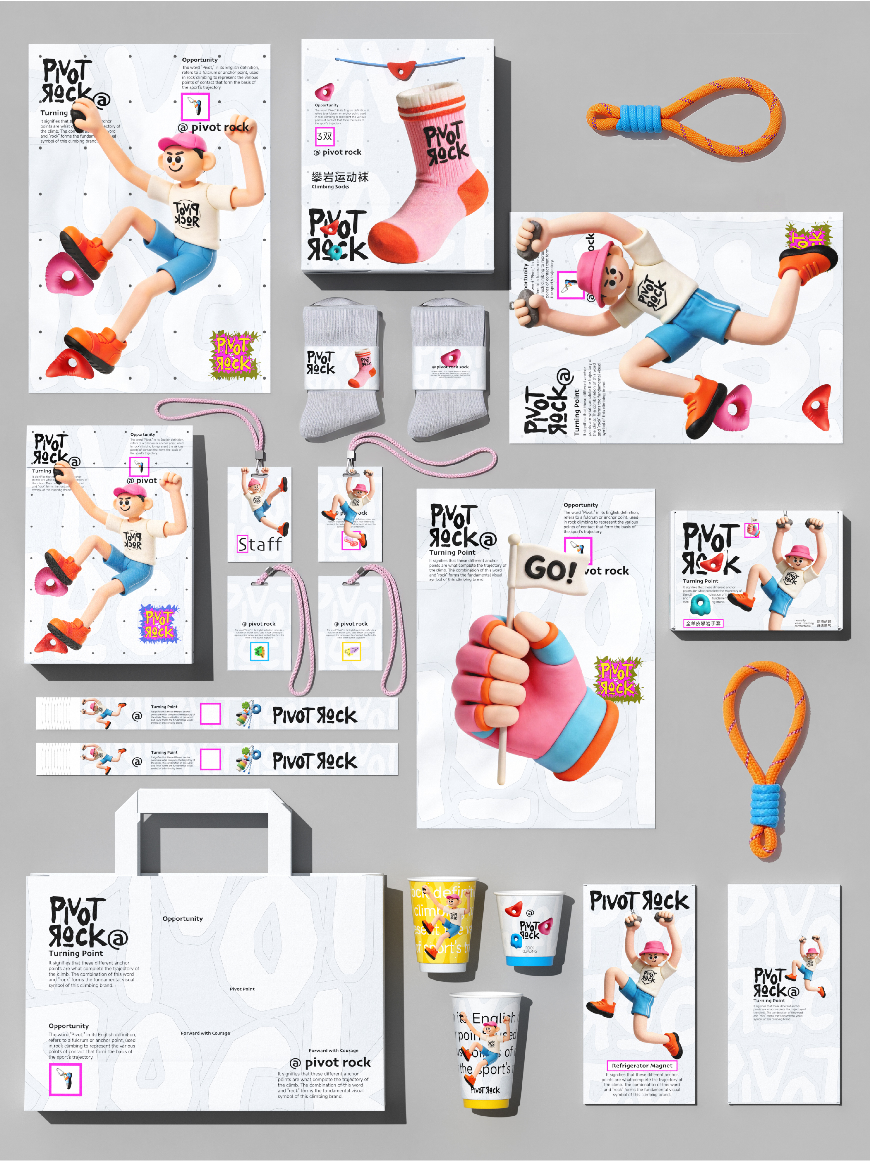
产品延展:品牌不仅仅停留在“攀岩”本身,而是构建了“几何岩点 × 多巴胺色彩 × 攀岩人IP”的完整品牌视觉体系。我们将这一体系系统化延展至咖啡饮品、生活周边(运动袜、帆布袋、冰箱贴等)与品牌传播之中。通过更多元的消费触点连接年轻用户,让攀岩运动融入日常消费和都市社交。
Brand proposition: In rock climbing, “pivot” represents the key pivot point for exertion and transformation.We elevate this physical concept to the brand spirit and propose the brand proposition: ‘Find the pivot and continue to move forward’.This is not only a description of the movement trajectory, but also the attitude of young people towards life.Product Extension: The brand is not just limited to “climbing” itself, but has built a complete brand visual system of “geometric rock points x dopamine colors x climber IP”.We will systematically extend this system to coffee drinks, daily necessities (sports socks, canvas bags, refrigerator stickers, etc.), and brand communication.Connect young users through more diverse consumer touchpoints, and integrate rock climbing into daily consumption and urban socialization.
视觉体系与产品落地:多巴胺美学与潮玩符号
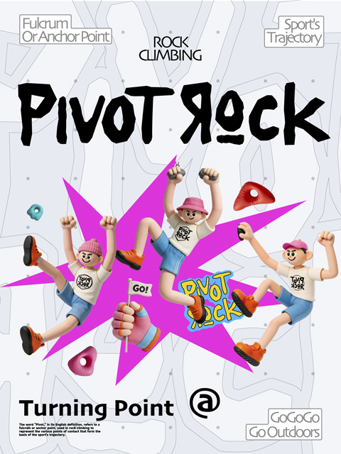
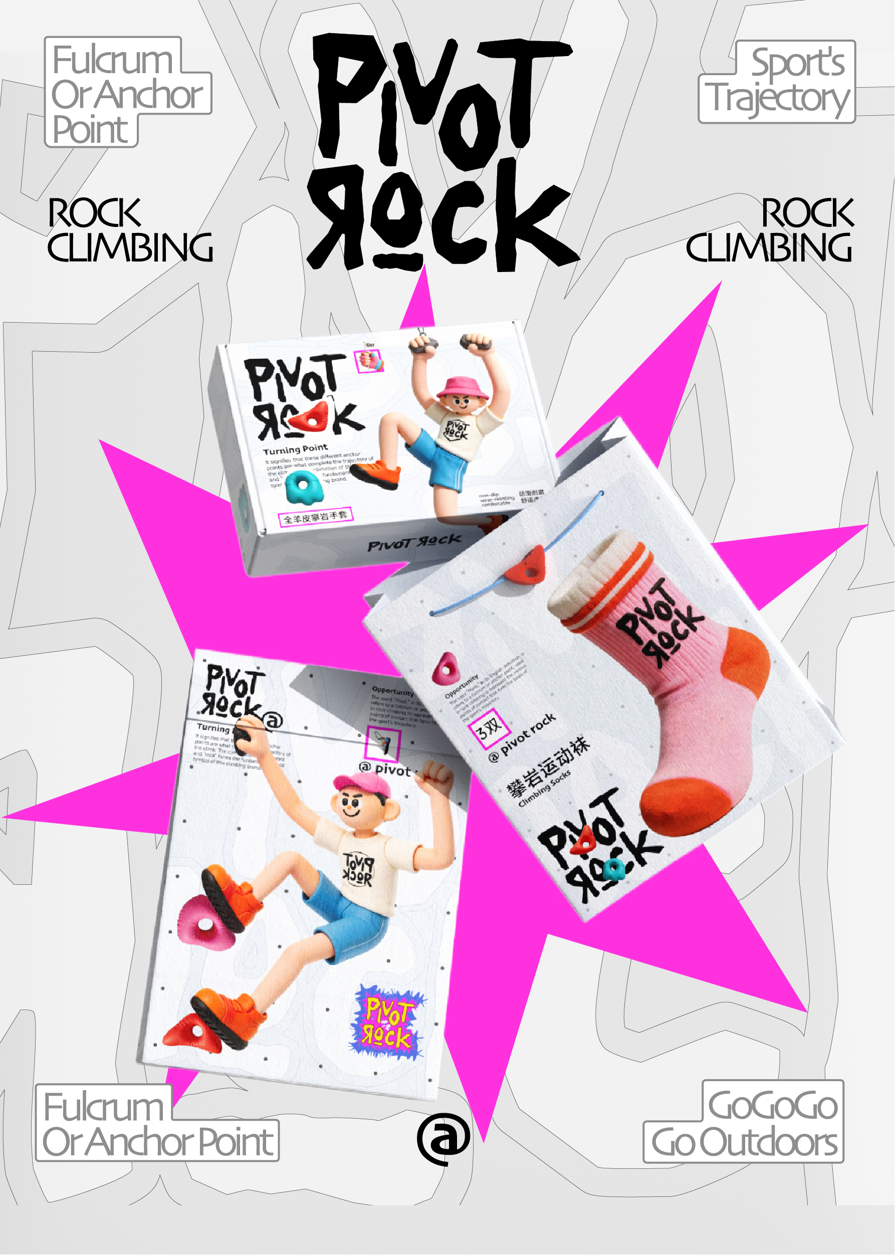
基于品牌理念,我们以几何岩点为核心视觉元素,结合高饱和度多巴胺色彩,构建了兼具行业属性与年轻活力的品牌视觉体系。品牌超级符号:以黑白色调、手绘涂鸦风格的「PIVOT ROCK」字体作为主视觉。其中反向的“Я”与结尾的“@”符号构筑了视觉记忆点,在字体排布上契合街头潮流语境,同时借“@”与反向“R”的视觉特性呼应“寻找支点”的品牌概念。
Based on the brand concept, we have constructed a brand visual system that combines industry attributes and youthful vitality, with geometric rock points as the core visual elements and high saturation dopamine colors.Brand super symbol: The “PIVOT ROCK” font with black and white tones and hand drawn graffiti style serves as the main visual element. The reverse “Я” and the ending “@” symbol construct visual memory points, which fit the street trend context in font layout. At the same time, the visual characteristics of “@” and reverse “R” echo the brand concept of “finding a pivot”.
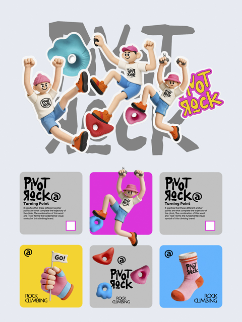
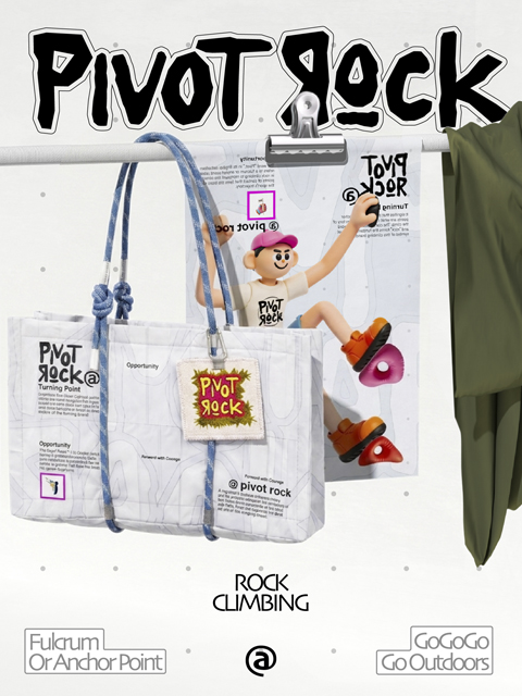
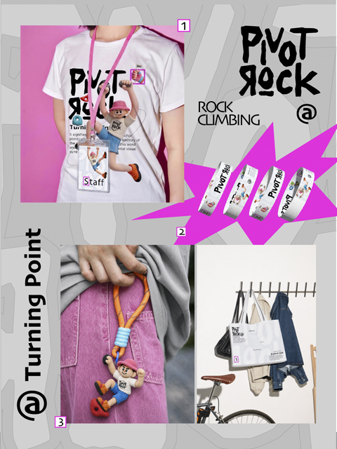
潮玩IP形象:充满力量感的3D攀岩人IP成为品牌精神的象征。通过跃动、攀爬、突破的姿态,视觉化传递“持续向上”的理念。IP形象色彩鲜活,以跃动的姿态贯穿于所有视觉物料中。生活化周边载体:周边载体以视觉与功能双重延伸为设计线索。帆布袋采用真实的攀岩绳作为提手,将“支点”这一符号转译为可直接感知的日常接触点;此外,配套的多巴胺色彩运动袜、咖啡纸杯、岩点造型冰箱贴及员工挂绳,在功能上覆盖了通勤、办公、居家等多维场景,构建起一套具备高识别度的品牌应用矩阵。
Trendy IP image: The powerful 3D climber IP has become a symbol of the brand spirit. Visually conveying the concept of “continuous upward movement” through jumping, climbing, and breakthrough postures. The vivid colors of the IP image run through all visual materials with a lively posture. Life oriented peripheral carrier: The peripheral carrier is designed with a dual extension of visual and functional clues. The canvas bag uses real climbing ropes as handles, translating the symbol “pivot point” into a directly perceptible daily contact point; In addition, the matching dopamine colored sports socks, coffee paper cups, rock point shaped refrigerator stickers, and employee hanging ropes cover multi-dimensional scenarios such as commuting, office, and home, building a highly recognizable brand application matrix.
NiceDesign x 「PIVOT ROCK」
“找到支点,持续向上”