

YUMMBAKE 有焙丨烘焙品牌
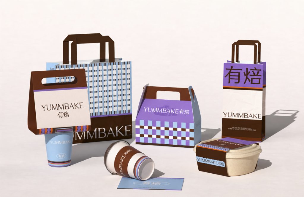
YUMMBAKE 有焙
品牌定位:烘焙品牌
项目内容:视觉策略 /品牌VI设计/ 包装设计
烘焙市场不缺创新的面包,缺的是清晰且独特的品牌表达。烘焙行业已经进入成熟竞争阶段,当产品越来越接近,建立识别度与差异化成为品牌破局的新解法,用户需求正在从“从我想买什么样的面包到我想买什么品牌的面包”。
The bakery market is not lacking innovative bread products, but rather clear and distinctive brand expressions. The baking industry has entered a mature competitive phase where products are increasingly similar. Building
recognition and differentiation has become a new solution for brands to break through, as consumer demand shifts from “what kind of bread I want to buy” to “what brand of bread I want to buy.”.

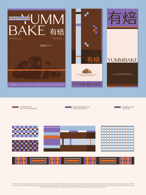
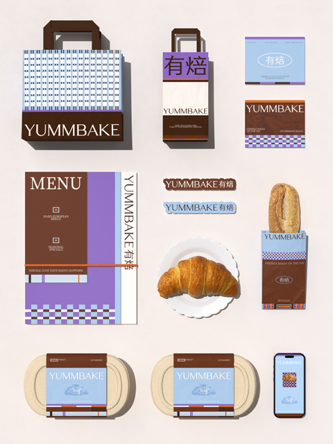
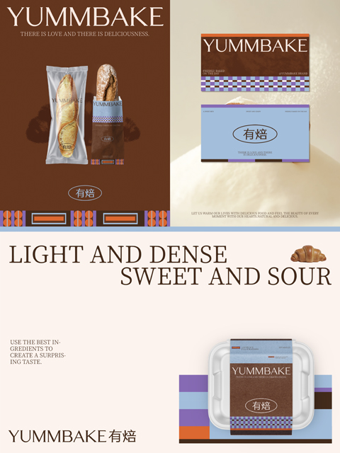
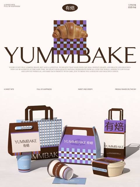
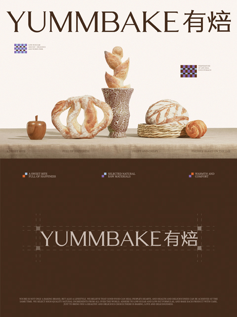
LOGO设计:衬线字体兼顾精致质感与结构对称感,作为品牌识别的视觉基础。品牌色彩系统:焦糖棕承载面包出炉后的麦香温度,锚定烘焙品类的烟火气;浆果紫呼应果酱与果干原料,点亮温暖与活力的品牌氛围;静谧蓝中和暖调厚重感,为品牌注入轻盈松弛的呼吸感塑造品牌图形,打造一眼识别的品牌视觉锤。我们提炼出具有烘焙属性的格纹元素,作为品牌视觉语言。它既让人联想到面包房、餐桌与温暖生活场景,也让品牌在同类烘焙视觉中,形成具有差异化的品牌识别。
LOGO Design: The serif font balances refined texture with structural symmetry, serving as the visual foundation for brand identity. Brand Color System: Caramel brown embodies the warmth of freshly baked bread, anchoring the aroma of the baking category; berry purple echoes the ingredients of jam and dried fruits, illuminating a brand atmosphere of warmth and vitality; tranquil blue softens the heaviness of warm tones, infusing the brand with a light and relaxed breathing sensation. We shape brand graphics to create a visual hammer instantly recognizable as a brand. We distill a plaid element with baking attributes as the brand’s visual language. It evokes associations with bakeries, dining tables, and warm living scenes, while also differentiating the brand in the visual landscape of similar baking categories.