软糯厚实的费尔岛格纹毛衣,与三两好友围坐在冬日炉火旁,烤箱里新鲜出炉金黄酥脆的面包,热气裹挟着麦香扑向空气,这一刻深呼吸只为感受在身边的幸福感。这是我们为YUMMBAKE有焙构想的温暖烘焙童话,我们希望每一位走进有焙的朋友,都像进入了费尔岛温暖岛屿,温暖而幸福。生活再忙,也为一片面包的香气驻足。
A soft and thick Fel Island plaid sweater, sitting with a few friends by the winter fire, freshly baked golden and crispy bread in the oven, the hot air carrying the fragrance of wheat rushing into the air, taking a deep breath at this moment just to feel the happiness of being around. This is a warm baking fairy tale that we have envisioned for YUMMBAKE. We hope that every friend who enters the baking world feels like they have entered the warm island of Fer, warm and happy. No matter how busy life is, it still lingers for the fragrance of a piece of bread.
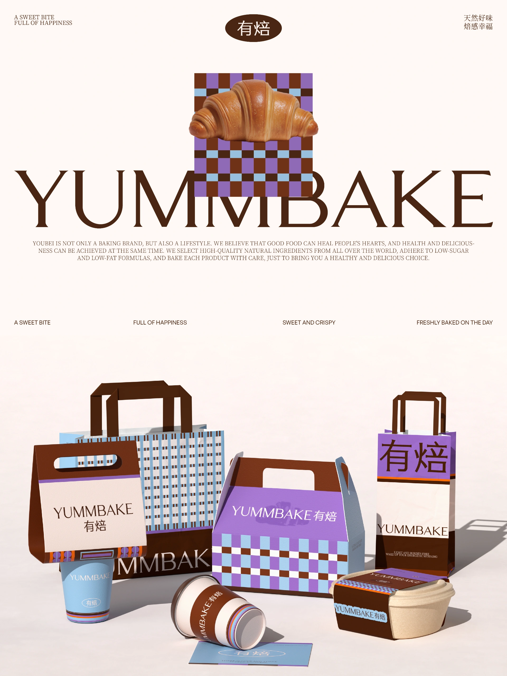
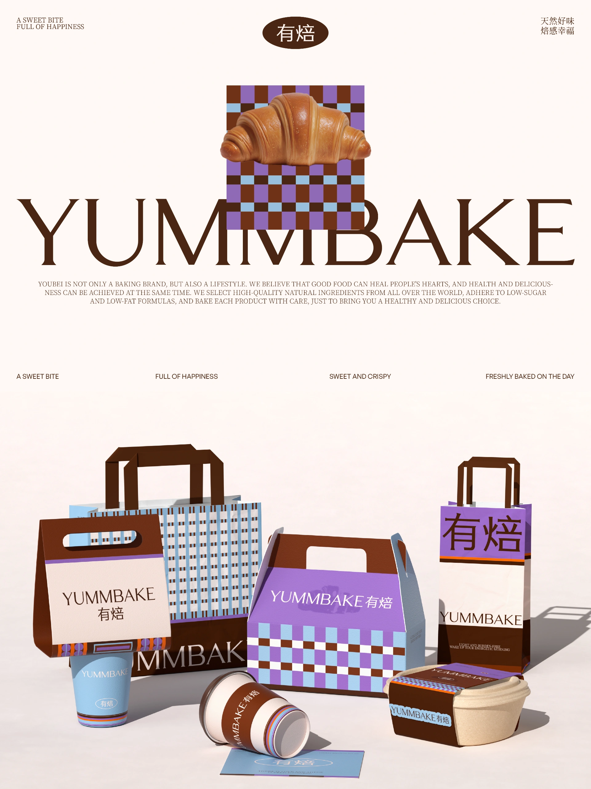
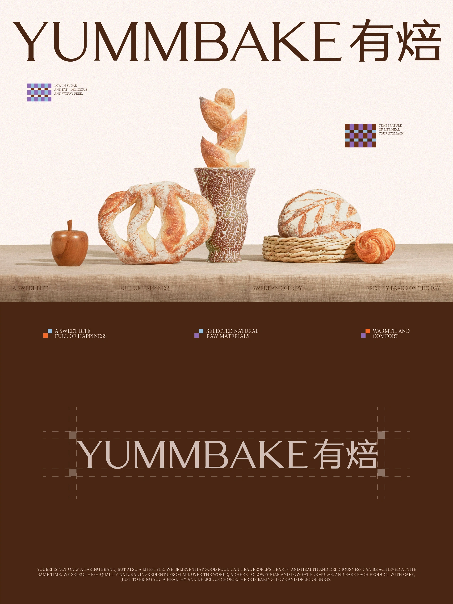
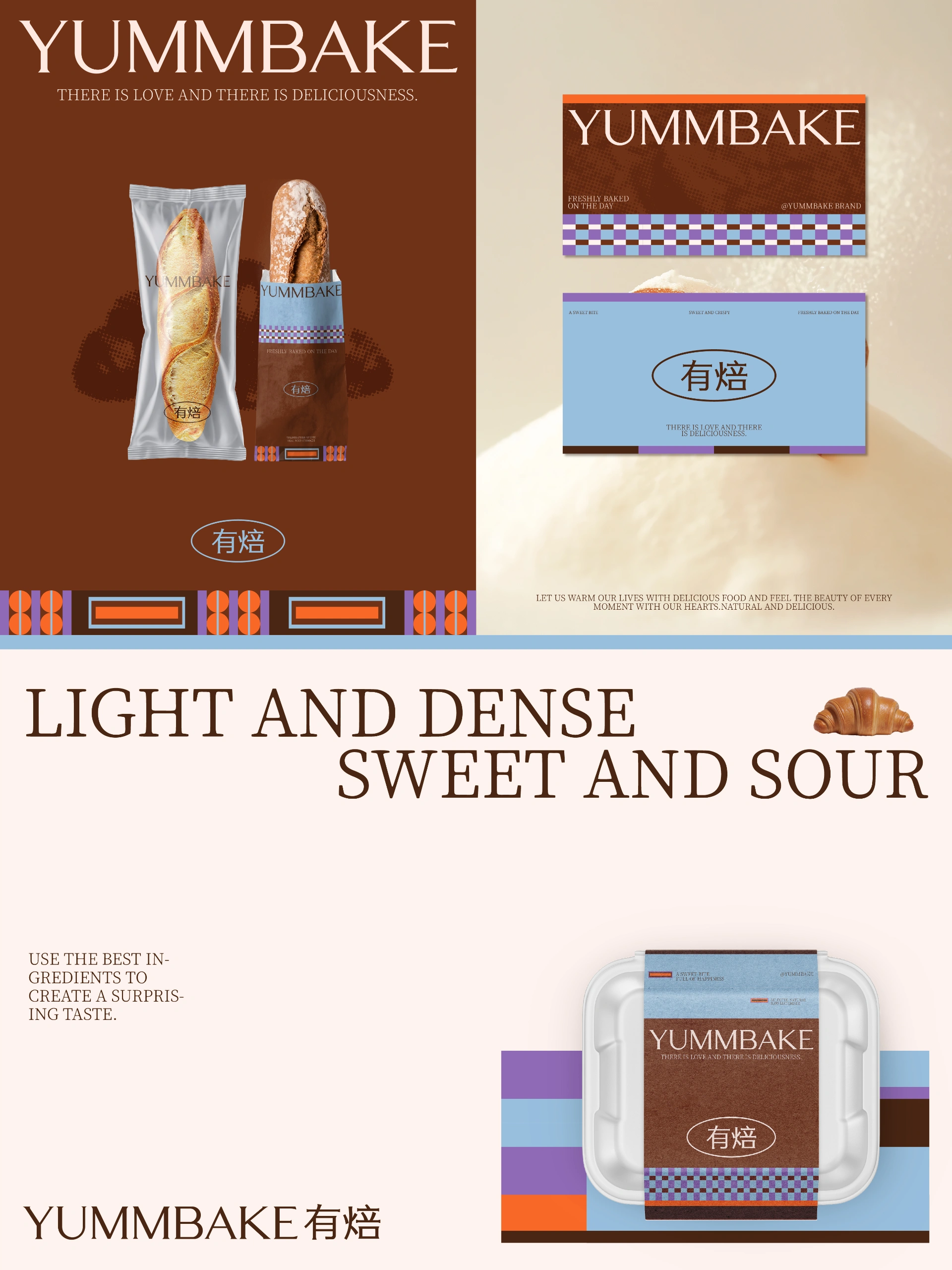
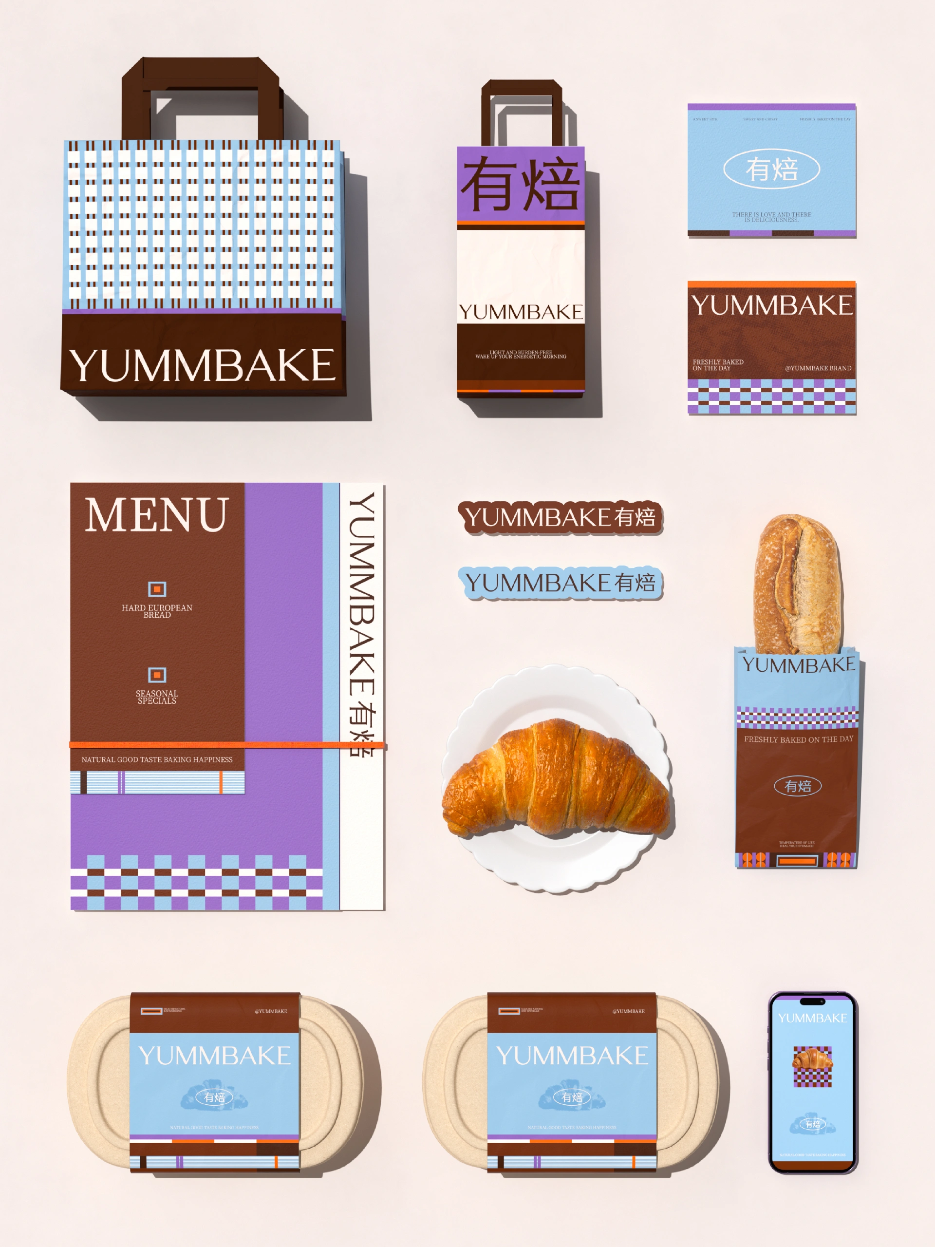
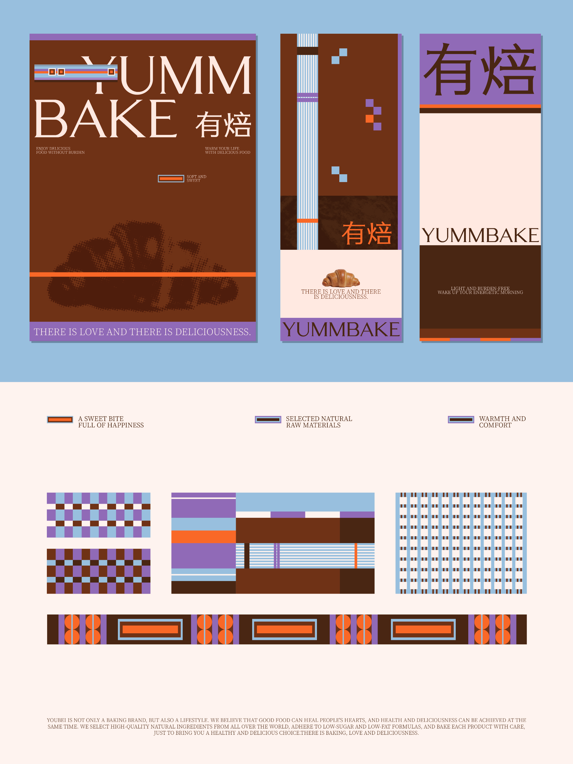
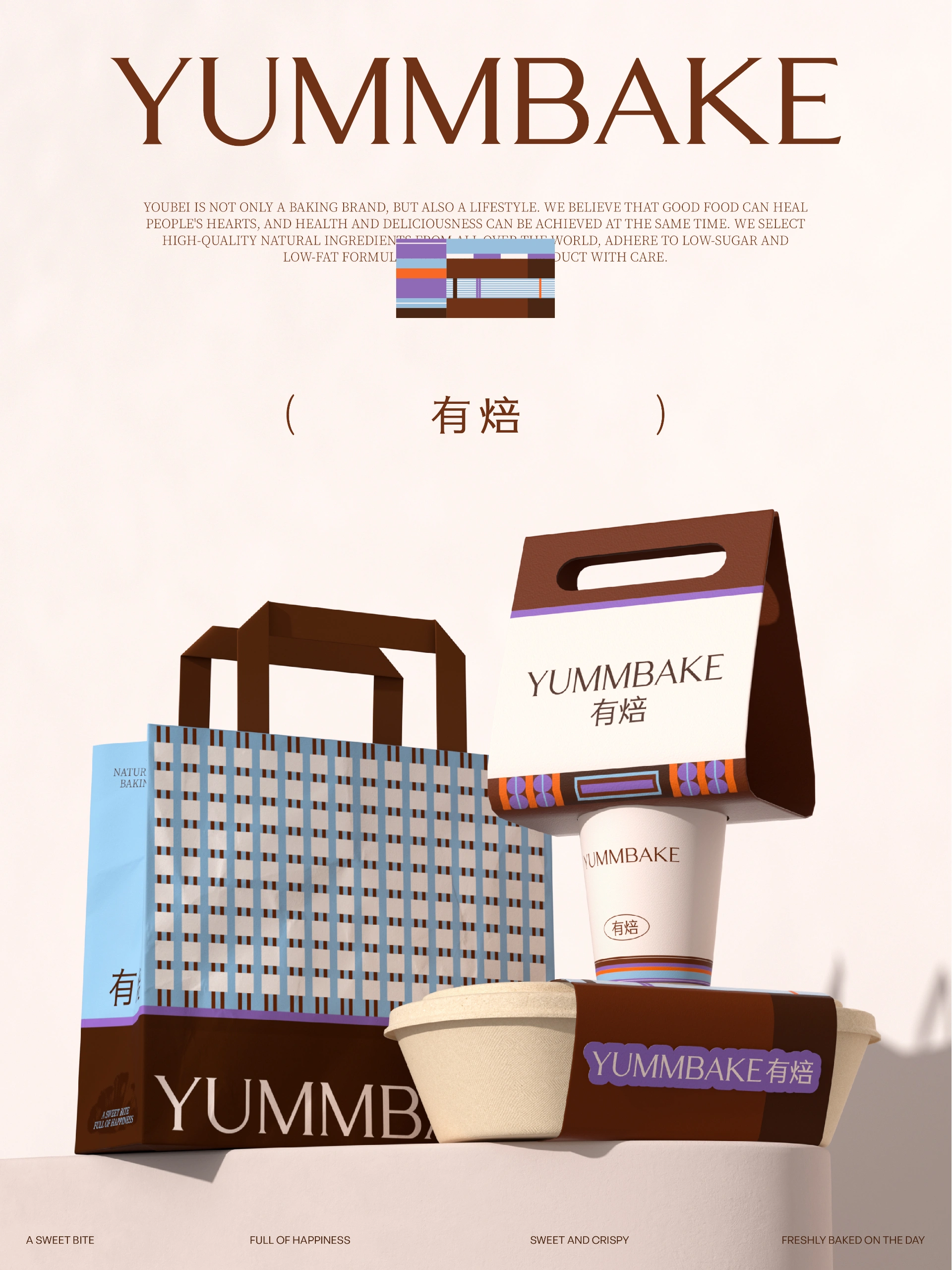
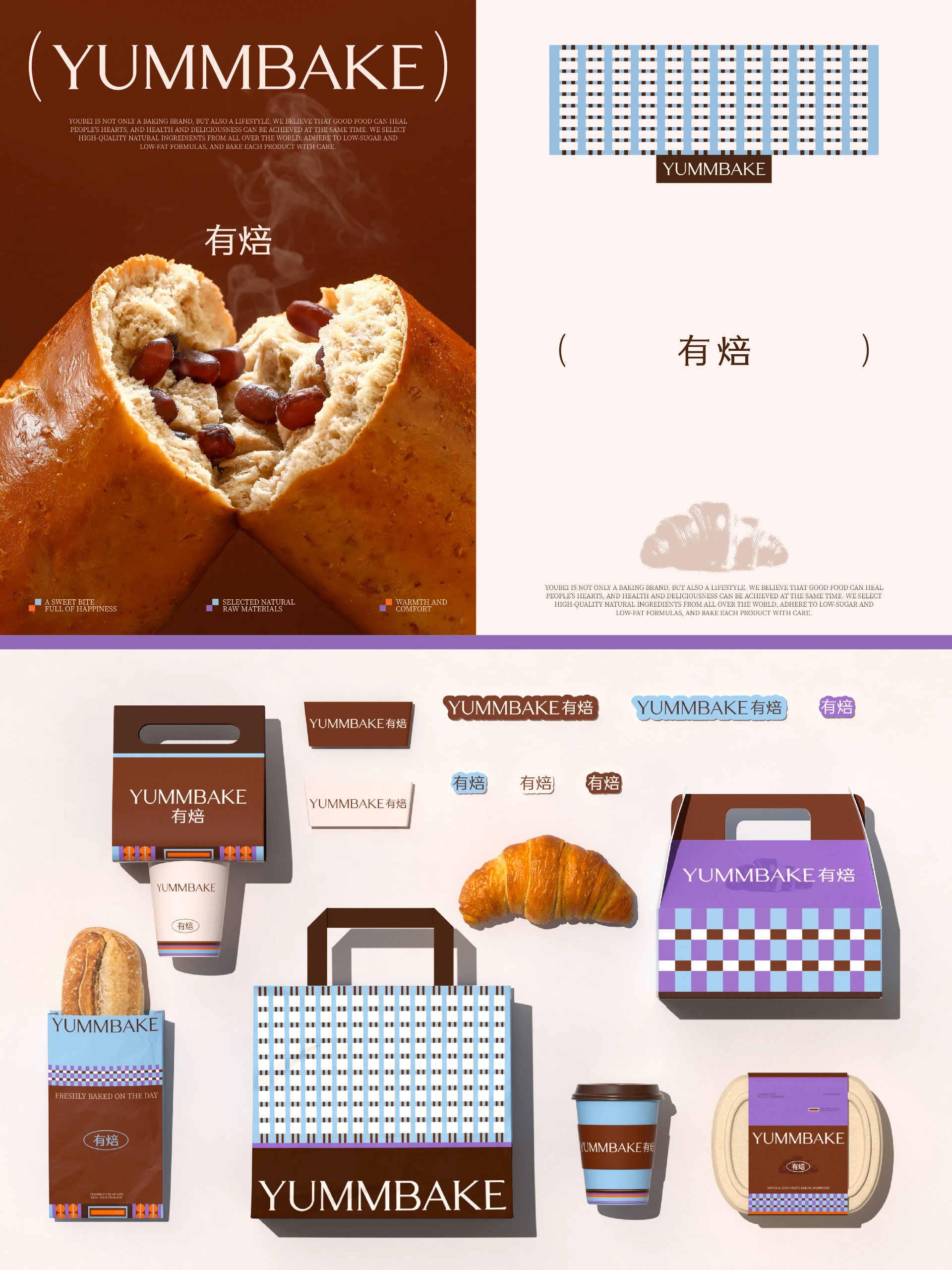
从打造费尔岛系温暖治愈视觉感出发,我们采用了棕色紫色蓝色交织的格纹作为辅助图形,像一件冬日毛衣的针脚。棕调是面包烘烤后的焦糖脉络,贴近烘焙行业属性,蓝调是寒夜静谧的底色,紫调如浆果果酱的深邃甜蜜,格纹则藏着老式面包房的质朴记忆,为整体设计增添几分复古美学。
在考虑LOGO设计时,我们希望兼顾费尔岛系经典元素 复古视觉美学与面包品类识别元素。图形LOGO采用费尔岛毛衣经典格纹图形作为底色+牛角面包图样,增加LOGO的层次感和触感,让人联想到手工烘焙的温暖和细腻。字体设计倾向突出品牌的复古精致感 整体字体结构平稳有力 略带不规则的衬线体来匹配费尔岛系的复古美学 在不同媒介上都能保持良好的辨识度和平衡感。
Starting from creating a warm and healing visual experience in the Fel Island style, we used a grid pattern of brown, purple, and blue interwoven patterns as auxiliary graphics, resembling the stitches of a winter sweater. Brown tones are the caramel veins of baked bread, closely related to the baking industry's attributes. Blues are the serene base color of cold nights, while purple tones are the deep and sweet taste of jam and fruit sauce. Grid patterns conceal the rustic memories of old-fashioned bakeries, adding a touch of retro aesthetics to the overall design.
When considering logo design, we aim to balance the classic elements of Fel Island with retro visual aesthetics and bread category recognition elements. The graphic logo adopts the classic grid pattern of the Fel Island sweater as the base color and the croissant pattern, adding a sense of layering and touch to the logo, reminiscent of the warmth and delicacy of handmade baking. The font design tends to highlight the brand's retro and exquisite sense. The overall font structure is stable and powerful, with slightly irregular serifs to match the retro aesthetics of the Fel Island style. It can maintain good recognition and balance on different media.
上一篇::哈哈计划丨户外营地品牌设计
下一篇::Forme丨瑜伽服品牌设计


Copyright © https://www.niicedesign.net/ All Rights Reserved. 蜀ICP备2026029678号‑1 技术支持:橙鱼传媒


 134 8895 1004