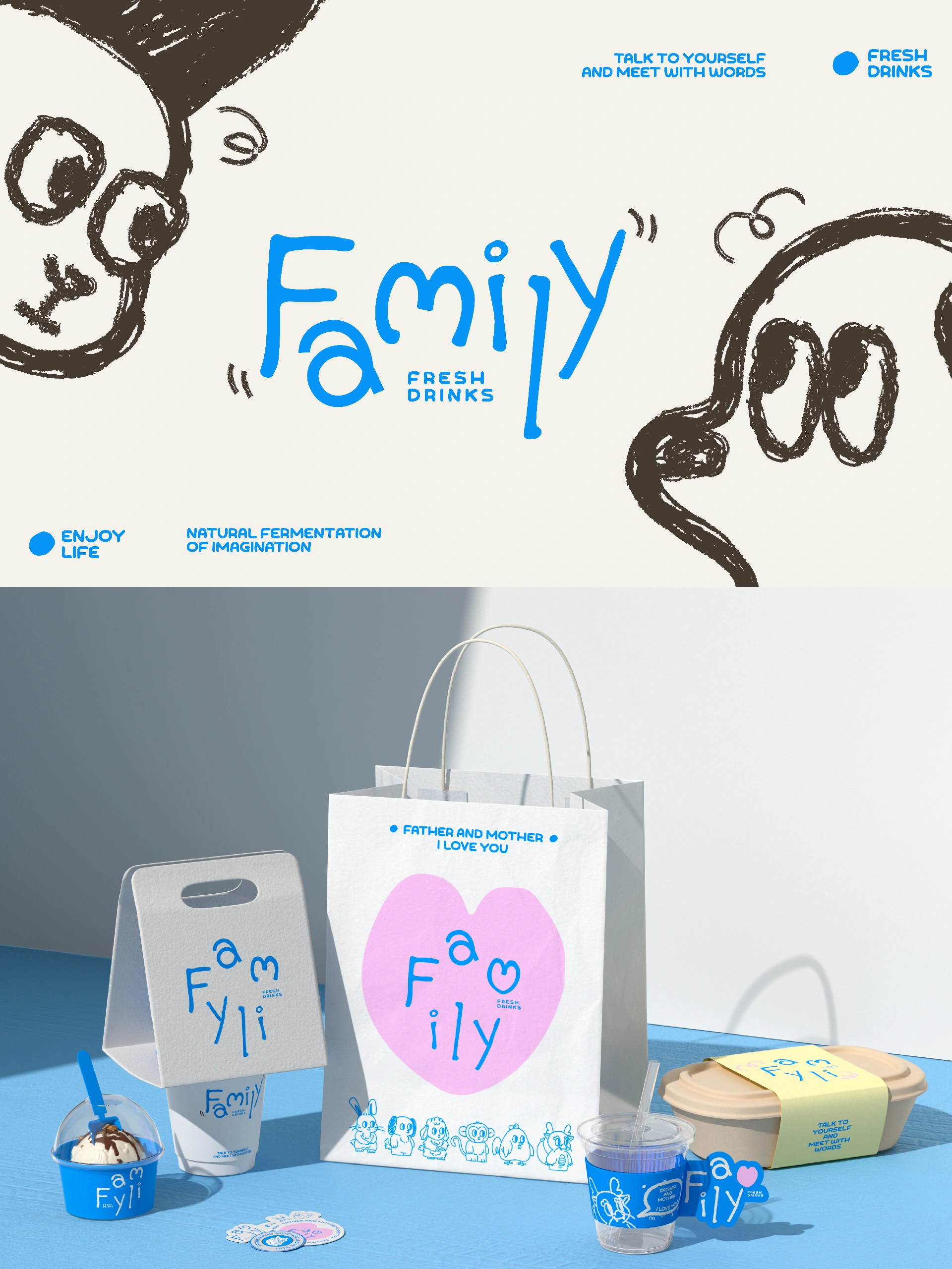
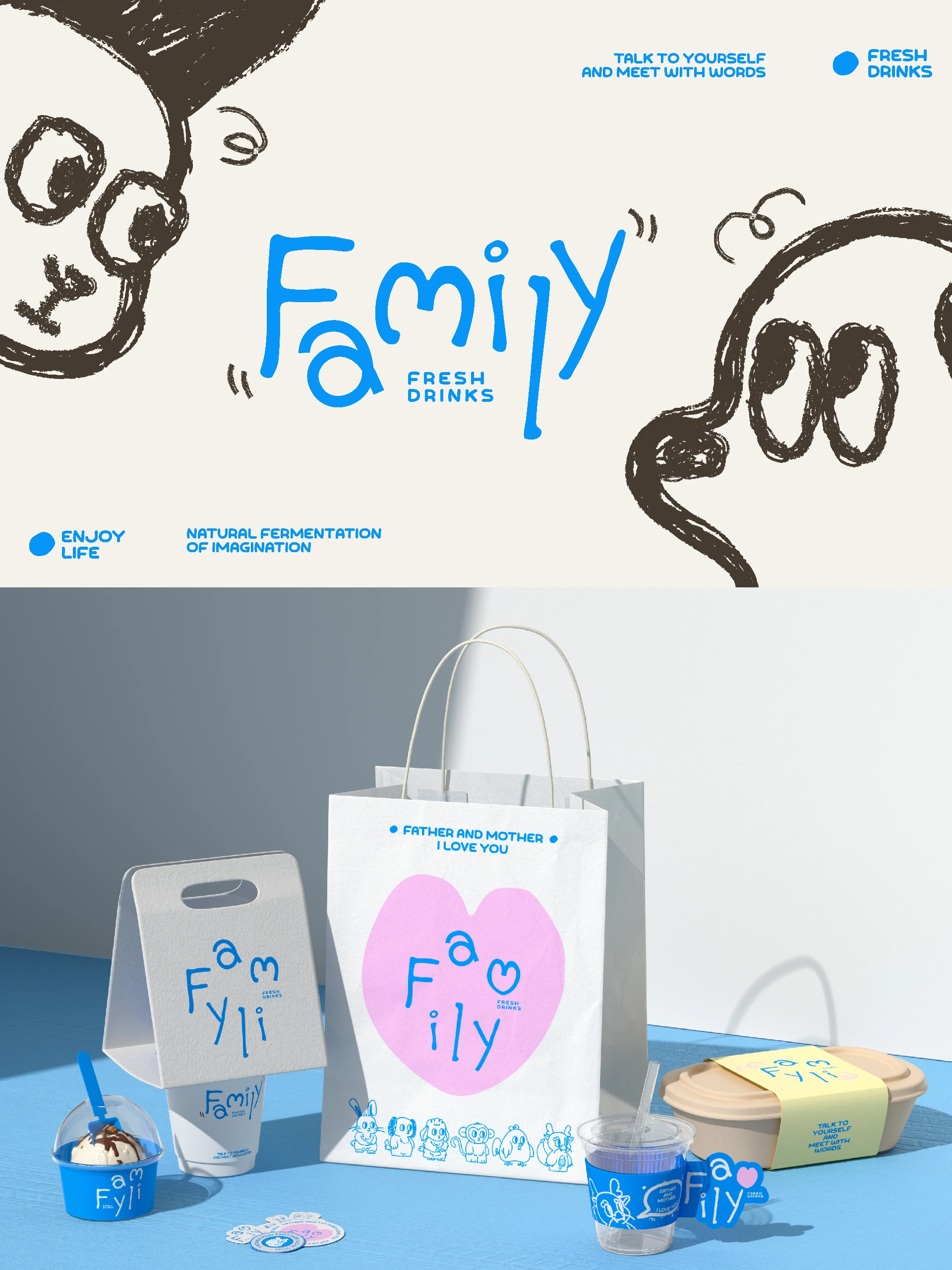
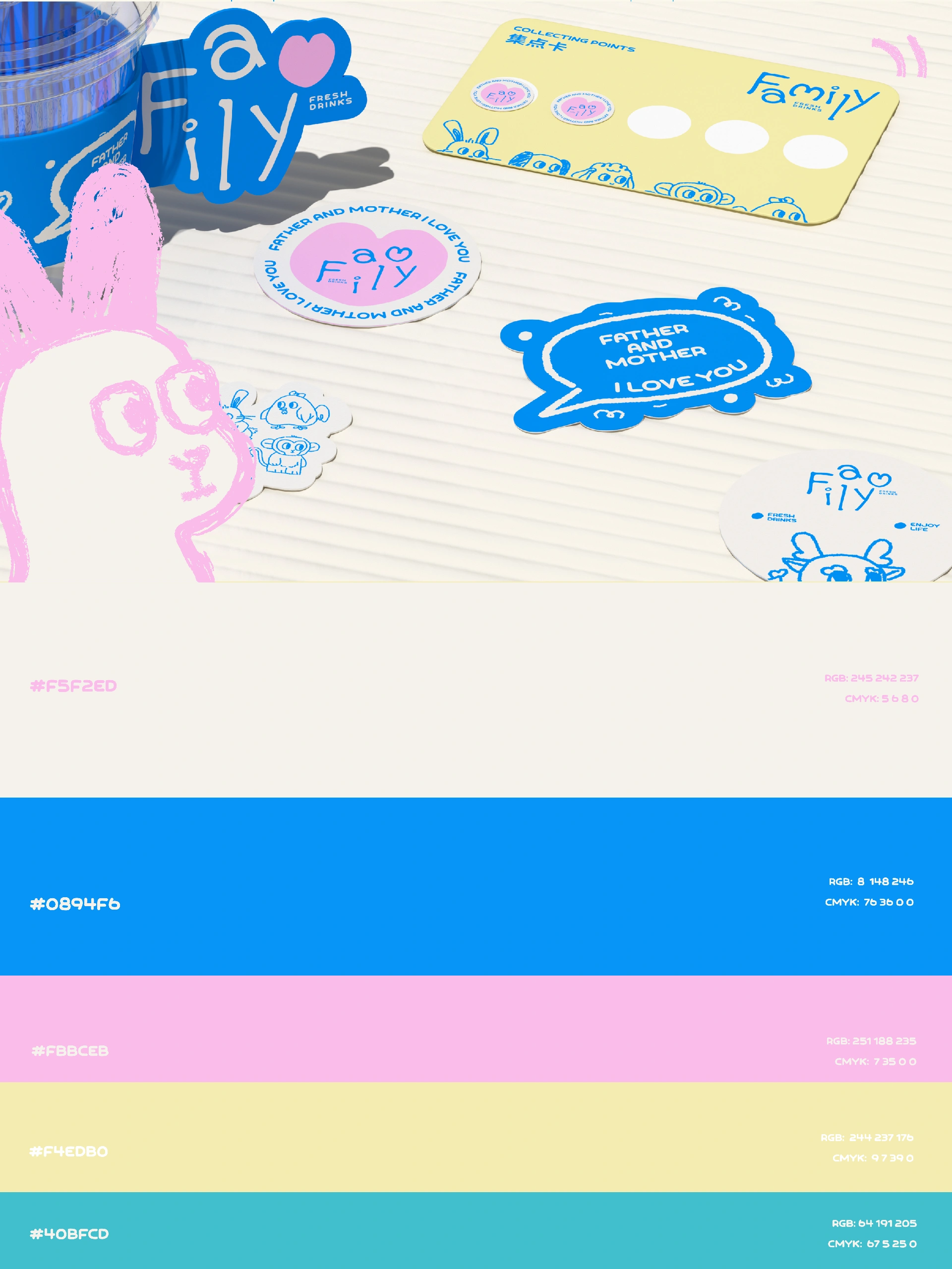
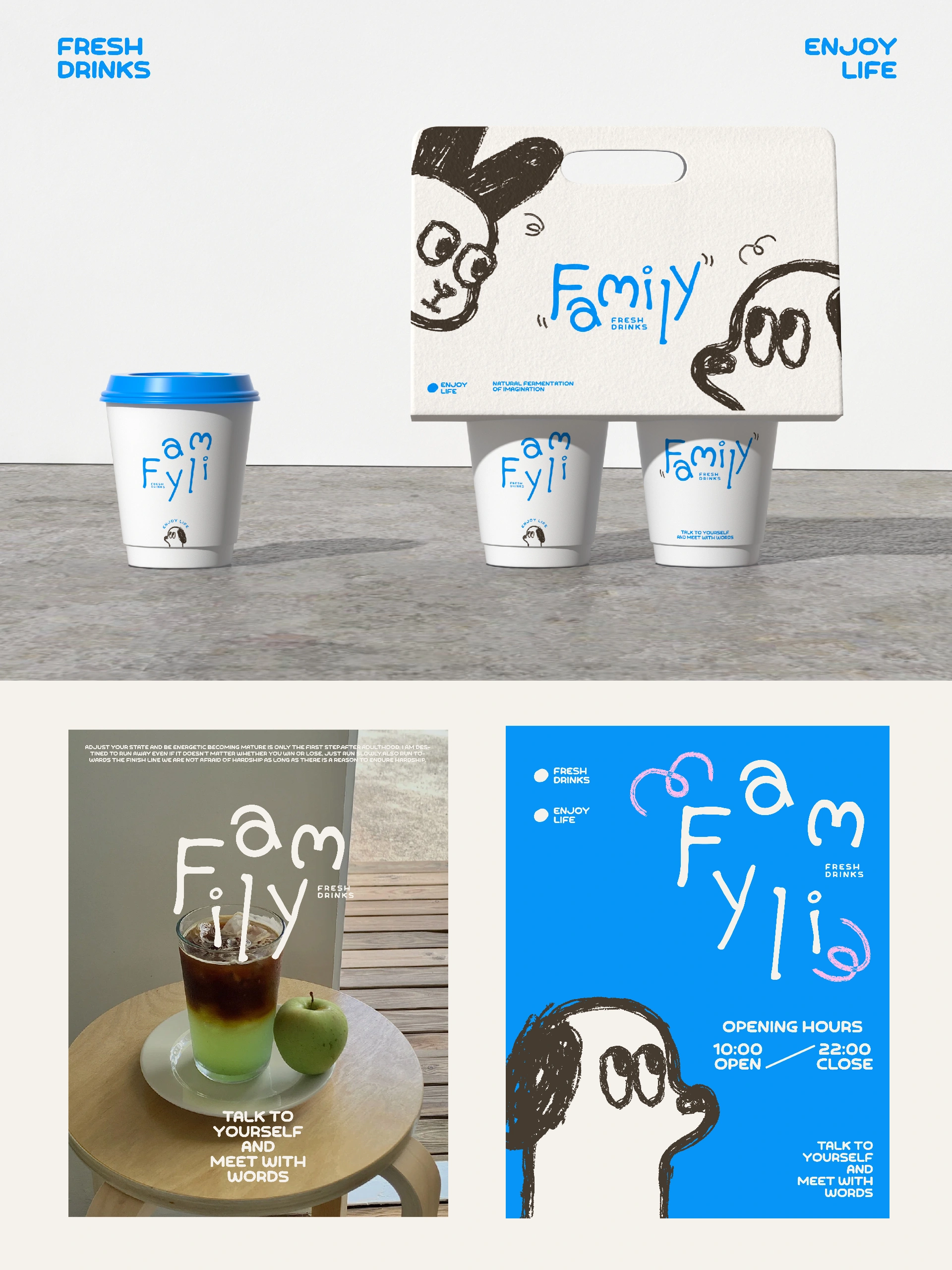
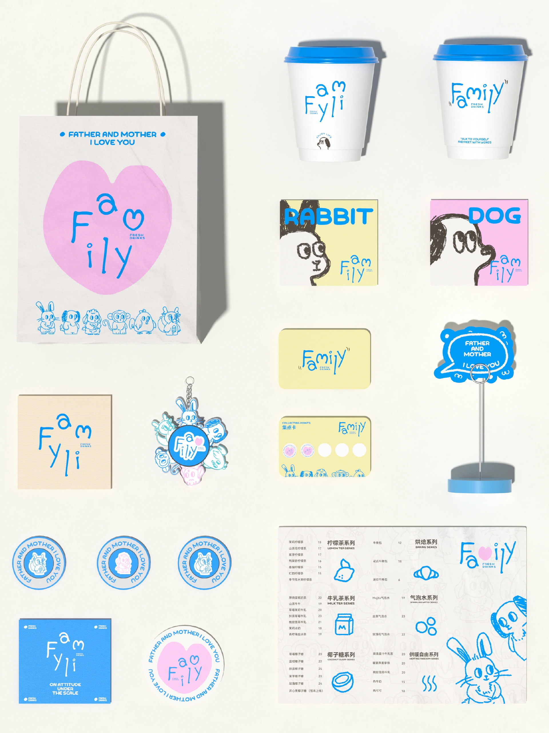
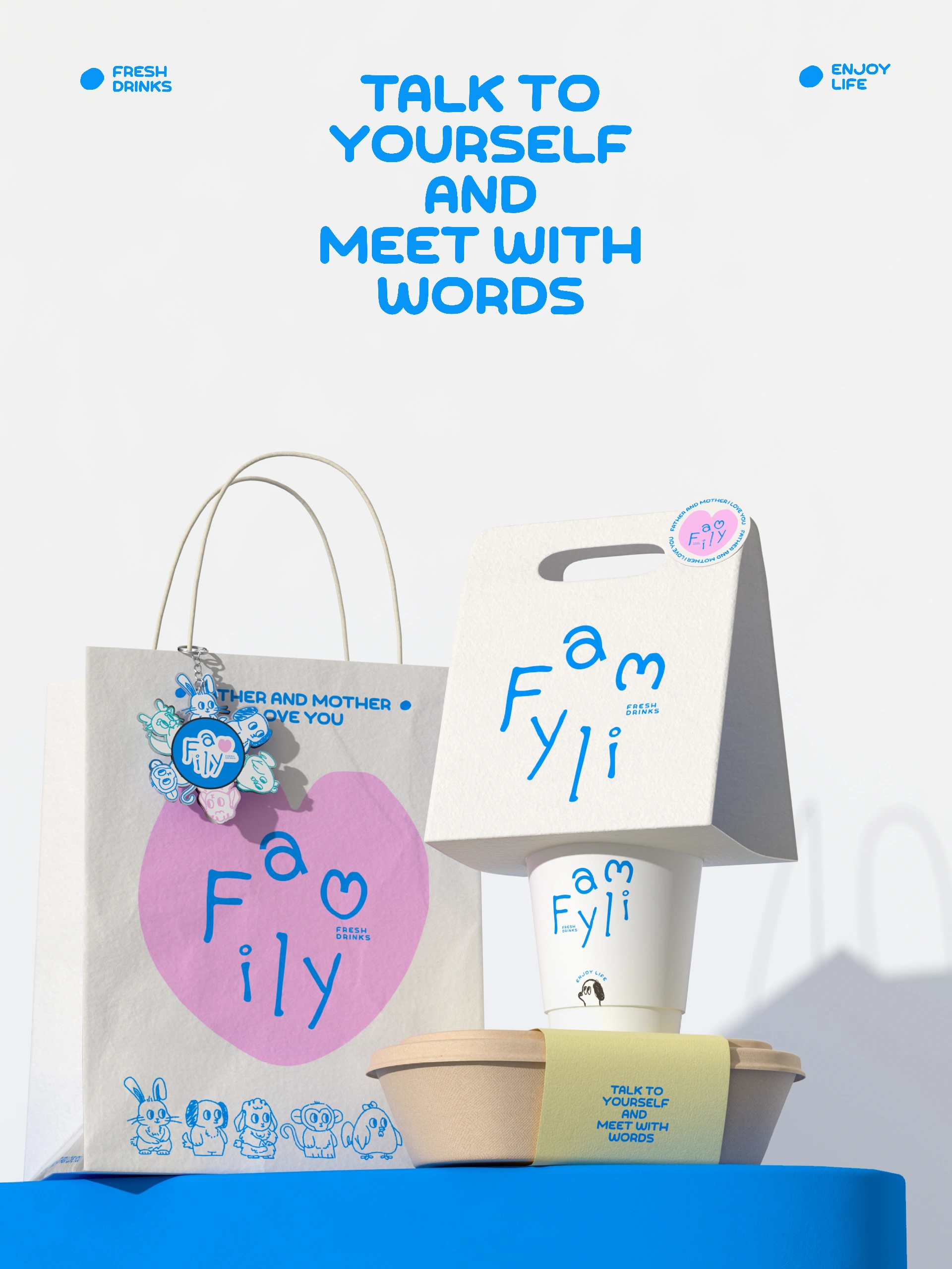
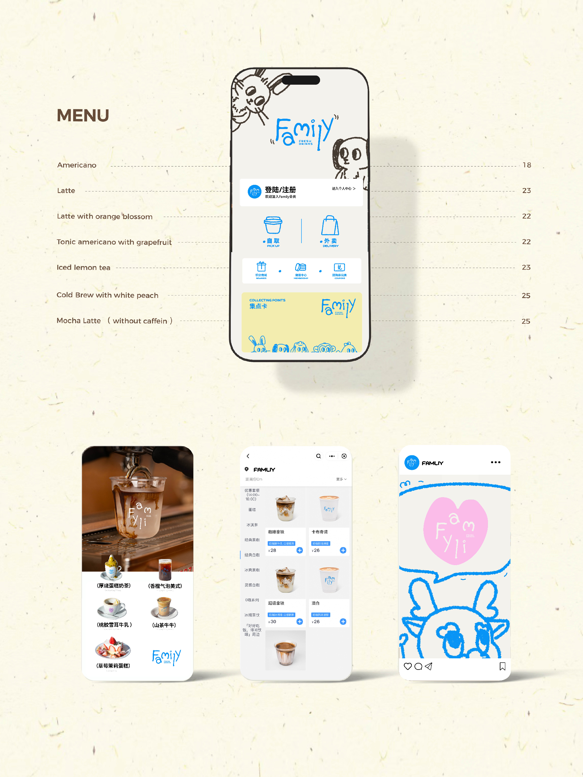
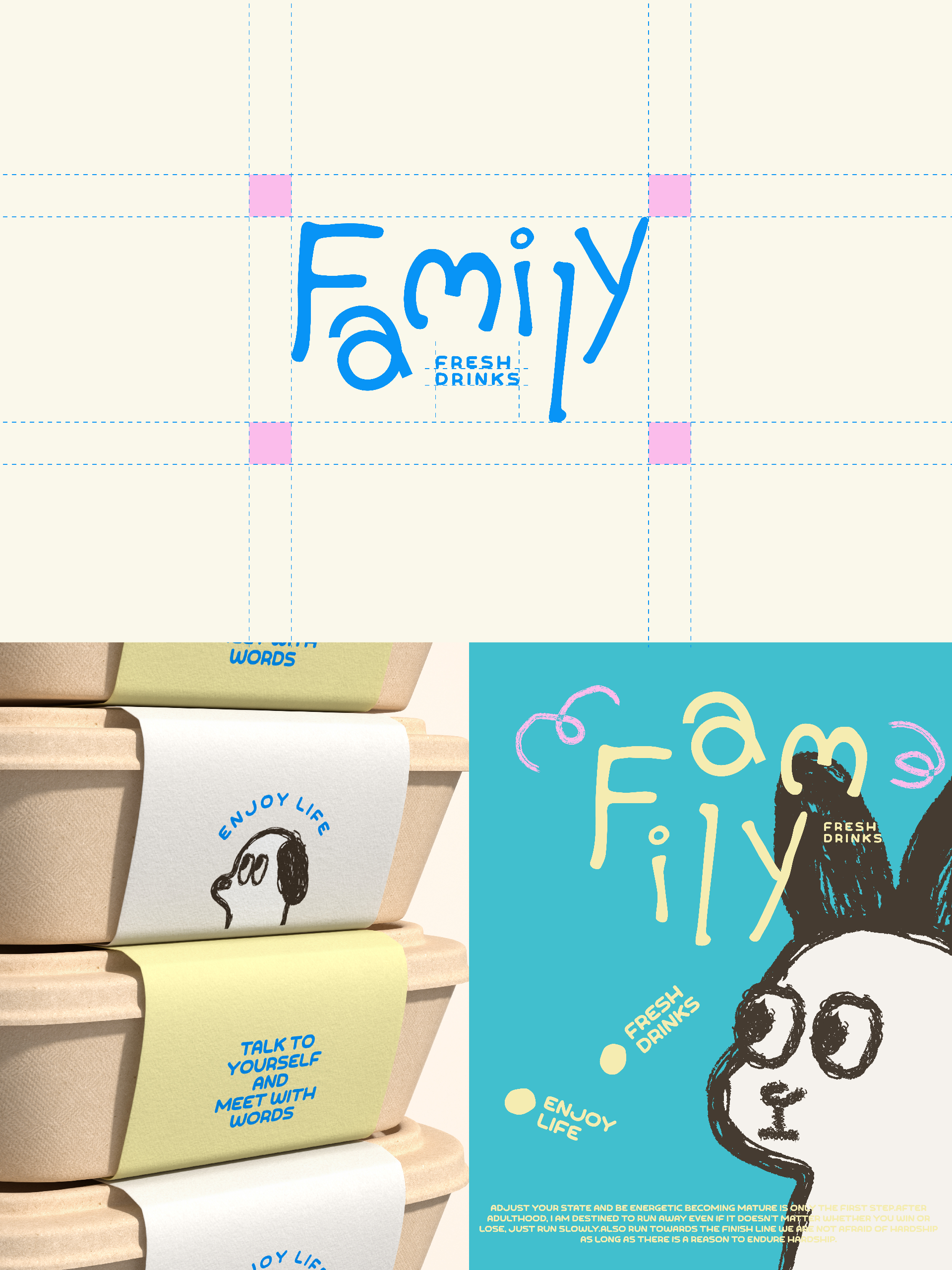
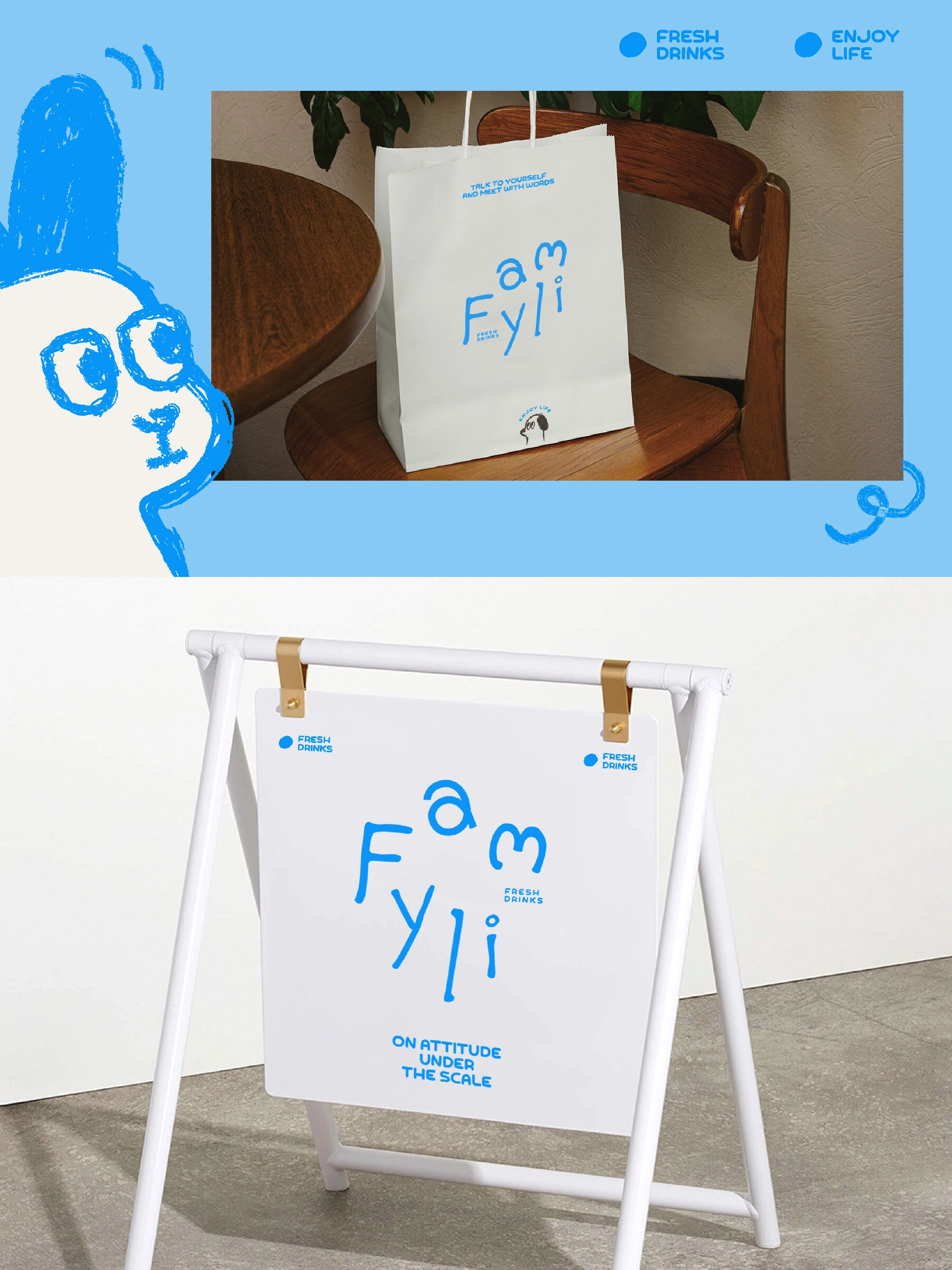
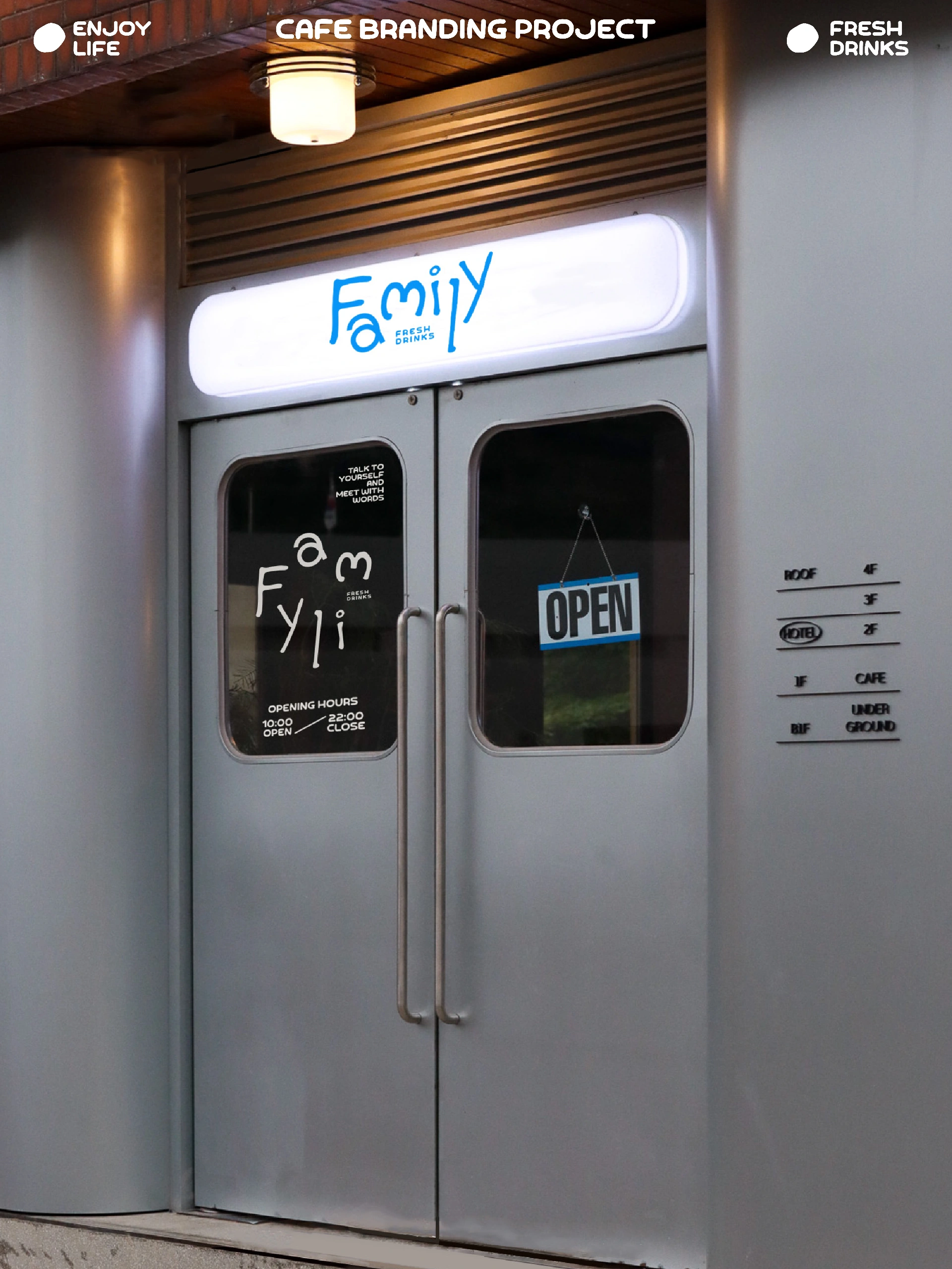
温馨治愈的品牌形象真的很受大家喜爱,family是一家社区饮品店,想要传递给顾客的是温馨和爱的信息。我们从品牌名字出发,提取出来“家”作为贯穿整体品牌的视觉符号,将品牌内核融于logo中,使用手写不规则排版,打造趣味且有亲和力的品牌视觉表达
A warm and comforting brand image truly resonates with people. "Family" is a neighborhood beverage shop that aims to convey a message of warmth and love to its customers. Taking the brand name as a starting point, we adopted the concept of "home" as a unifying visual symbol and integrated the brand's core essence into the logo. By utilizing an irregular, hand-lettered typographic style, we created a visual identity that is both playful and approachable.
在品牌设计过程中,适当使用一些插画图标作为辅助图形效果会事半功倍。辅助图形一定是和“家”主题相关的,对主理人家人的生肖进行简化绘制的图案赋予了family独特有趣的属性。现在的做品牌的年轻人越来越多,年轻化的品牌也随之变多,在体现品牌个性化的同时,如何能吸引年轻人的目光,才是现在一个好的设计应该思考的。
Incorporating illustrative icons as supplementary graphic elements during the brand design process can yield exceptional results. These supporting graphics are intrinsically linked to the theme of "home"; stylized, simplified illustrations based on the Chinese zodiac signs of the founder's family members infuse the brand with a unique and playful character. As more young entrepreneurs launch brands, the market is seeing a rise in youth-oriented branding. Consequently, the challenge for effective modern design lies not only in expressing a brand's unique personality but also in successfully capturing the attention of a young audience.

 134 8895 1004